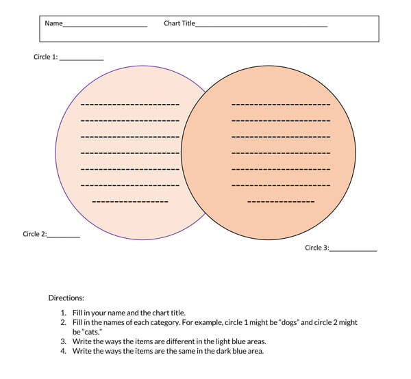
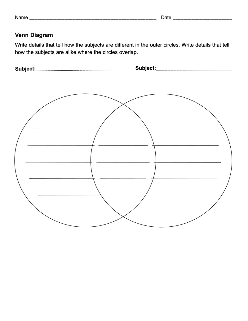
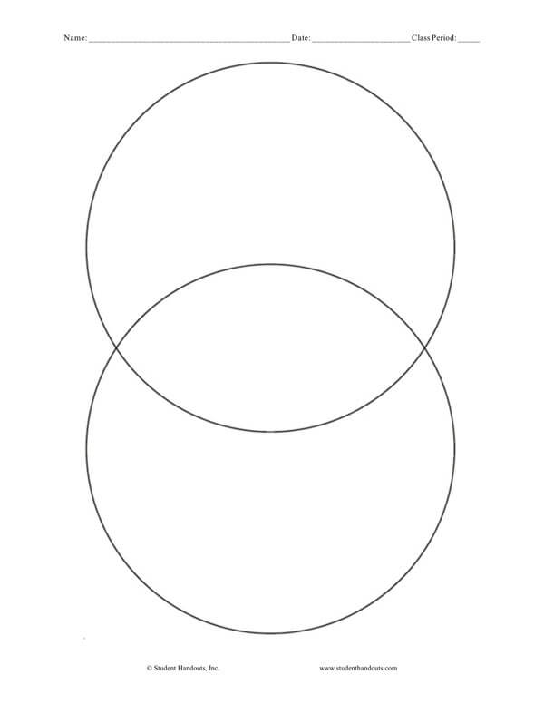
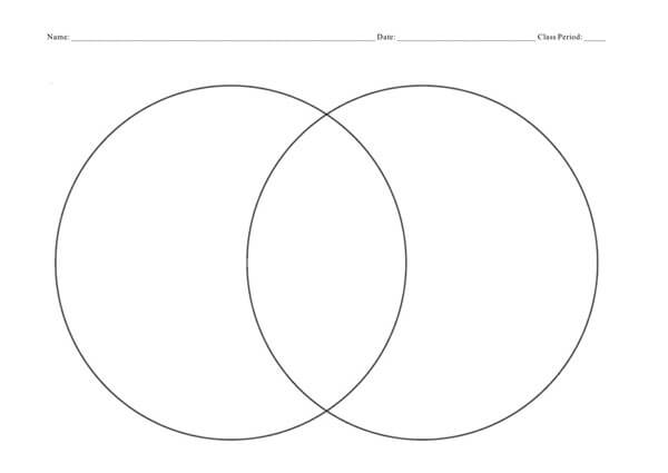
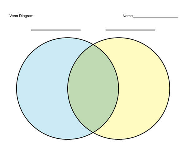
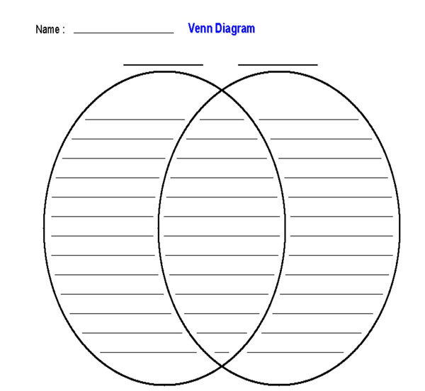
A Venn Diagram is a representation of the relationship between things or a finite group of things.
A Venn Diagram Template is a form in which these relationships are shown through circles that may be overlapping with one another.
Groups of things inside the overlapping sections of the circles are said to share the same characteristics or traits. Those that are located outside the overlapping sections are the groups of things that do not possess the same characteristics or traits.
One of the most widely used graphic organizers today is the Venn diagram. You may have come across it when studying your mathematics and practically used this to group or set numbers apart. But there’s more to numbers with this beneficial mathematical tool.
Free Templates
Word format
PDF format
The Origin of Venn Diagram
Before being called the Venn diagram, in honor of its inventor; John Venn, it was first called the Eulerian Circles. This was the term used by the proponent in 1880, as he published his paper about representing propositions and reasoning.
Although Venn presented this idea to have another way to represent propositions through diagrams, it was not until 1918 that the diagram was attached to Venn’s surname in his honor. However, it was Clarence Irving Lewis, the father of conceptual pragmatism, through his book A Survey of Symbolic Logic, who paid tribute to Venn.
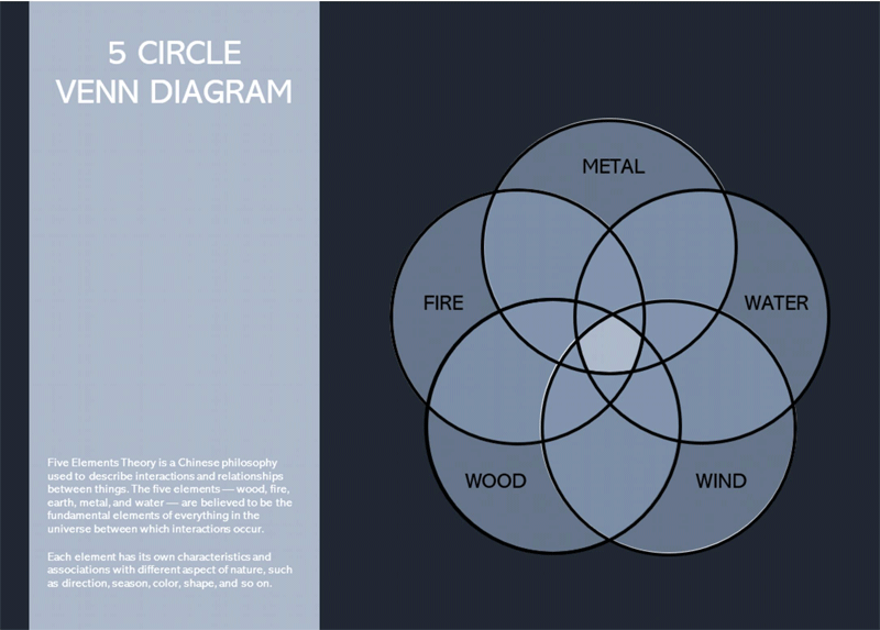
According to history, other Venn-like diagrams came into existence before accepting the Venn diagram as a mathematical tool. There was the Euler diagram which Leonhard Euler invented in the 17th century and the Euler-like diagrams by the philosopher and theologian Ramon Lull
The popularity of this diagram started in the 1960s when it became one of the primary tools in the study of set theories. During these times, it was utilized by the new math movement to publicize and explain their propositions. Soon, other fields like engineering and reading began utilizing it in their curriculum.
Important Mathematical Tool
You have practically been exposed to Venn diagrams as you study probability and algebra in high school and university mathematics. You have been taught that it is an important mathematical tool that can graphically or visually show how numbers and objects are related or not within sets.
But is this what these diagrams are all about?
The diagram continues to evolve to be a vital analytical and logical tool. The academy has also adopted it as a very precious teaching tool. Teachers and professors are using it to present their lessons, particularly in online distance learning setups.
Researchers and scholars alike are also using it in their studies. It is a very crucial tool in presenting similarities and contrasts among their subjects. In business, it has become a powerful tool in report-making to see which products are hotcakes and likely causes of losses.
Even ordinary people can use the Venn diagram/Venn diagram template as a decision tool. Parents can use it to compare schools before deciding which one is the best for their kid’s education by illustrating teaching methodologies, type of curriculum offered, spaciousness, co-curricular activities, etc. A group of friends can use it to decide whether to go on a destination vacation or a staycation by pinpointing various recreational features through the help of a template.
There are many more uses of the template such that we can go on and on to cite or list them. But, all of those boils down to one generalization – the Venn diagram template is an essential tool in presenting ideas. It is a decision tool, an analytical tool, and a presentation tool rolled into one.
How it Works
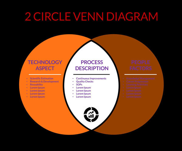
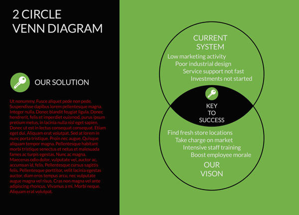
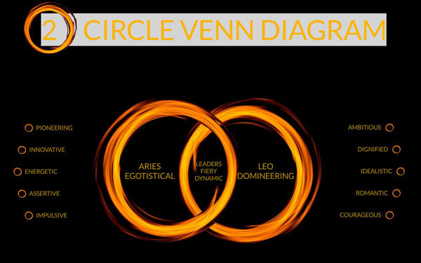
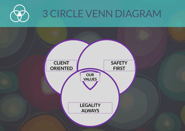
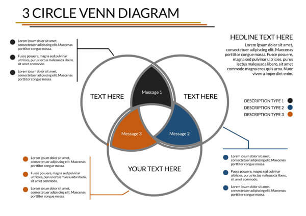
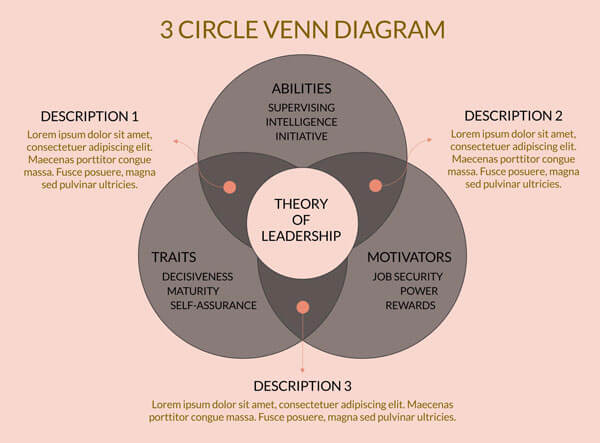
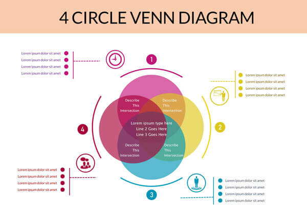
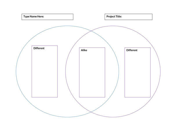
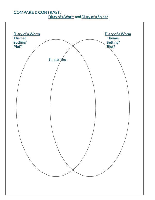
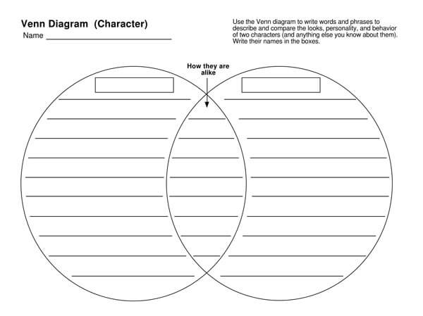
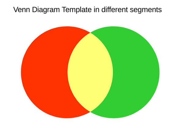
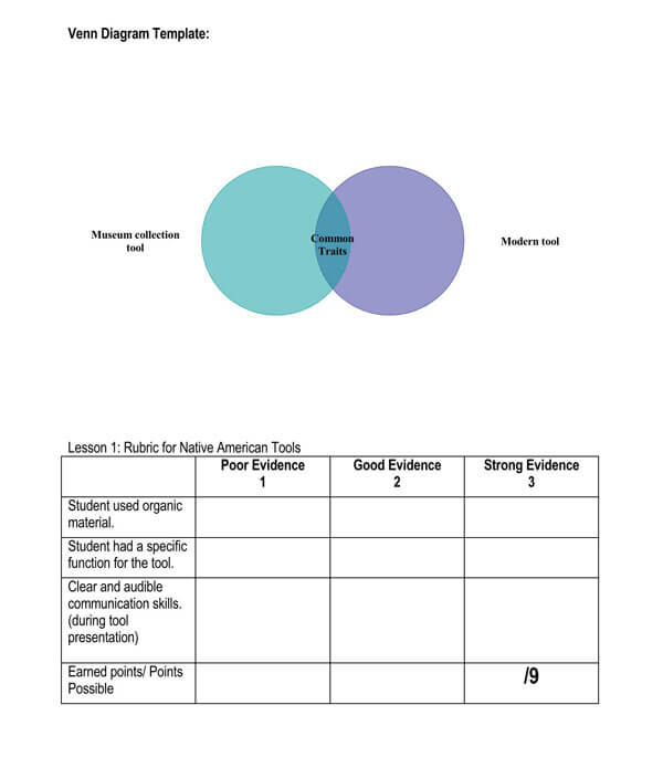
The overlapping sections or the intersections and the outer sections or outer circles hold the key in understanding what is being presented by a Venn diagram. The commonality between two or more sets is indicated in the intersections. In contrast, the characters or traits or even objects that do not fit specific criteria are always indicated on the outer circles.
EXAMPLE
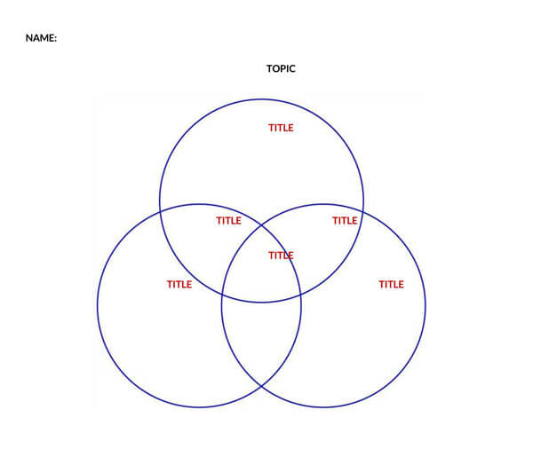
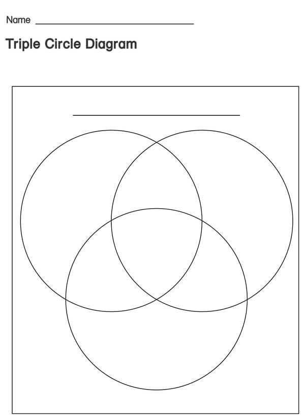
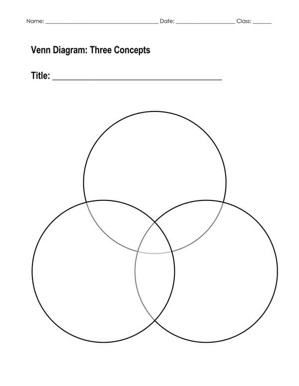
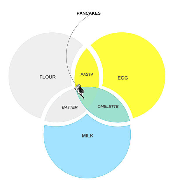
Suppose you are studying the branches of the government particularly its executive, legislative branches, and judicial branches. In that case, you will list the roles and responsibilities of each office in the outer circles. The common characteristics in each set will be the overlapping sections.
Uses of Venn Diagram Template
The use of the template has become more profound. First confined in mathematical studies to show relations between number data sets, its use has expanded into many disciplines.
The templates are helpful tools for formative assessments as they are utilized for productive debate sessions and provide insight into pupils’ mindsets.
While the key to understanding the diagram lies in the overlaps and the outer circles, you must also understand that one of its strengths is simplicity. It is a very great visual tool. Seeing what are in the overlaps will already let you identify that these are shared traits or characteristics. Seeing what is in the outer circles will then let you identify that these traits are not shared. Simply put, it is an easy-to-use tool to present with ease and simplicity the similarities and differences there are.
Reading a Venn Diagram
The diagram can be used as an assessment tool such that you can ask about the similarities and differences between data sets or between the objects that are presented. An assessment type that can also be attached to validate the diagram is to ask whether statements taken from the data sets are true or false. Generalizations can also be extracted from the information presented by the diagram.
How to Make a Venn Diagram
Now that you’ve known how powerful a Venn diagram is as a graphic, visual, analytical, and assessment tool, it’s time for you to know how you can create your own. Of course, several applications can be used to create one. But in general, free presentation applications like Microsoft PowerPoint can easily do the trick.
Select layout
As the first step, you must click the Insert Tab, Illustrations Group until you find SmartArt. Afterward, under the Choose a SmartArt Graphic, choose Relationship under which you can choose the layout you want before clicking the OK.
Adding texts
The Venn diagram would not be useful without the presence of textual data. For you to insert text to the circles, you need to select a shape under the SmartArt Graphic before going to the Text pane to type the text you want for the sections. You can utilize the copy-and-paste commands to reproduce texts for the other sections of the diagram.
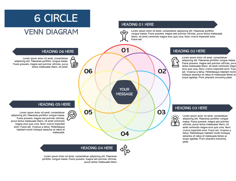
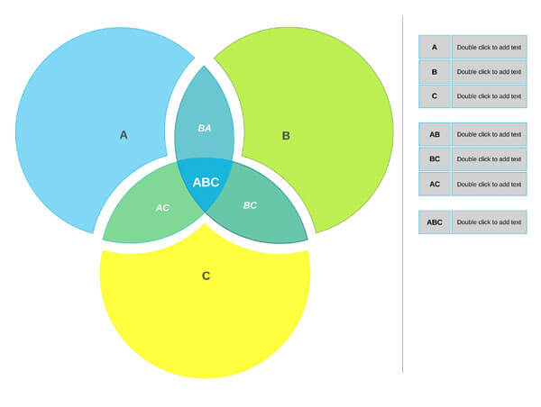
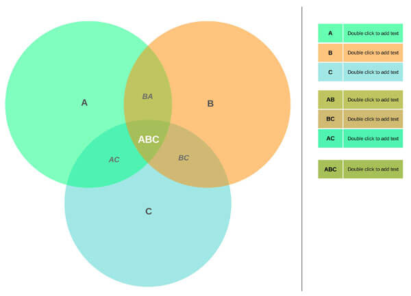
Adding or deleting circles
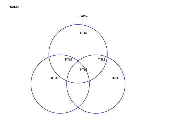
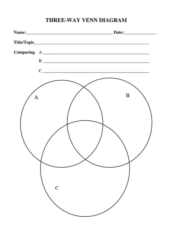
It is usually composed of two circles. But when there are more than two points of comparison and contrasts, you can add more circles. To do this, you must click one of the existing circles choosing whichever is the closest to where you want the additional circle. After doing this, go to the SmartArt Tools. Next, select Create Graphic group on the Design tab before finally clicking the arrow located next to Add Shape. To insert a circle after the selected circle, click Add Shape After. Otherwise, clicking Add Shape Before will insert a circle before the selected circle.
If you want to remove a circle, select the circle you want to remove, then click Delete.
Moving the circle
Click the circle, and with the use of your mouse or trackpad, drag it to its new location.
Changing colors
It can be more visually appealing when colors are applied to the circles. To do this, go to the SmartArt Tools. Then under the Design Tab in the SmartArt Styles, click Change Colors.
note
Microsoft PowerPoint incorporates various layouts for the diagram. However, you can steer away from the usual layouts. To do this, select the Venn diagram you created. Then, under SmartArt Tools, find the Design Tab and then the Layout groups. Possible selections include Linear Venn, Stacked Venn, and Radial Venn.
Frequently Asked Questions
In mathematics, a Venn diagram is a visual or graphical representation that shows relationships – whether similarities or differences between data sets. As a popular instrument of set theory, it is helpful in the study of probability.
The similarities in a Venn Diagram are in the overlapping sections of the circles. The differences are in the outer circles.
They are called Venn diagrams in honor of its proponent, John Venn, who presented this in his published paper in 1880. Before this, the proponent used Eulerian circles to refer to these.
The middle of a Venn diagram in which circles overlap is called an intersection. This is where similarities between data sets are presented.
Conclusion
If you’re looking for a tool to perfectly present similarities and differences among your subjects or data, a Venn diagram is very fitting to use. Aside from its simplicity, it is also straightforward to create using various templates that are readily available from various applications.
About This Article