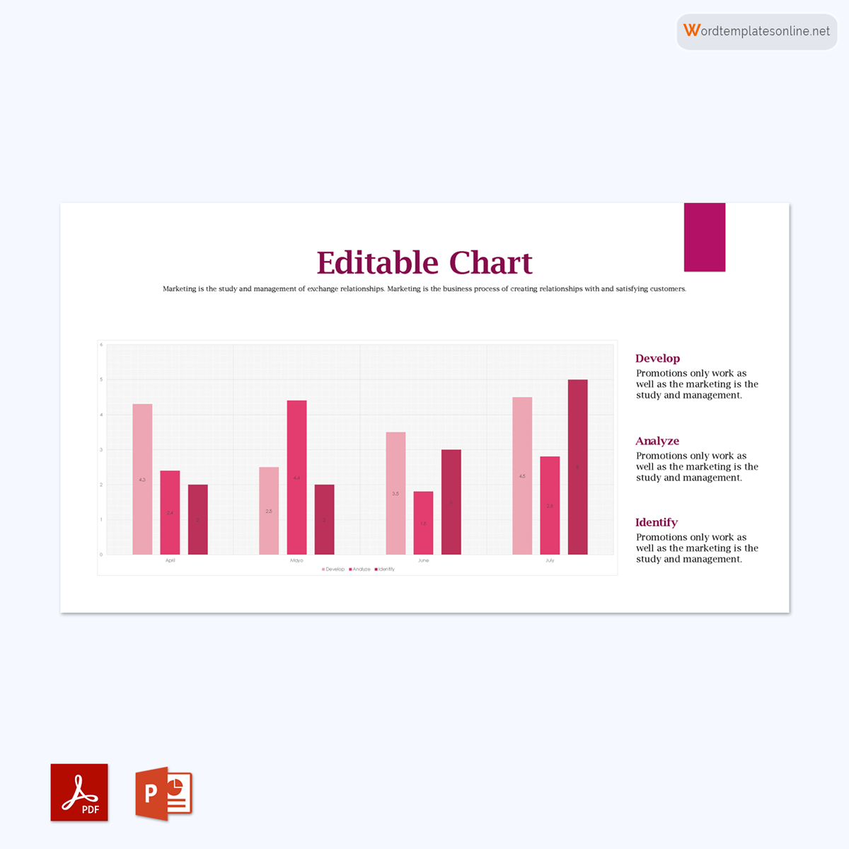
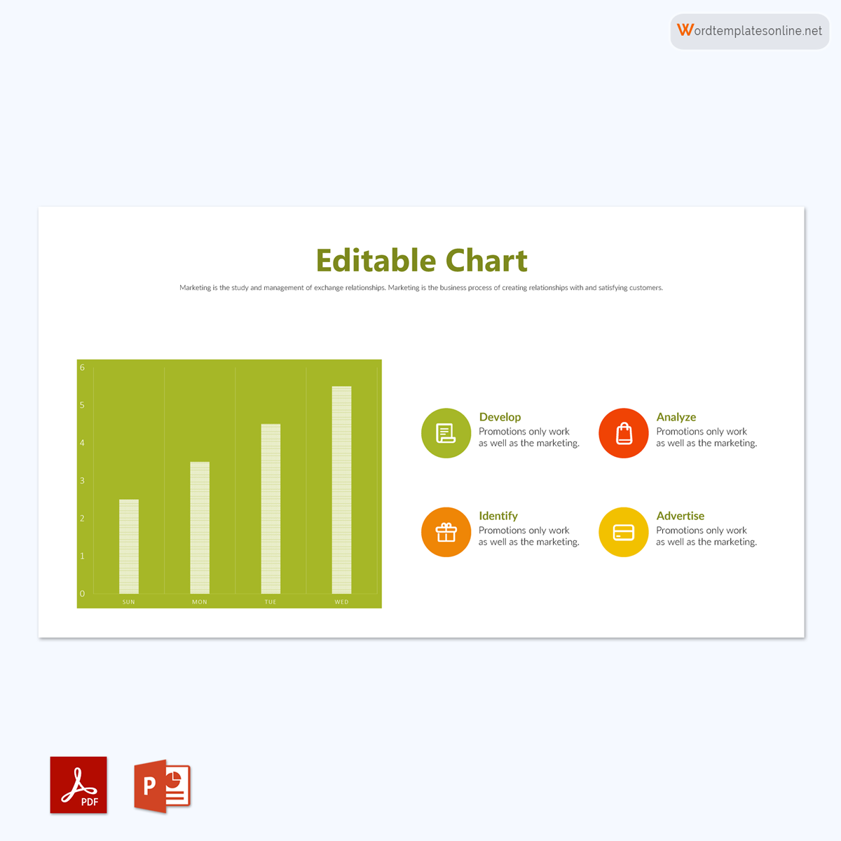
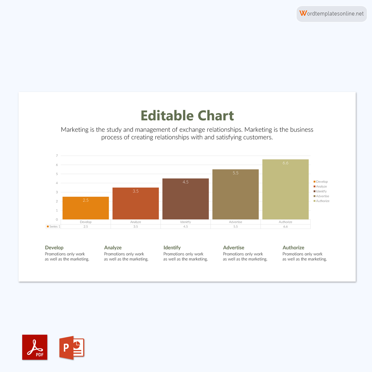
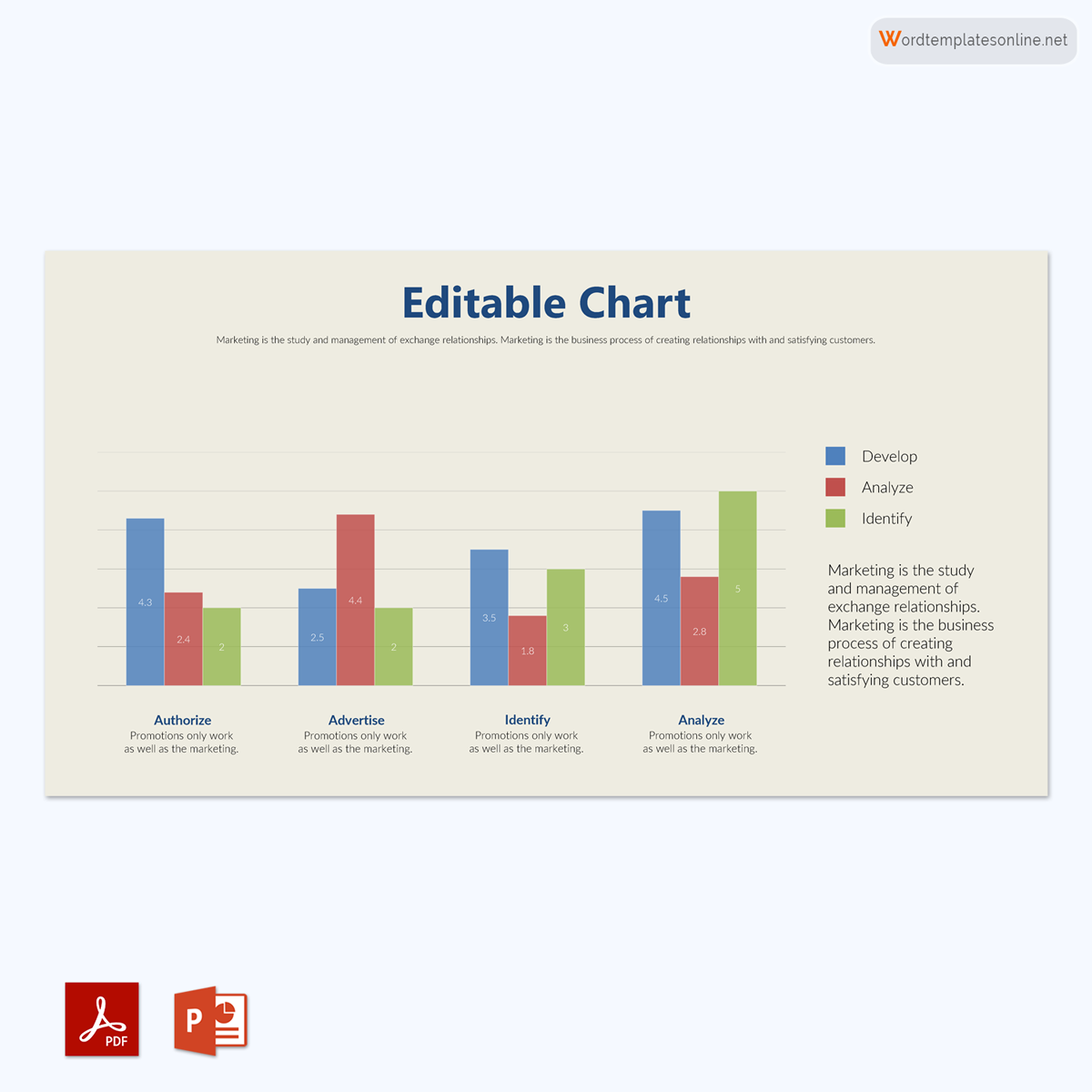
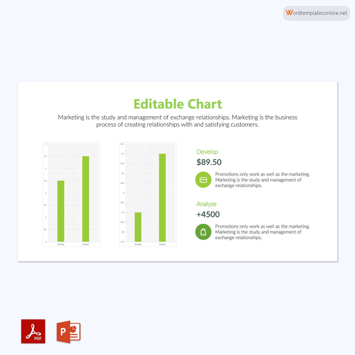
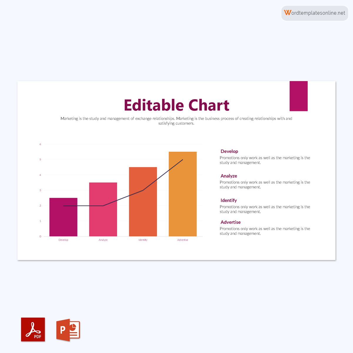
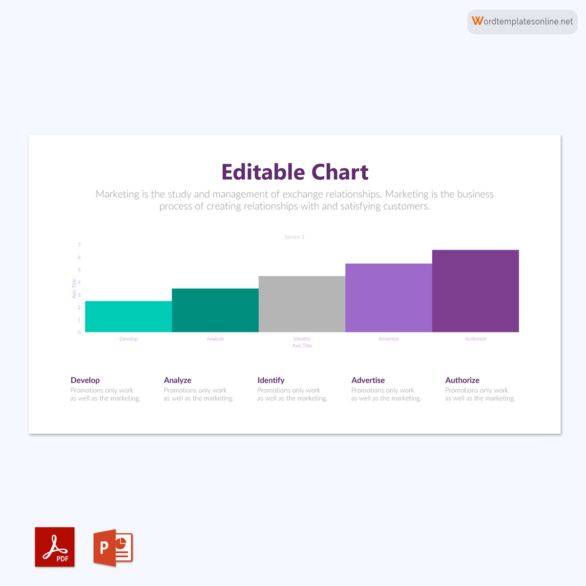
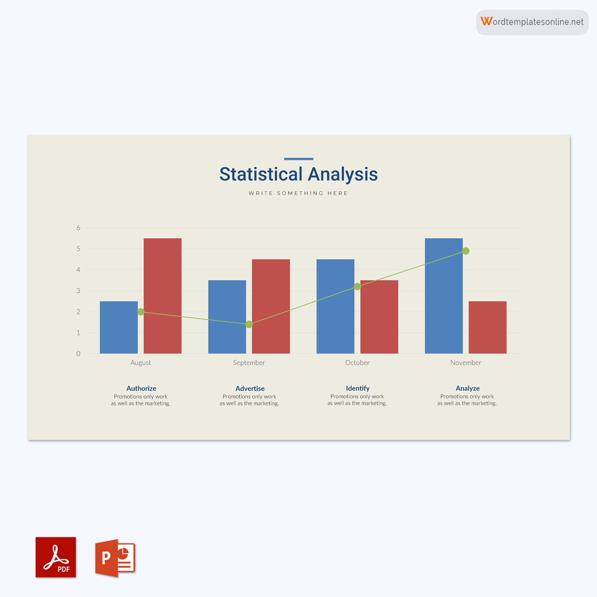
A bar graph is a chart that uses bars or strips to graphically represent data, statistics, quantities, and information.
This means that these graphs can be represented both vertically and horizontally. They are mainly used to compare and contrast categories of data, such as numbers and frequencies. In it, the comparison is indicated by comparing the lengths of the bars or strips.
It is also called a bar chart that typically represents the given group data using rectangular bars or strips. Make sure that each bar is proportionate to the information being represented when using this visual representation. Also, ensure that the bars are of different lengths to allow for proper representation and easier reading by your audience. Although the bar lengths are different, your chart must have uniform bar widths.
Additionally, you can use stacked bars or comparative bars to represent data in your chart. When creating it, ensure that you have two axes: the x and y-axis, to represent data. In order to ensure that your audience is aware of the variables being represented, the graphs must also be labeled.
This article will focus on it, its different types, and how it is used. The purpose of this guide is to explain how to create it using a temp
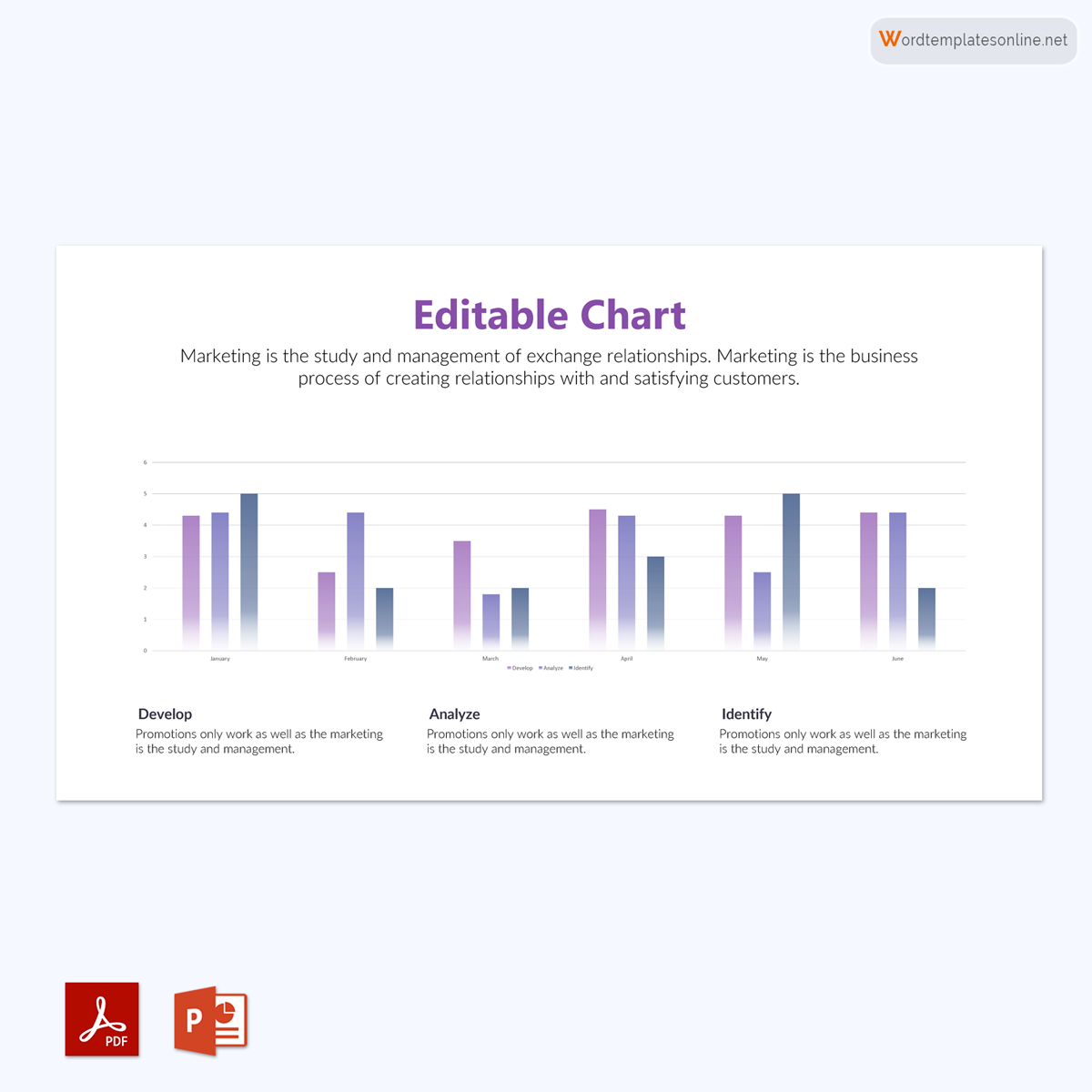
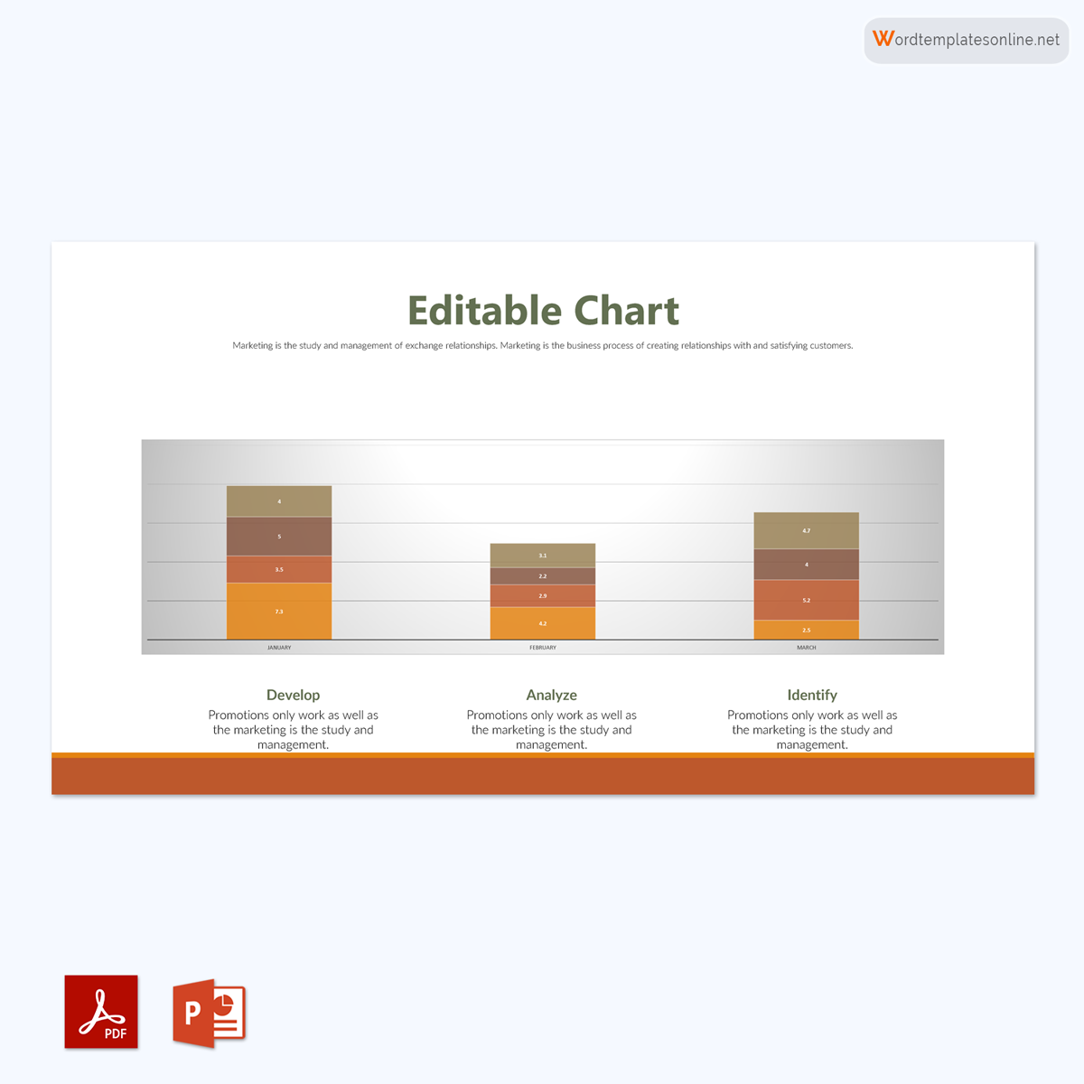
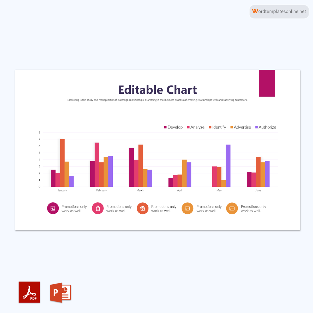
Free Bar Graph Templates
Uses of Bar Graphs
There are different areas where you can use it. Some of these applications include:
- You can use it for financial and statistical analysis to predict probability in a particular sample or set of data.
- They are used in technical analysis to spot changes over time, such as when examining trading data.
- They can also be used to compare items in various groups in fields like education, at home, at work, or even in stores.
Properties of a Bar Graph
There are some specific properties and attributes that a bar graph must have. Make sure to consider these characteristics as you make your own. A chart with these properties qualifies to be a bar graph. Ensure that it can compare different sets of data within different groups. It should be able to show any data changes that might take place over time.
It should be able to show a relationship. That means a bar graph has two axes used to show the relationship between two data sets. One axis is used for the data category, and the other is used for discrete data values. It must also have a common base with various columns of different heights and an equal width. Finally, make sure that the bar chart has the same distance between each bar.
Before learning how to draw it using a template, it is important to understand some of its features. It displays relative information, which demonstrates how the quantity and type of data relate to one another. The axes are used to display data and show the relationship of the represented information. It has a y-axis or the vertical axis, and an x-axis, or the horizontal axis.
The data value shown on the y-axis is represented by the height of the bars or strips on the x-axis. This indicates that the data on the x-axis is variable, which explains why the bars or strips have different lengths.
It is also important to include a title for your bar graph to help your audience easily interpret the chart. Some of them have scales that allow the x and y-axis to be increased to represent more data. In stacked bars, it is important to include a legend that makes reading the different colors of your bar chart easier.
Whether there are many or few values, ensure that it has all these features for easier understanding. Also, since data can be represented vertically or horizontally in a bar chart, ensure that you change the alignment of the x and y-axis.
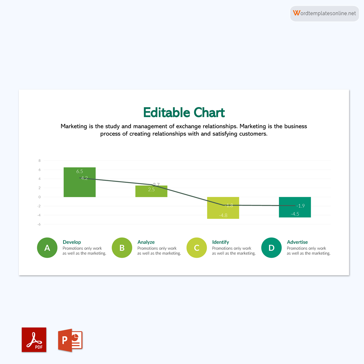
It is also possible to display values in the bar graph that are both positive and negative. The common base of it, where the upper bars represent the positive values and the lower bars represent the negative values, will be the zero line.
Steps to Make a Bar Graph
Using a template to draw your bar chart is helpful. It is time-saving and will ensure that the drawing process is easier for you.
Here are the steps you need to observe when drawing your graph.
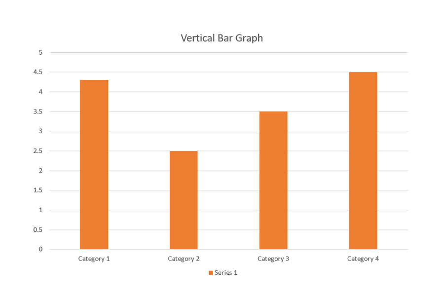
To demonstrate the steps for creating it, we will use the following data.There are five types of fruits in a basket:
- Apples (15)
- Oranges (5)
- Bananas (20)
- Peaches (35)
- Pawpaw (10)
Step 1: Add the title
Make sure you choose a title for your bar graph. In this case, your title can be ‘Types of Fruits in the Basket.’
Step 2: Draw horizontal and vertical axes
The next step will be to draw a horizontal and vertical axis.
Step 3: Label the axis
You need to label your x-axis and your y-axis for easier reading. In this case, your horizontal axis (x-axis) can be referred to as “Names of Fruits,” while the vertical axis (y-axis) can be labeled as “Number of Fruits.”
Step 4: Add data
You will also need to include the data and statistics after preparing your horizontal and vertical axes. On the horizontal axis, you should add the names of the fruits, that is, apples, oranges, bananas, peaches, and pawpaw. On the vertical axis, add the quantity of the fruits, that is, 15, 5, 20, 35, and 10 respectively.
Step 5: Finalize the scale range
To ensure that all of the data and statistics of the various types are included in it, the next step is to finalize the scale range.
Step 6: Draw the graph
Finally, it is time for you to draw the graph so as to represent the information given; in this instance, it is the number and types of fruits. Ensure that you use a proper template to draw it correctly.
Types of Bar Graphs
Depending on the data you want to represent graphically, you can choose from a variety of types.
The following are types that you can draw:
Vertical bar graph
It is a diagram that uses bars to represent grouped data vertically. These bars represent the measure of the data being represented; that is, the y-axis contains the data displayed by the bars’ height, which represents the values.
EXAMPLE
The y-axis displays the numerical values of the temperature for each day.
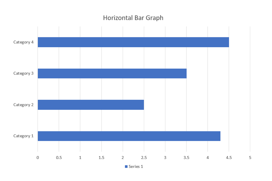
Horizontal bar graph
It is a chart used to represent grouped data horizontally by using bars that display the measure of data. The x-axis displays the bars whose lengths are determined by the values being represented.
EXAMPLE
The x-axis contains the values in this horizontal bar graph:
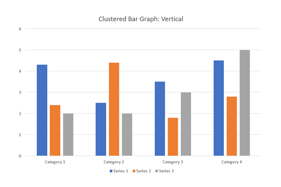
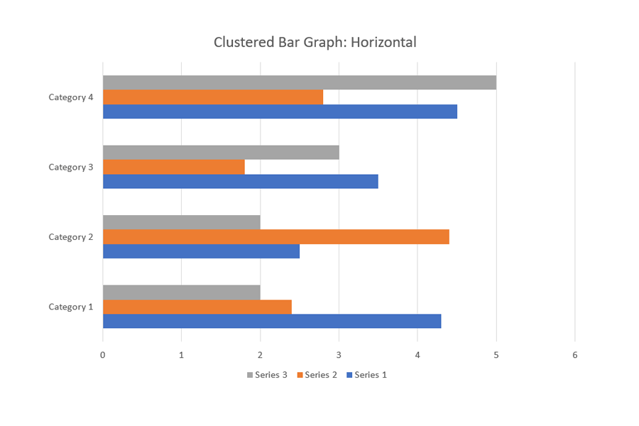
Clustered bar graph
It is a chart that represents the distinct value of objects that fall under the same category. In this type, similar data items are grouped into sets and compared to other sets as single units. For this type, you should choose a single color to represent a specific data item series across the entire set.
Grouped bars can have both vertical and horizontal representations
EXAMPLE
The x-axis contains the values in this horizontal bar graph.
This is a vertical clustered bar graph:
This is a horizontal clustered bar graph:
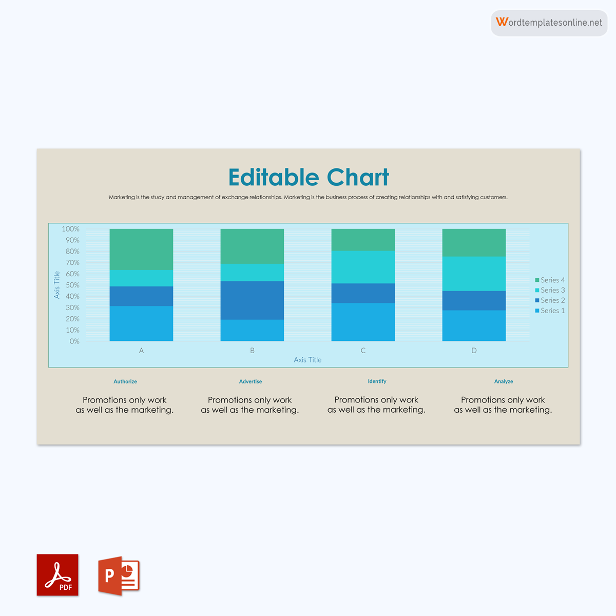
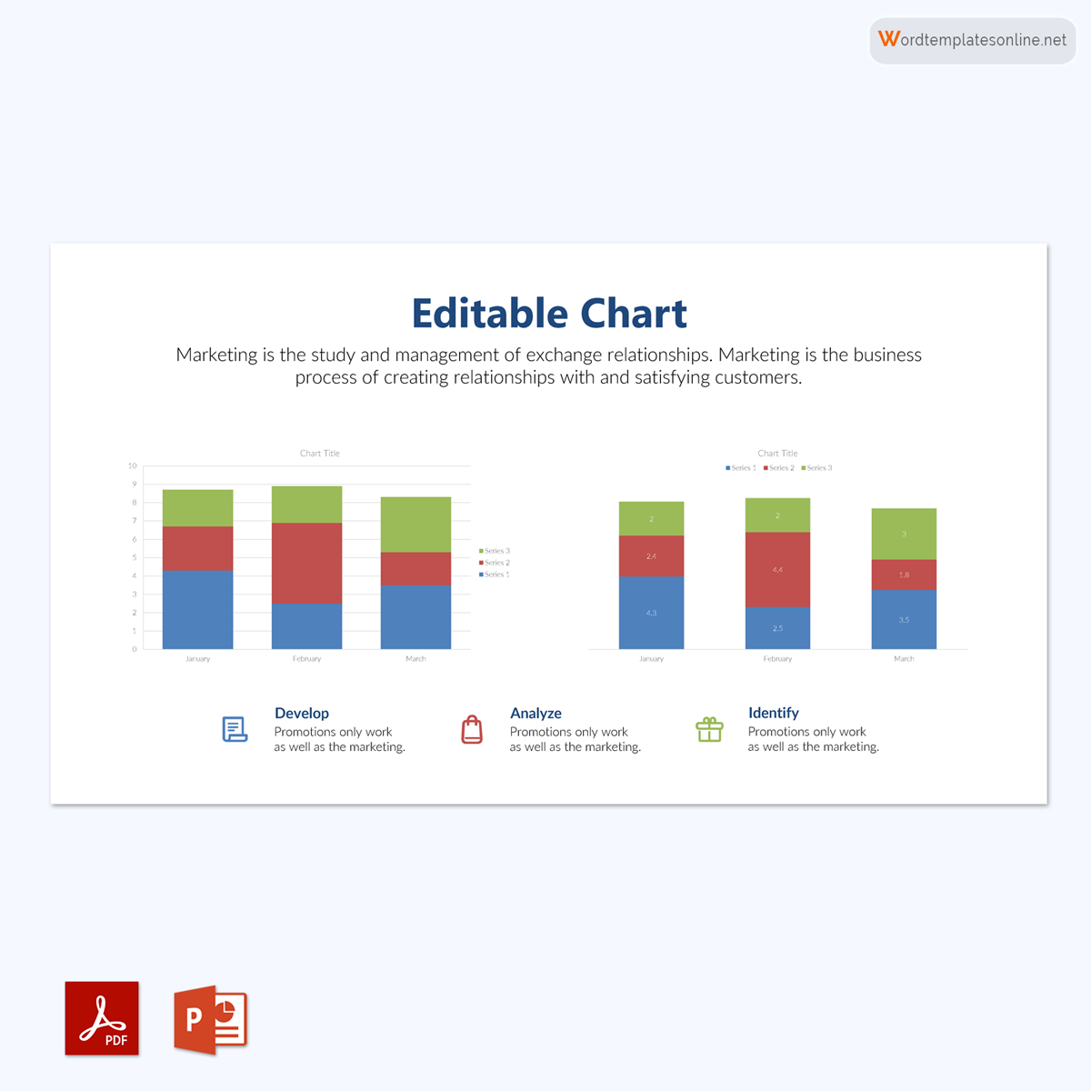
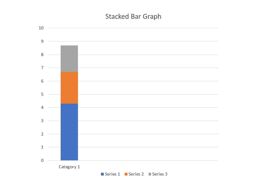
Stacked bar graph
It is a bar chart that divides the collective bar into different parts; this means the entire bar represents the whole and is divided into sections representing different segments of the whole. Each bar represents different categories and uses different colors to help in identification. Also, you need to have a legend or properly label it to help identify the whole and its sections.
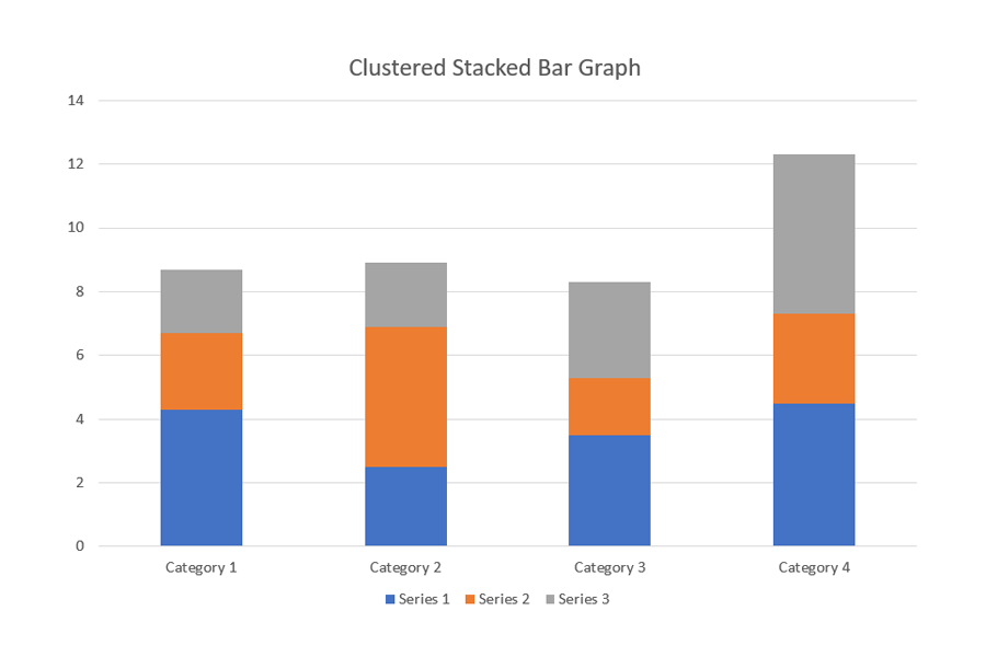
Clustered stacked bar graph
It is a chart that results from the grouped and the stacked bar charts. This chart is meant to break down data to provide multiple stacks of data per group. For example, this chart represents a comparison between the forecast and actual data while still providing a comparison between the data under each category.
Benefits and Drawbacks
There are certain benefits and disadvantages of using a bar graph or chart. They, for example, aid in the visual presentation of groups of data, making them simpler to comprehend and interpret. When displaying the various data categories for frequency distribution, they will be of assistance. Another important advantage of using it is that it offers your audience clarity about the data trends. Also, it will help you judge the data values just by looking at them.
When it comes to showing patterns, effects, and causes, it is not the best chart to use, and it is one of its biggest limitations. These graphs can also be easily changed to display false information. If the scale used to represent that data on it is uneven, too large, or too small, it is easy for your audience to misinterpret the data. Also, these graphs tend to provide information that might be relevant or from a compelling source.
Frequently Asked Questions
The difference is that a bar graph displays categorical data, while histograms display numerical data. This means that while graphs can display different types of data, a histogram can only display data that has numbers. Also, histograms tend to leave space between their bars, which makes them different from the former.
The difference between them is that while a bar graph uses rectangular bars or strips to represent its data, a pie chart uses slices of a whole (or a circle) to represent that data.
The main difference between them is that a line graph uses a series of data points on a straight line to represent data, while a bar graph uses rectangular blocks of different lengths to graphically represent data.
It is used when you need to compare items from various groups over a period of time. These charts come in different types and can also be used to determine changes in data over time.
You should use a horizontal chart when you need to represent nominal variables graphically. These are variables that usually contain numerical data.
It does not always include numbers, works best when you need to graphically represent common variables.
About This Article