“Alex Morgan coordinates community events, bringing volunteers, venues and schedules together.” This invented opening is short, but it gives a reader something concrete: a person, a role and the work involved. That’s a useful starting point when a blank bio page makes your whole career feel difficult to sum up.
The ten professional bio templates below give that introduction a designed page, with space for supporting details and a photo. They’re professional profile sheets, with sections such as education, experience, skills and contact information. Each is supplied as a Word DOTX template, an ODT file and a linked Google Doc. The Word layouts use US Letter portrait pages.
Browse the designs with the information you actually need to share in mind. A large experience area is useful if you have relevant work to explain; a prominent portrait and shorter introduction may suit a more visual profile. You don’t need to fill every sample box just because it’s there.
Bio Template 01
Bio Template 02
Bio Template 03
Bio Template 04
Bio Template 05
Bio Template 06
Bio Template 07
Bio Template 08
Bio Template 09
Bio Template 10
Let the introduction do one job
Your opening should help this particular reader understand who you are and what you do. It doesn’t have to contain every qualification, interest and past job. The rest of the sheet can carry the supporting facts.
Compare the invented sentence about Alex with “Alex is a passionate, highly skilled professional.” The second version could describe almost anyone. The first gives a reader a reason to keep reading if they need someone who organizes events. To draft your own, try a plain sentence with your name, current role and the work most relevant to the person receiving it. Then add a detail that helps that reader, rather than another adjective.
For example, an event organizer might care about the kinds of programs Alex coordinates. A prospective collaborator may need to know which part of the work Alex handles. Those are different introductions built from the same truthful background. Keep your facts consistent even when you change the emphasis.
There’s no universal word count that makes a bio right. A website profile, a designed handout and a two-line introduction have different space and audience requirements. Boise State’s professional bio guide discusses several lengths and recommends tailoring the content to its audience and purpose. For these sheets, begin with the required message, then see how comfortably it fits the actual layout.
Three ways to give that opening a place
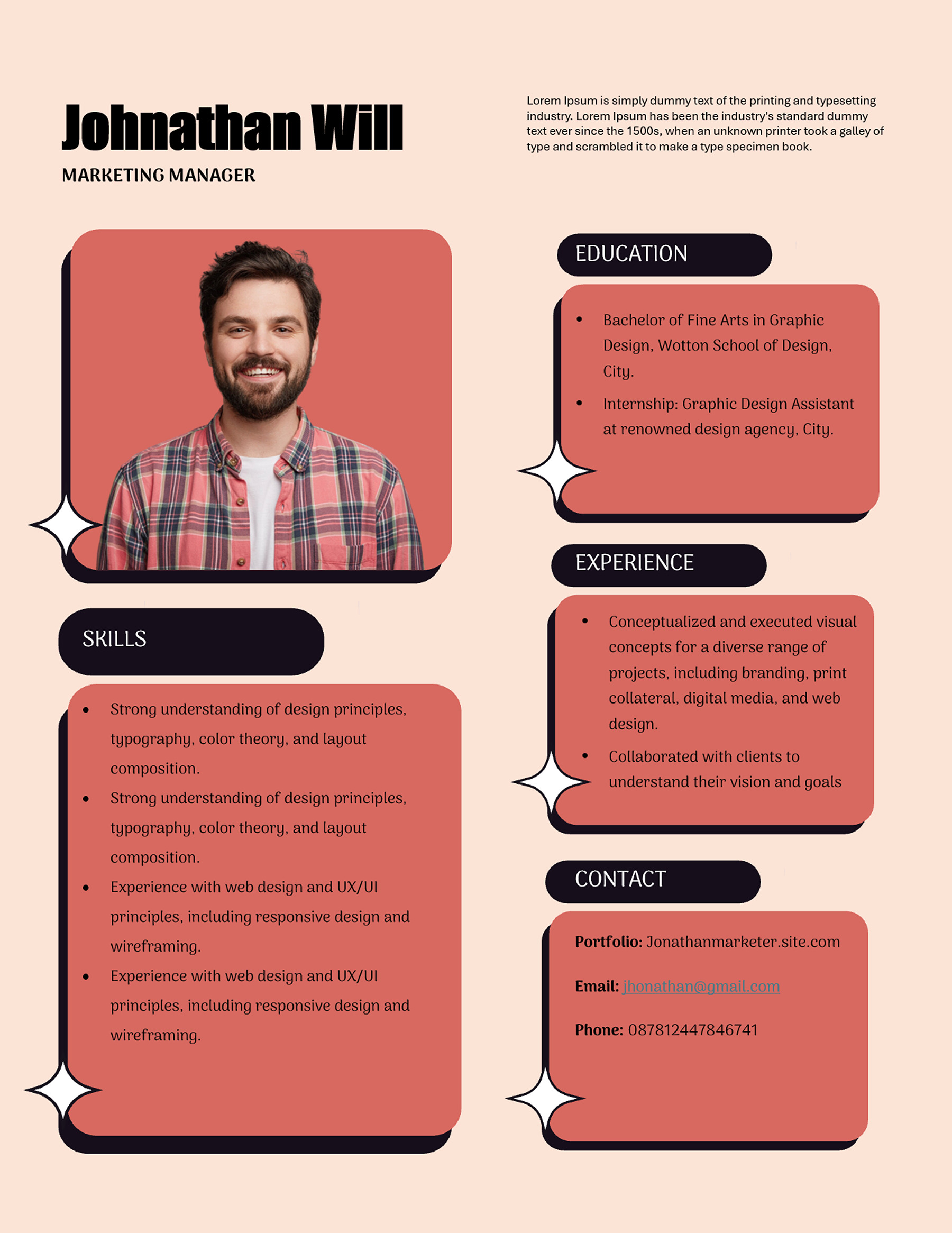
The peach-and-coral design uses a large portrait and rounded dark section labels. The introduction sits near the name, while the colored boxes separate education, experience, skills and contact details. That clear separation can help when your opening is brief and the supporting facts need their own space. Keep the introduction focused; repeating the same skills in both places makes the page feel fuller without telling the reader more.
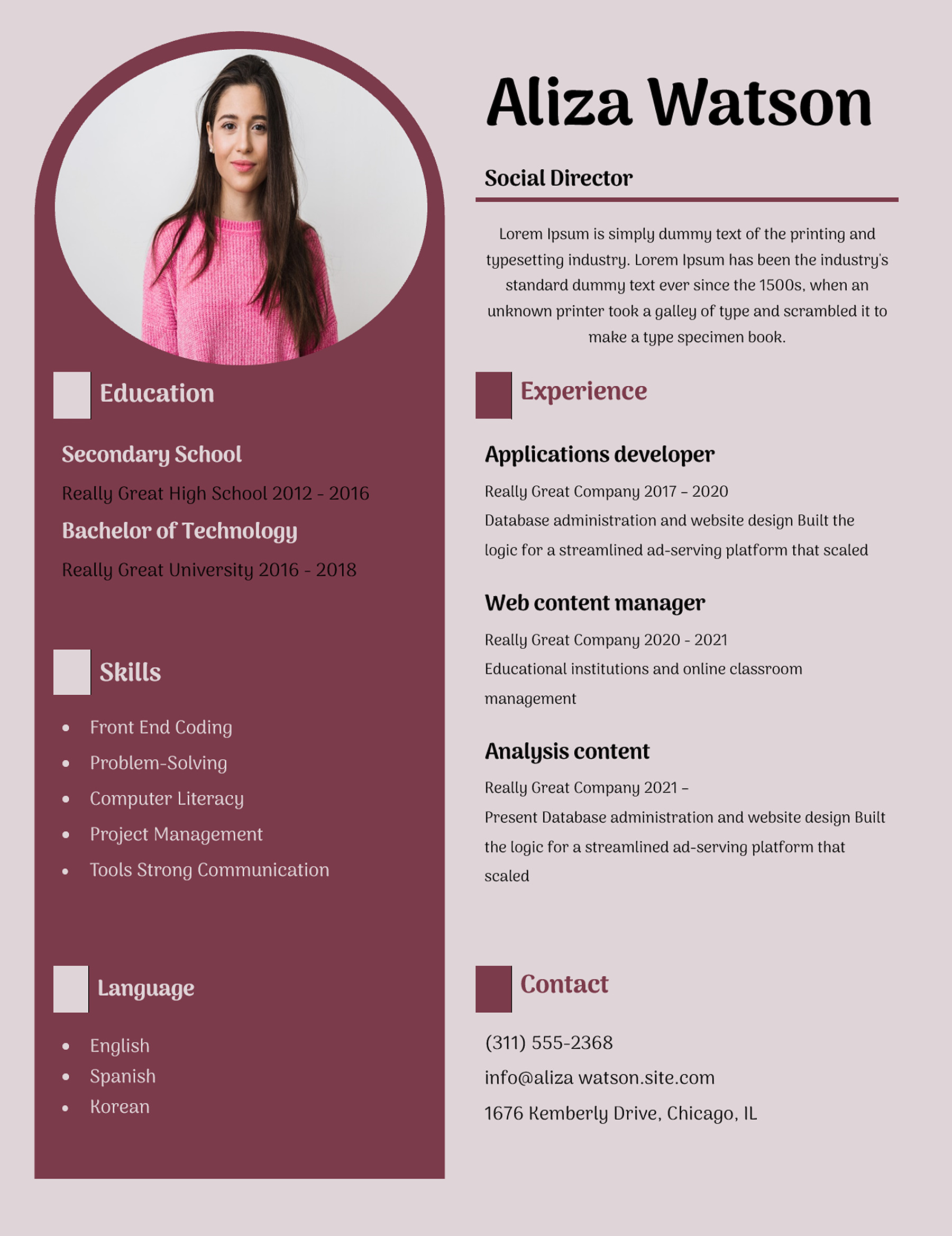
The mauve sidebar design gives short supporting information a narrower column and leaves a wider area for the introduction and experience. It is worth considering when you need a little more explanation in the main text but can keep education, skills and languages concise. A long qualification title may need more care in the sidebar than it would in a broad section.
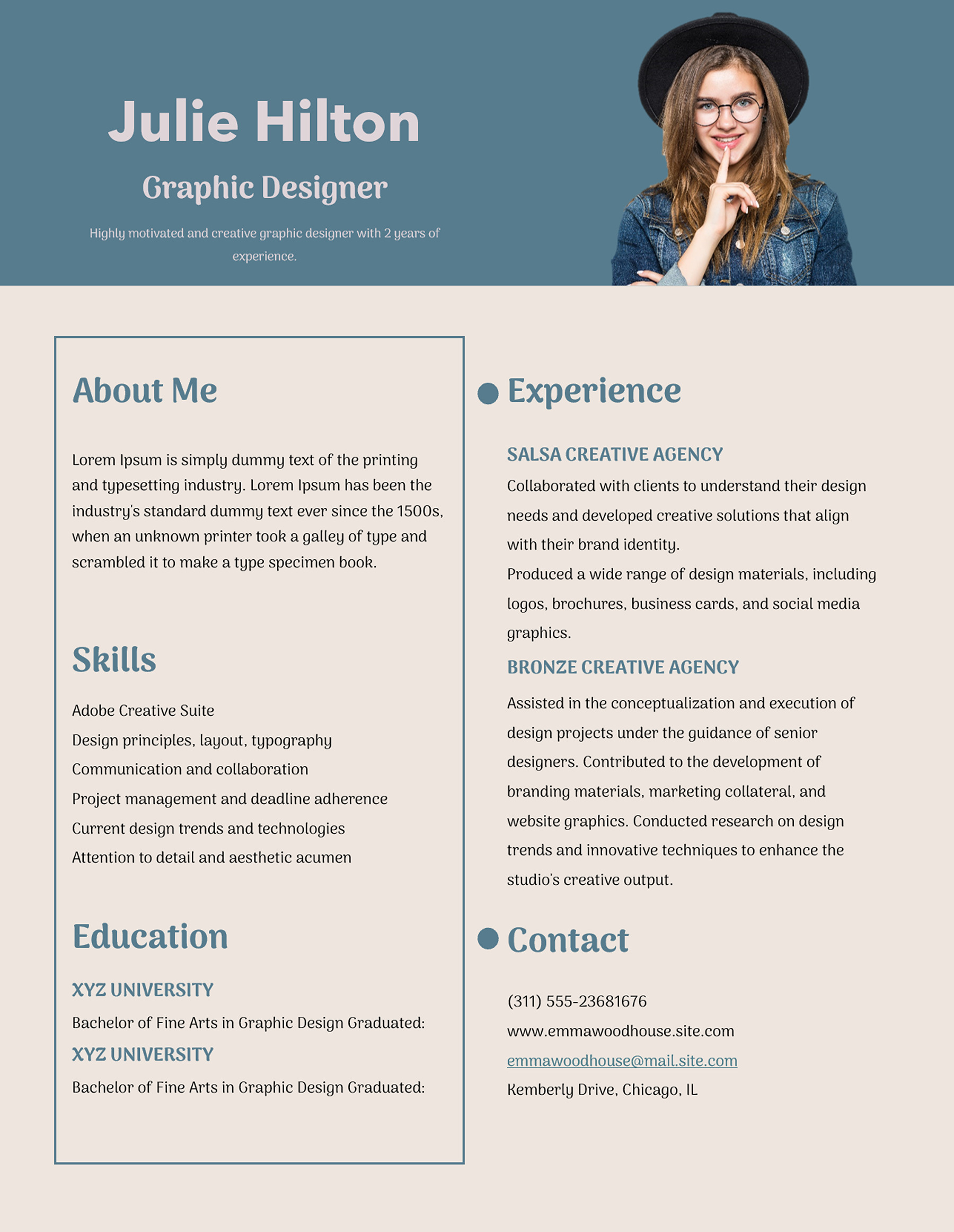
The blue portrait-header design gives the name and role a strong opening, then places About Me on the left and experience on the right. Skills and education continue beneath About Me. This works as a conversation between the introduction and the evidence: one side says what you do, while the other shows where you’ve done it. Read the two together to make sure they describe the same professional story.
Give the supporting boxes something worth reading
After the introduction, look for facts that support it. A relevant role, project or qualification tells the reader more than a long list of general qualities. If your opening says you coordinate events, an experience entry might explain your responsibility for a particular kind of event. Use your own records; the sample employers, achievements and dates are placeholders to replace.
You don’t need to copy the sample’s amount of text. One clear entry can be more useful than several loosely related ones. Keep dates and job titles consistent, and avoid presenting a course you are taking as a qualification already earned.
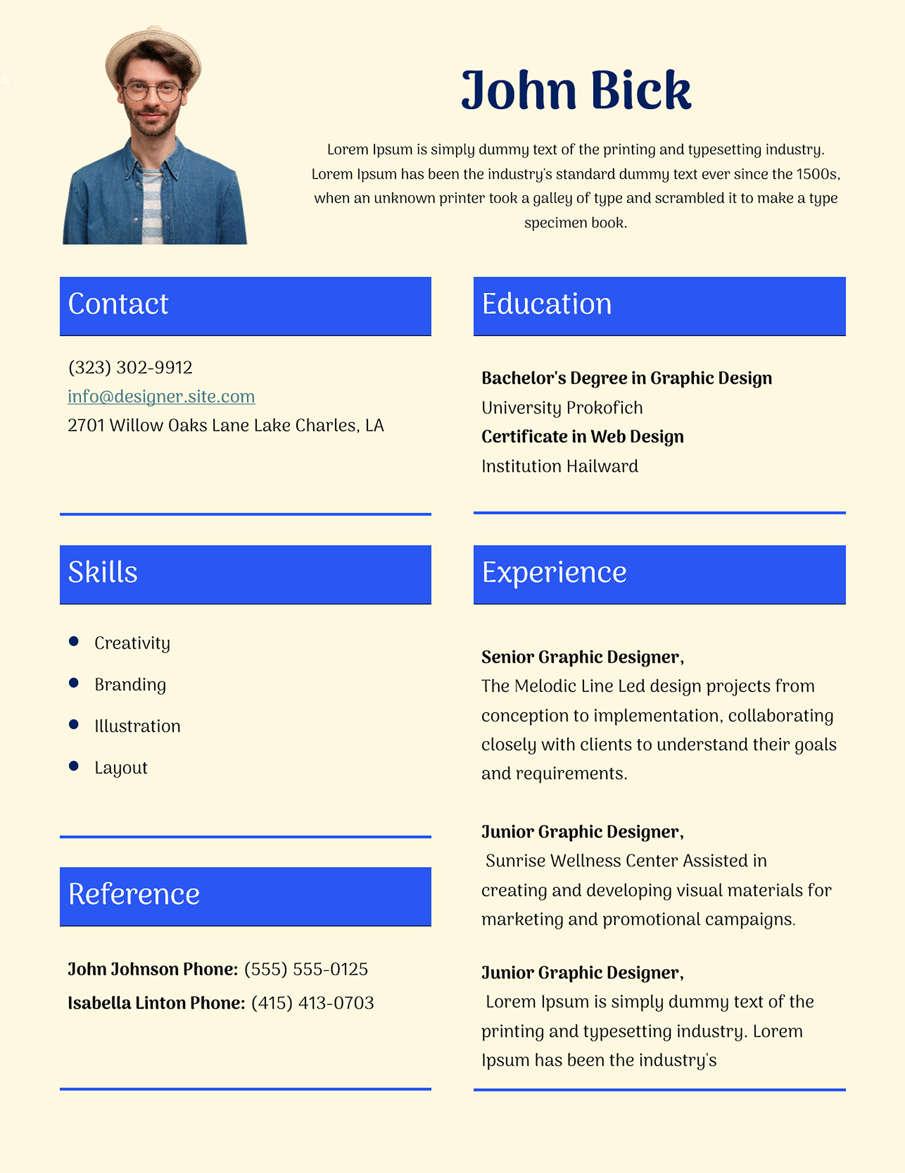
The cream design with bright blue section bars puts contact details, skills and references on one side, with education and experience on the other. Its reference area is a layout option, not a requirement to put other people’s contact details on every profile. Include references only when they belong in the version you’re sharing and you have permission to share their information. You can adapt your personal copy if that section isn’t needed.
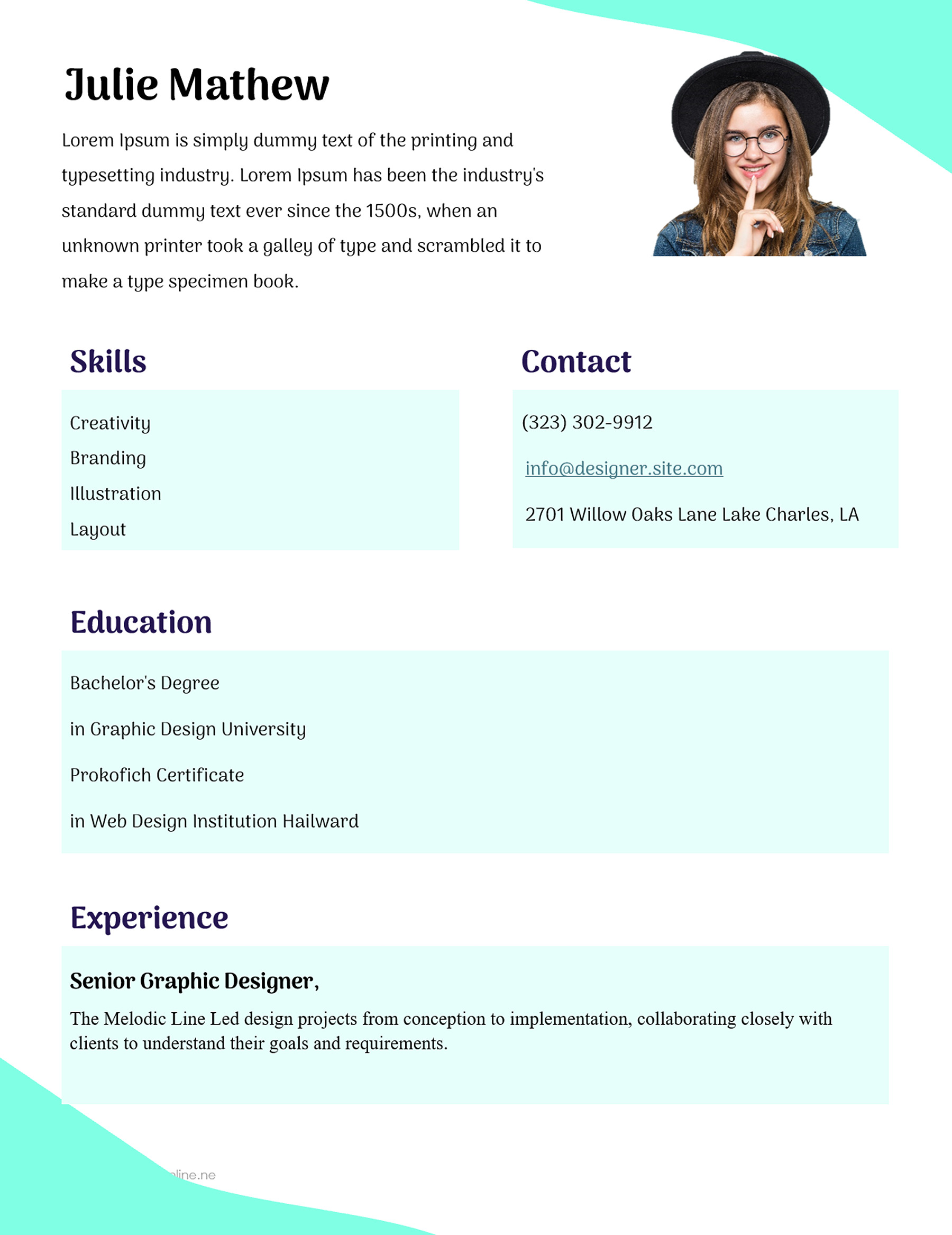
The white-and-mint design gives education and experience broader horizontal areas, with compact skills and contact boxes above. It can accommodate a fuller explanation of one relevant role without turning the top of the page into a dense list. If a short profile and one substantial experience entry tell the story, let them do so; empty space doesn’t need to be filled with unrelated work.
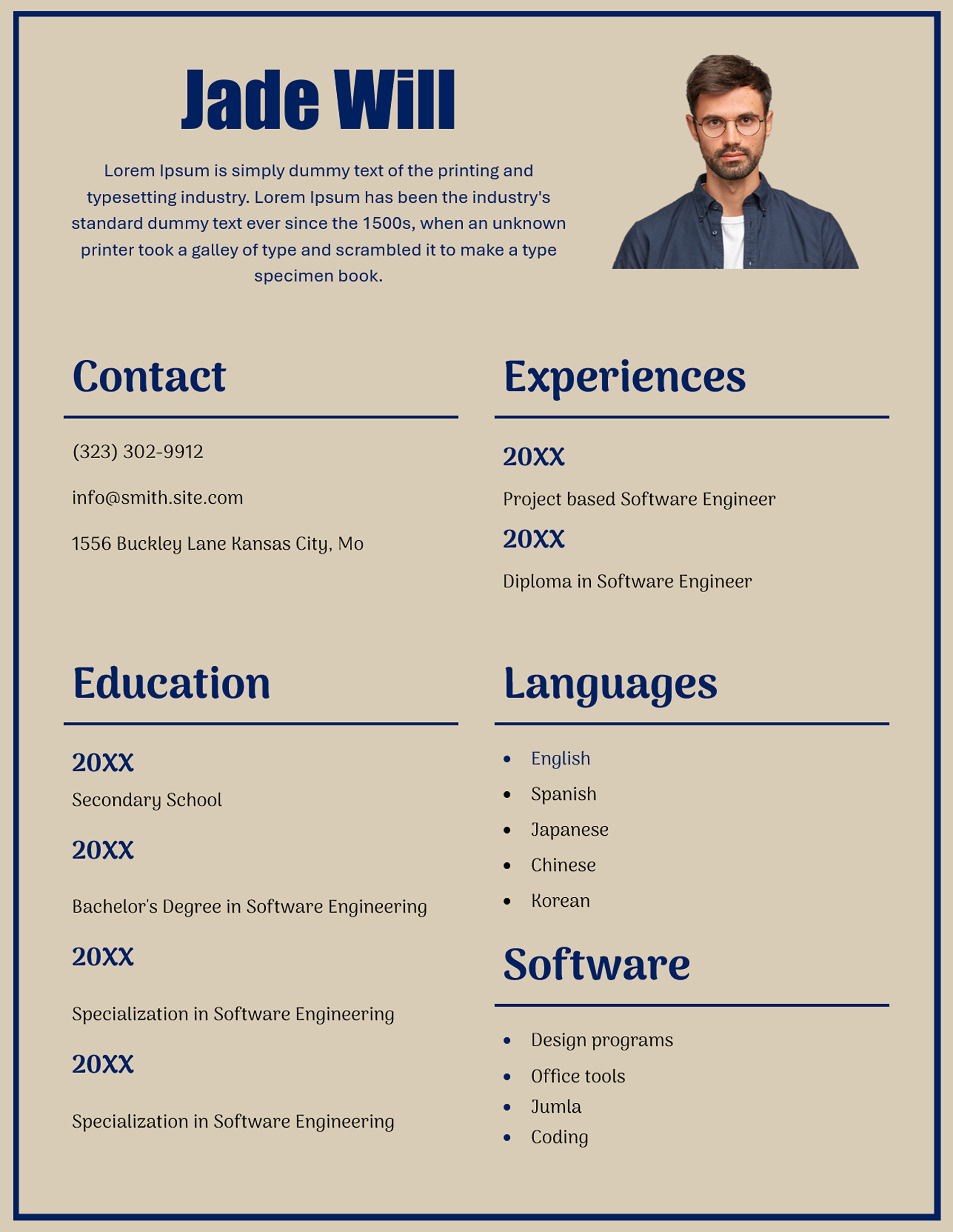
The tan-and-navy design includes distinct language and software sections. Those headings are useful when these abilities matter to the reader, but they shouldn’t persuade you to keep sample claims. Name the languages or tools you use and describe your level accurately where that distinction matters. “Office tools” may be less helpful than the particular software needed for the work you’re discussing.
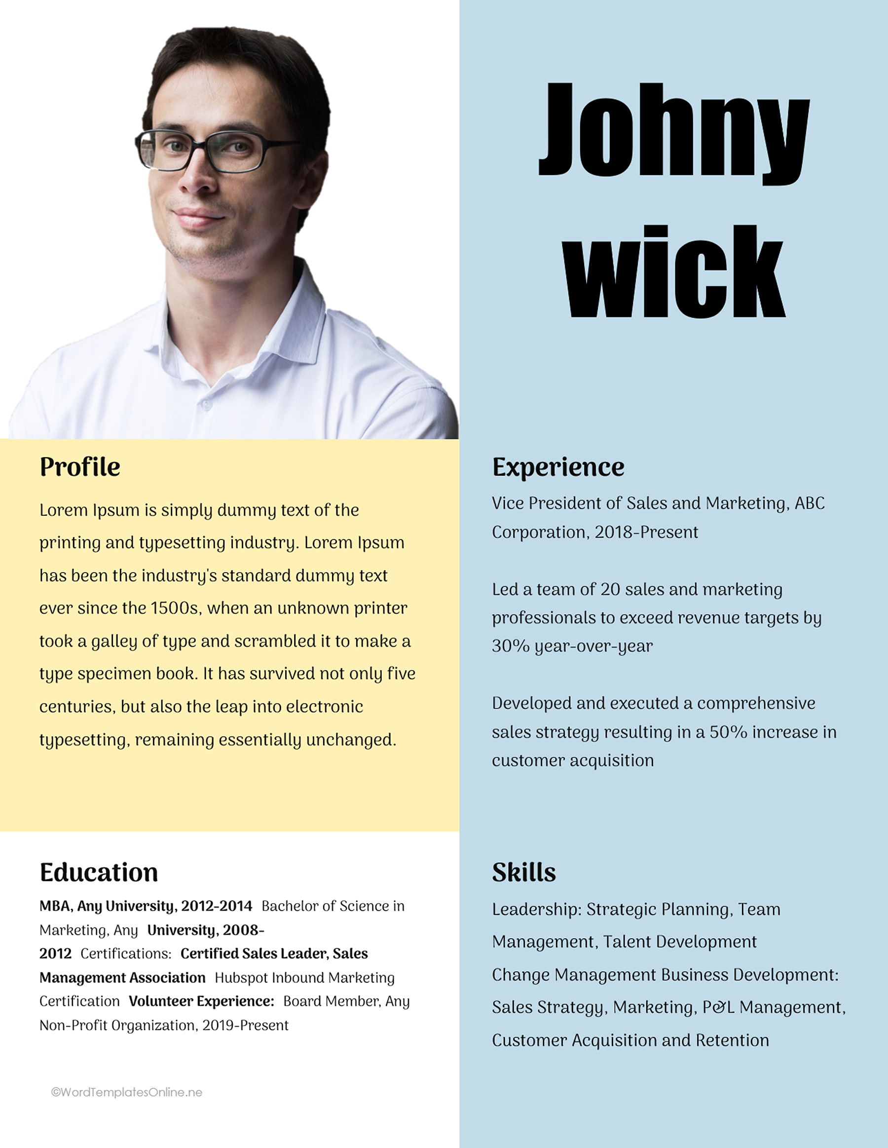
For a less conventional arrangement, the pale-blue-and-yellow design places the profile and education beneath the portrait, with experience and skills in the taller right-hand area. It gives the two sides different jobs. Check the overall reading order after adding your text, especially if one section grows much longer than its sample.
When the page should feel more visual
Not every profile needs the same two-column rhythm. Three of the designs use more pronounced boxes or panels, which may suit a short introduction that people will browse rather than read as a continuous narrative.
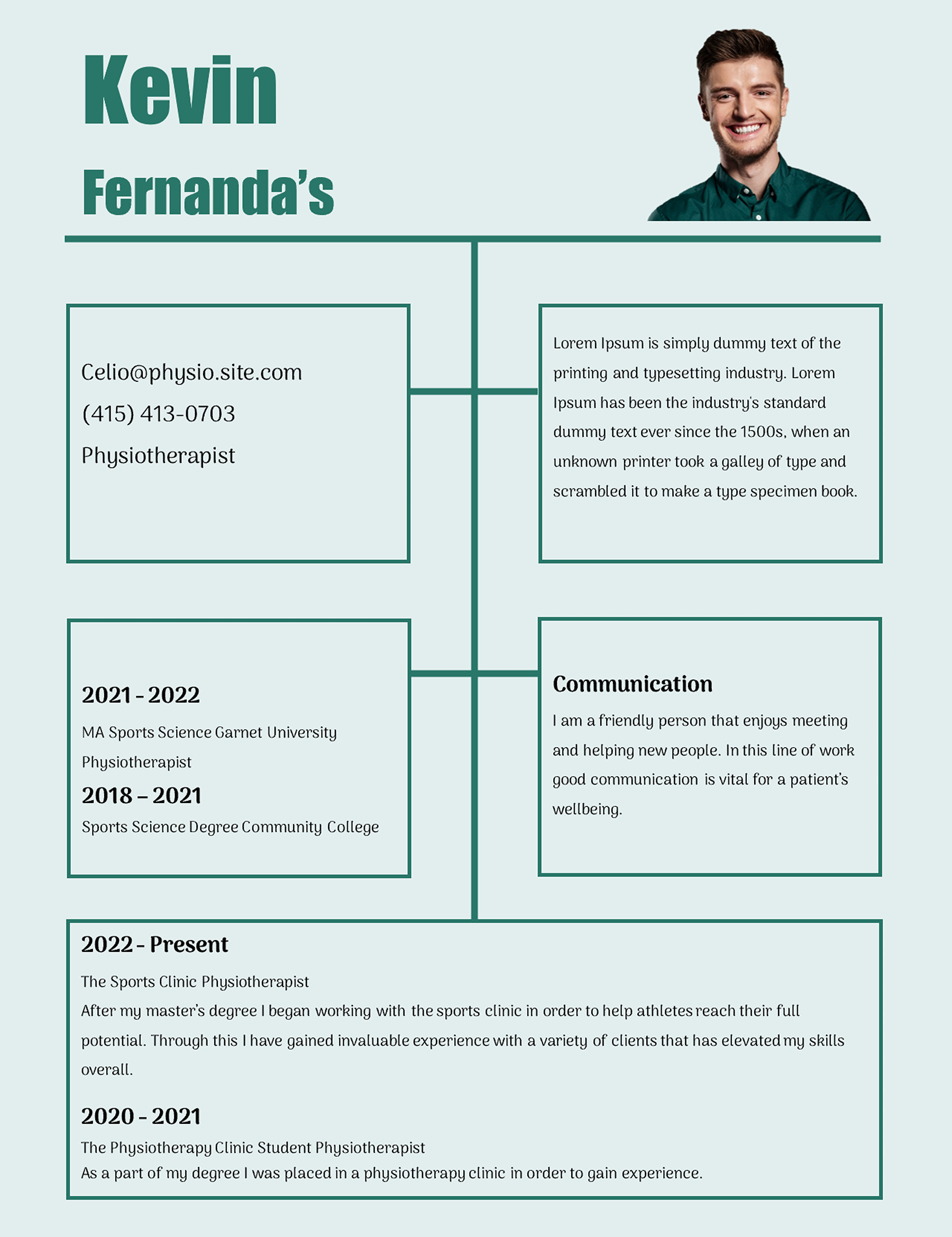
The pale-teal connected-box design links several areas with lines and reserves a wider box below for experience. It invites short, selected pieces of information. A long paragraph in every box would make that visual route harder to follow. Although the sample describes a physiotherapist, the layout itself doesn’t limit you to that occupation. Replace the whole sample with an accurate profile of the person represented.
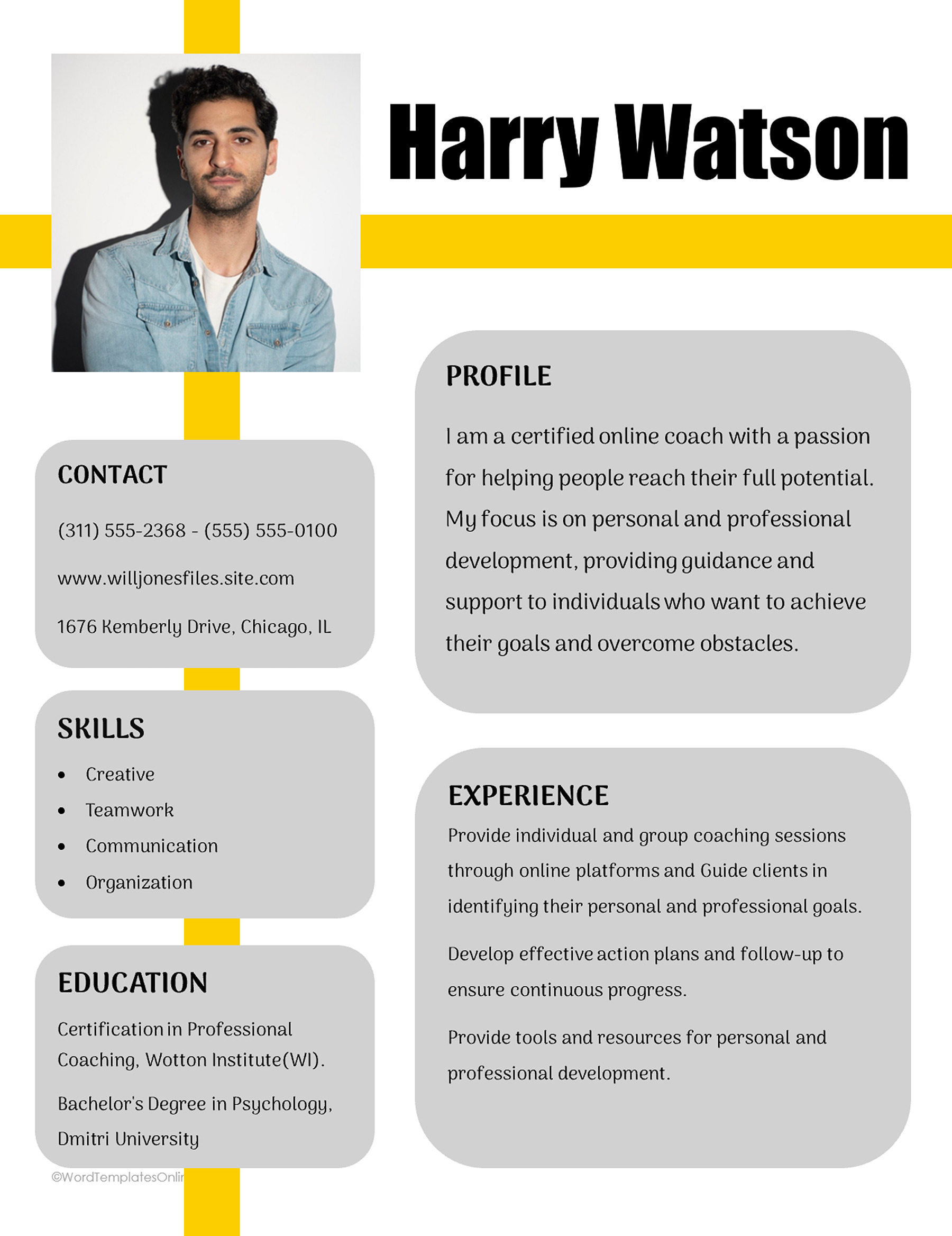
The white-and-yellow design with gray cards gives Profile and Experience larger panels, with smaller contact, skills and education areas alongside them. This is a useful alternative when you want the opening and work history to receive more attention than a list of qualifications. The portrait and yellow line already add visual emphasis; the text can stay straightforward.
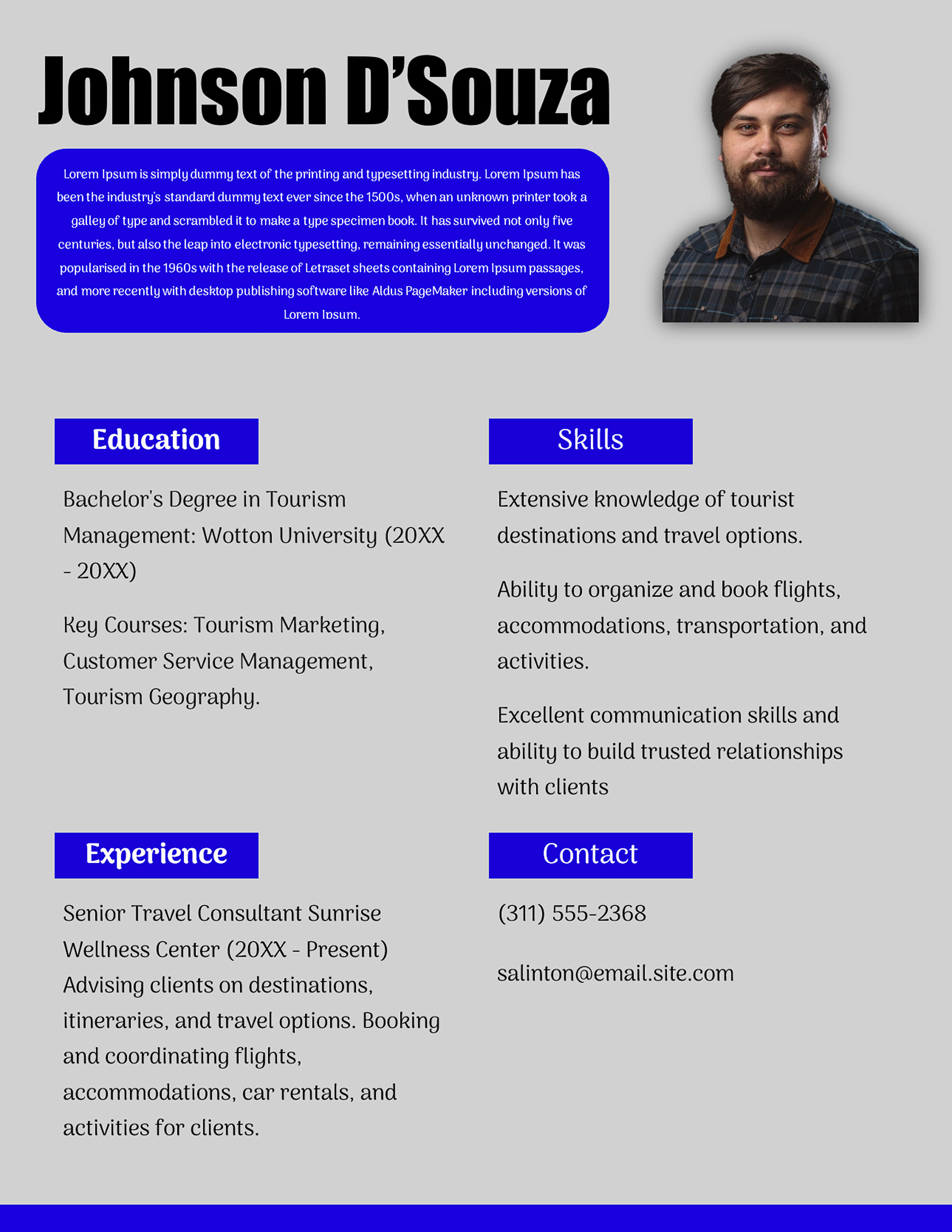
The blue-accented design with a rounded introduction box puts the opening beside the portrait and spreads education, skills, experience and contact into four sections below. That arrangement makes the initial paragraph especially noticeable. Try your actual wording there before choosing the design: a compact sample box won’t necessarily accommodate a long introduction at a comfortable size.
With any of these layouts, the photograph should represent you accurately and suit the context. Use an image you have permission to use. Check the crop after replacement; a frame that fits the sample portrait may cut into a different photo.
Read it once as the person receiving it
Imagine someone opens the sheet without knowing you. Can they identify your role, find the supporting detail they need and see how to contact you? A profile can contain plenty of information while still making those simple questions difficult to answer.
For the invented Alex example, the introduction identifies event coordination. An experience entry can supply a specific responsibility, and the contact area can point to an appropriate professional email or portfolio. There is no need to repeat the same sentence in each section. Each part should add something.
Check the whole page for leftover sample details, including small labels and text beneath the photo. Review names, dates and links carefully. Use contact information appropriate to the audience; a full home address isn’t automatically necessary because the sample includes one. If you keep a website or email link, test the destination as well as the visible text.
Before sending a designed sheet as a speaker bio, check what the organizer requested. A short text-only paragraph may be what they need for their program or website. Follow that request instead of assuming the page design will fit their process. If you’re working on a longer narrative biography, WTO’s personal biography examples and templates cover that separate writing task.
Save a version you can update
Work from a copy and keep the blank template available. A DOTX file is a Word template; Microsoft’s template guidance explains creating a document from one. Save your completed profile with a filename that identifies the person and, where helpful, the audience or version.
After editing in your chosen application, check the page count and layout in print preview or the exported file. Longer names, new photos and expanded experience entries can change the fit. The supplied Letter layout doesn’t guarantee that every edited version will stay on one page.
Read the smallest text at the intended viewing size before sharing. If it takes effort to make out, shorten the less useful material or adjust your own layout. Keep the version easy to revise when your role, work or contact details change, so the next introduction starts from accurate information.
About This Article