“Babysitting in [area], available [actual days and times]. Contact [name] at [enquiry route].” That one line gives a parent a useful place to start. Your flyer can add relevant experience or more detail, but the offer, availability and contact route still need to be easy to find.
These ten babysitting flyer templates are available in PowerPoint and linked Google Slides versions. Some suit a brief evening or weekend advert; others leave room for a fuller service introduction. The wording examples below use brackets for your own facts. Sample prices, schedules, qualifications and contact details in a design aren’t recommendations or claims you can automatically adopt.
Babysitting Flyer Template 01
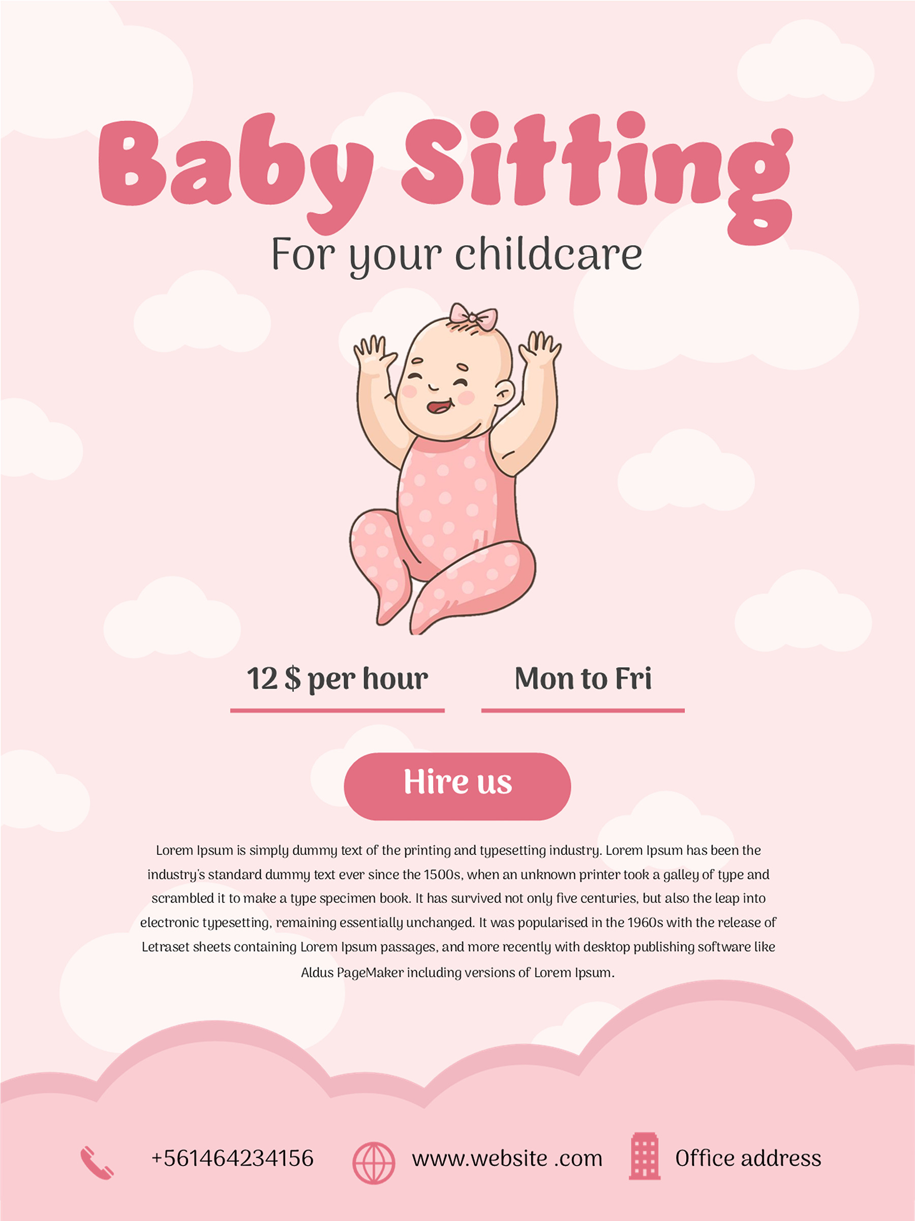
Babysitting Flyer Template 02
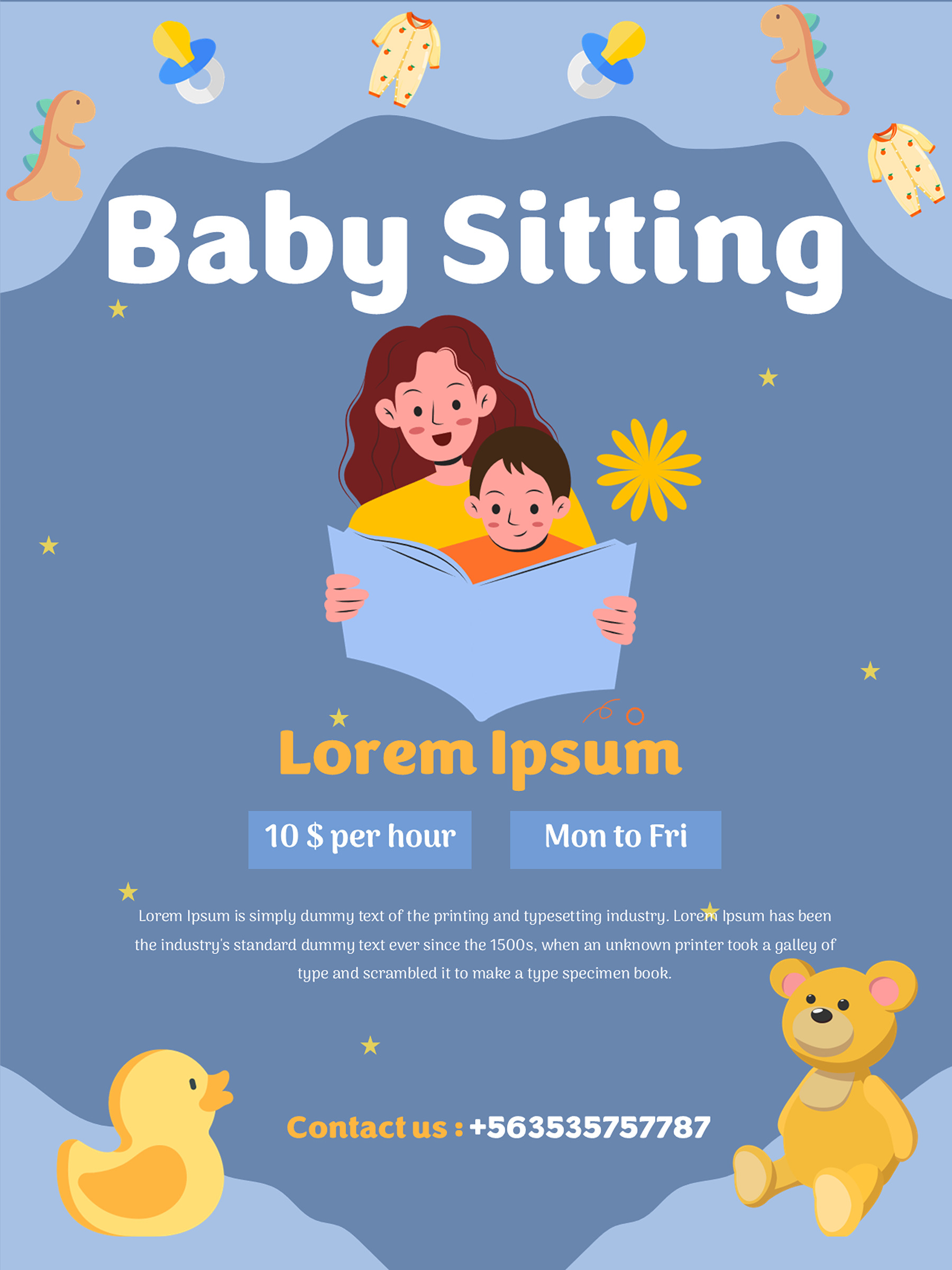
Babysitting Flyer Template 03
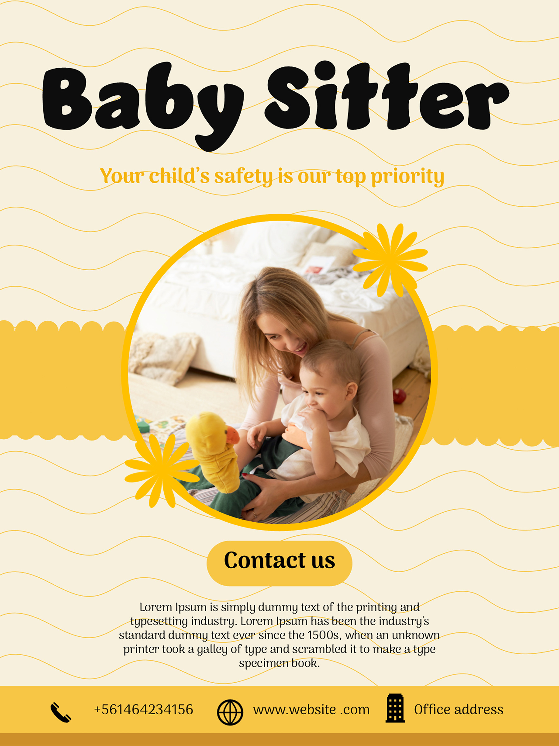
Babysitting Flyer Template 04
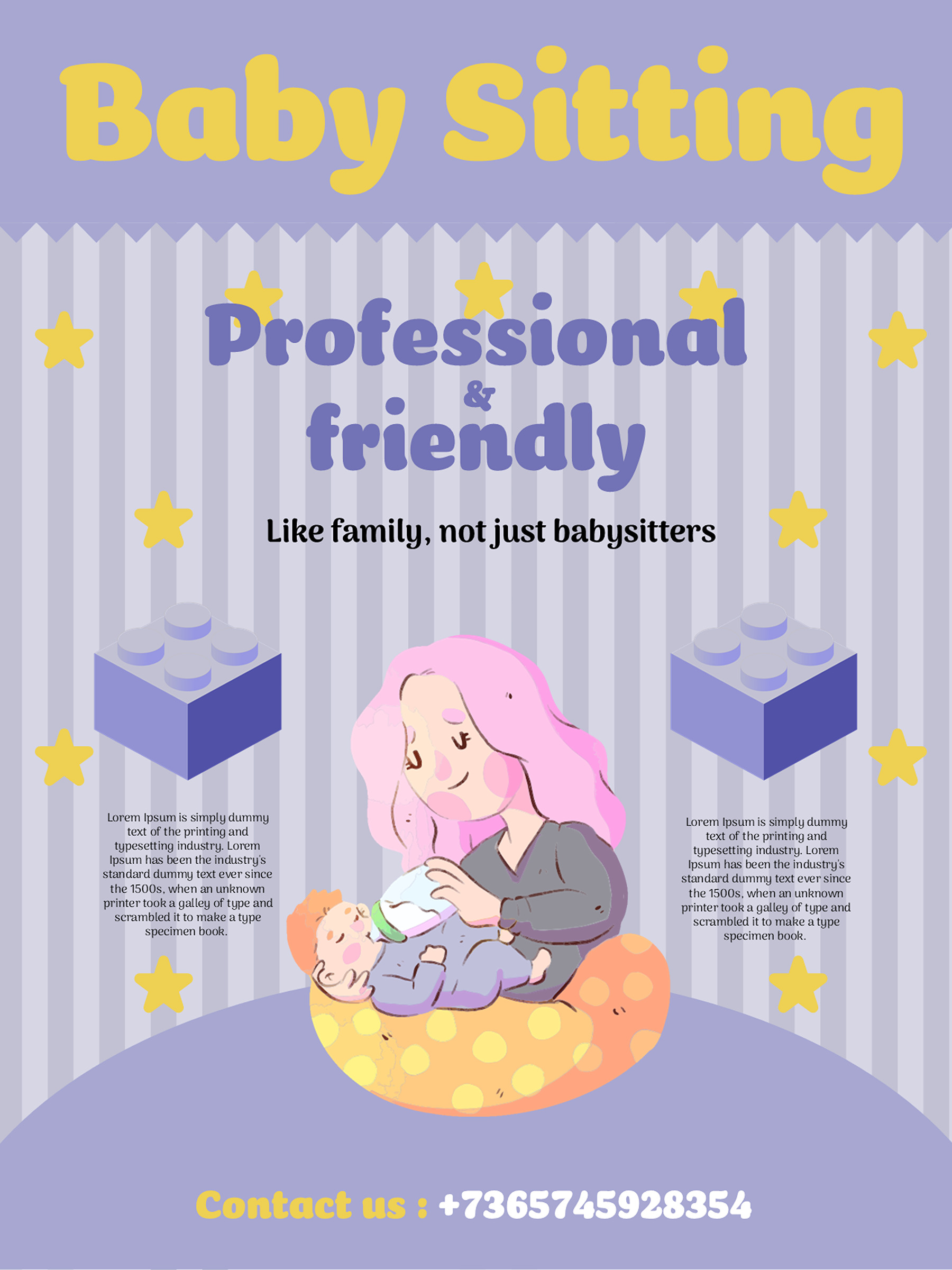
Babysitting Flyer Template 05
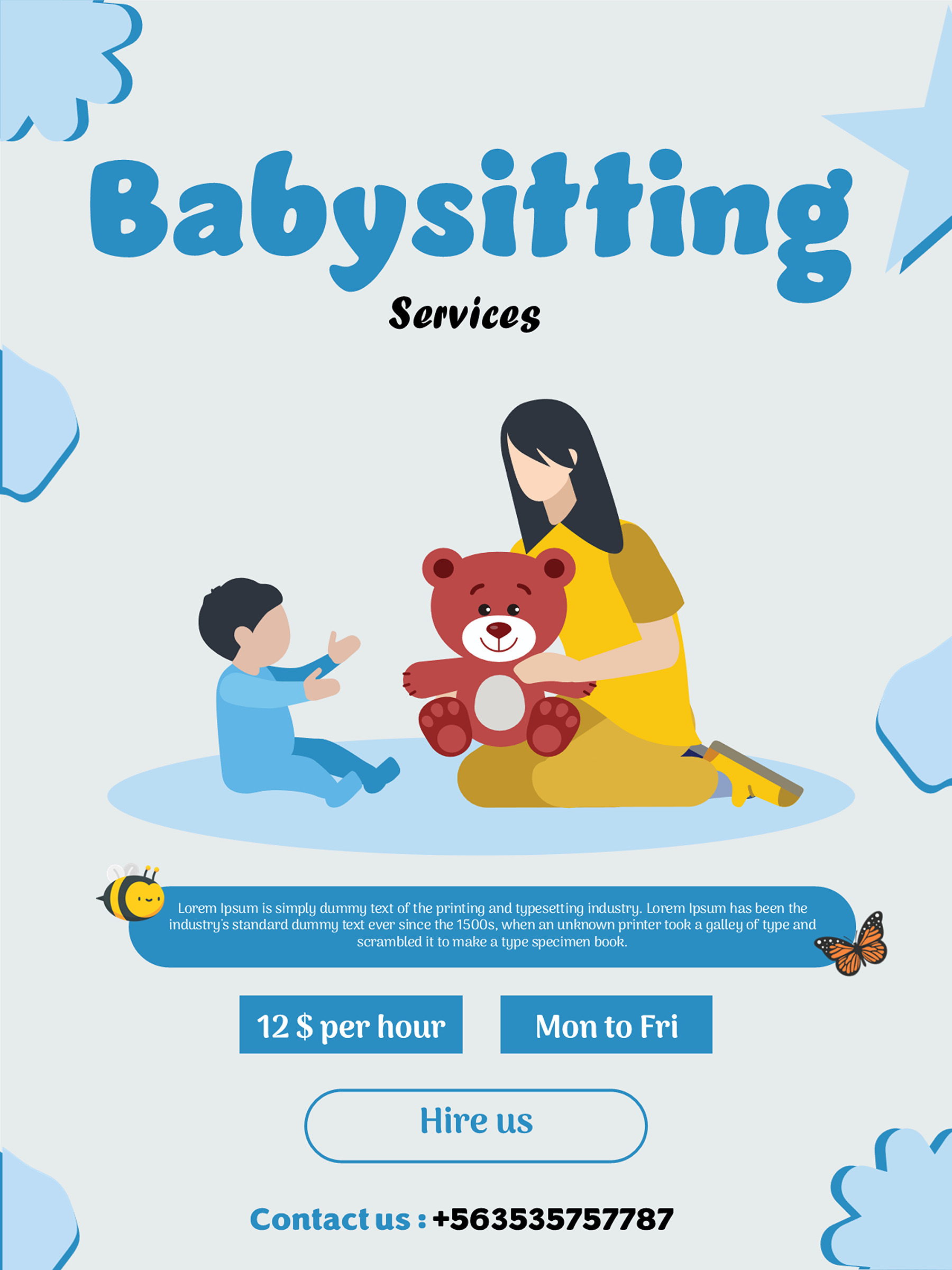
Babysitting Flyer Template 06
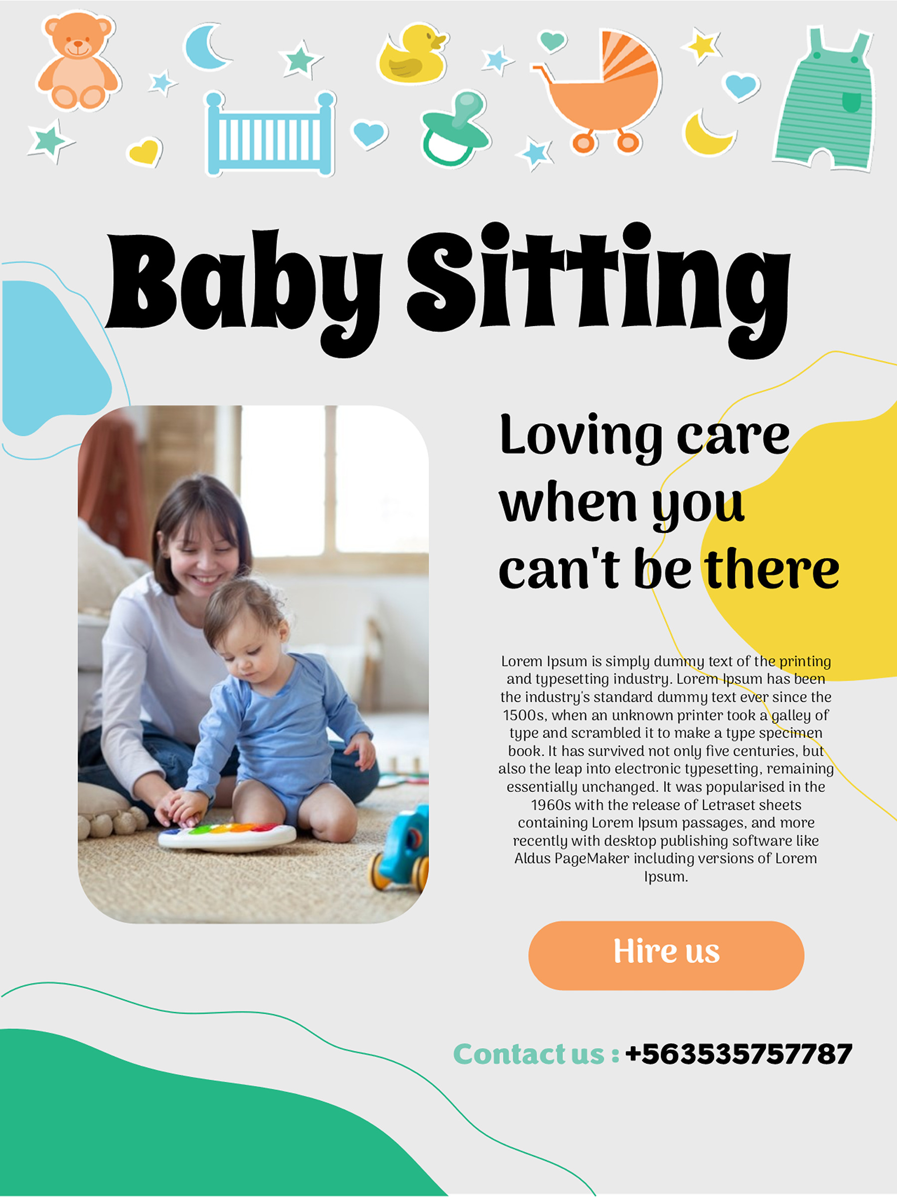
Babysitting Flyer Template 07
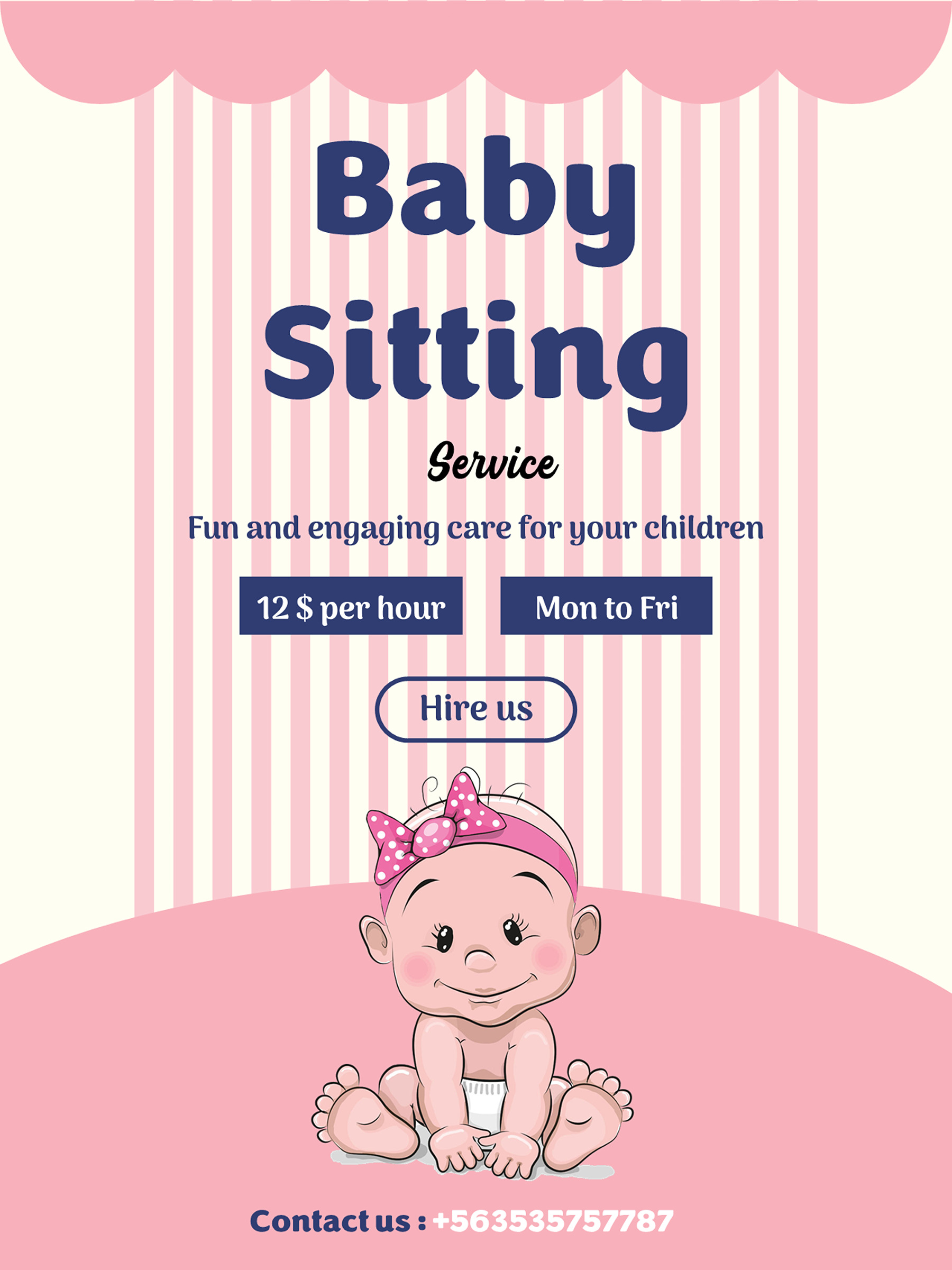
Babysitting Flyer Template 08
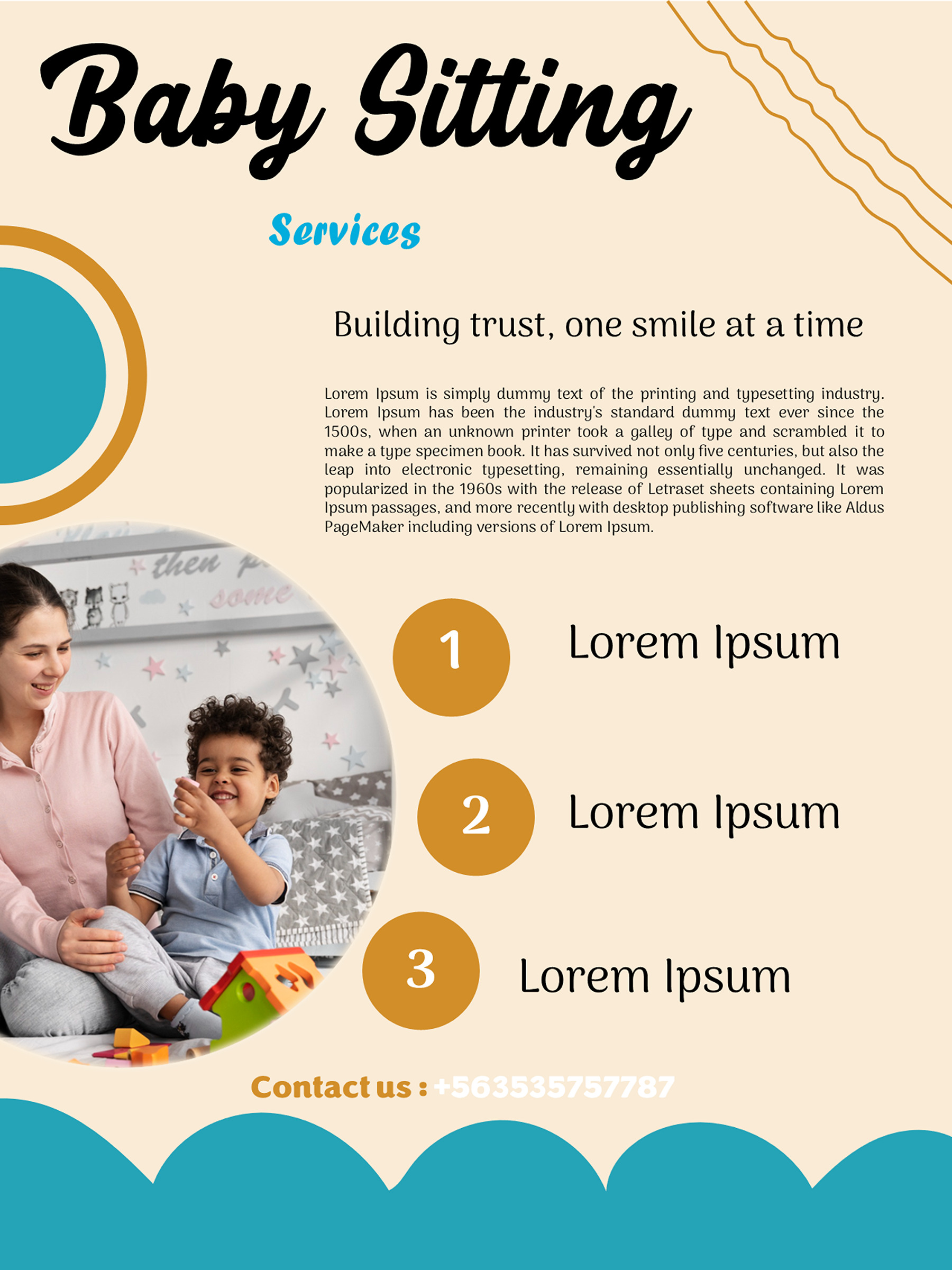
Babysitting Flyer Template 09
Babysitting Flyer Template 10
A short advert when availability is the main message
If you want enquiries about a particular opening in your schedule, you don’t need to begin with a long introduction. Build the message around that availability, then add one relevant fact and a way to respond. For example:
Evening babysitting in [service area]. Available [actual days and hours] for children aged [ages you care for]. [One accurate experience or training detail, if relevant.] Contact [name] at [enquiry route] to discuss availability.
This is a writing pattern, not a ready-made description of your service. Remove a clause if it doesn’t apply. “Evenings” may be enough for the headline, but the body should say which evenings and what hours you can actually offer. A parent looking for a particular time can then decide whether to get in touch.
The pink-stripe baby design has the shortest copy structure in the set. Its headline, tagline, sample price, schedule and phone number leave little need for a body paragraph. It works well with a compact offer, provided you replace each sample detail. Adding several paragraphs would change the very reason to choose it.
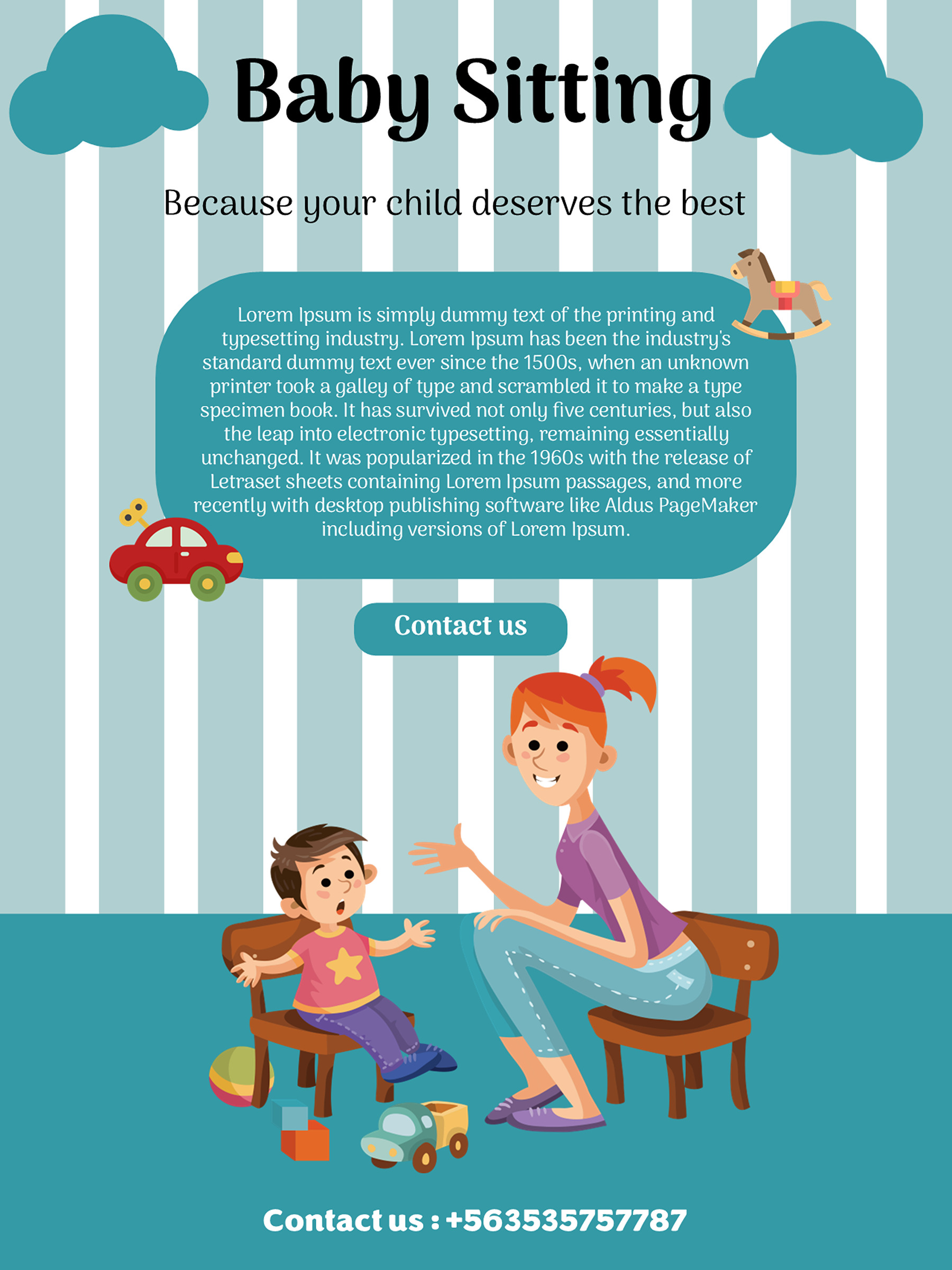
The blue caregiver-reading and light-blue illustration designs give you some body space as well as the prominent price, schedule and phone information. You could use that space for the care ages or a short experience detail from the example, while keeping the availability in its own field. Don’t repeat the whole message in every box. If the headline already says babysitting, the next line can tell the parent something new.
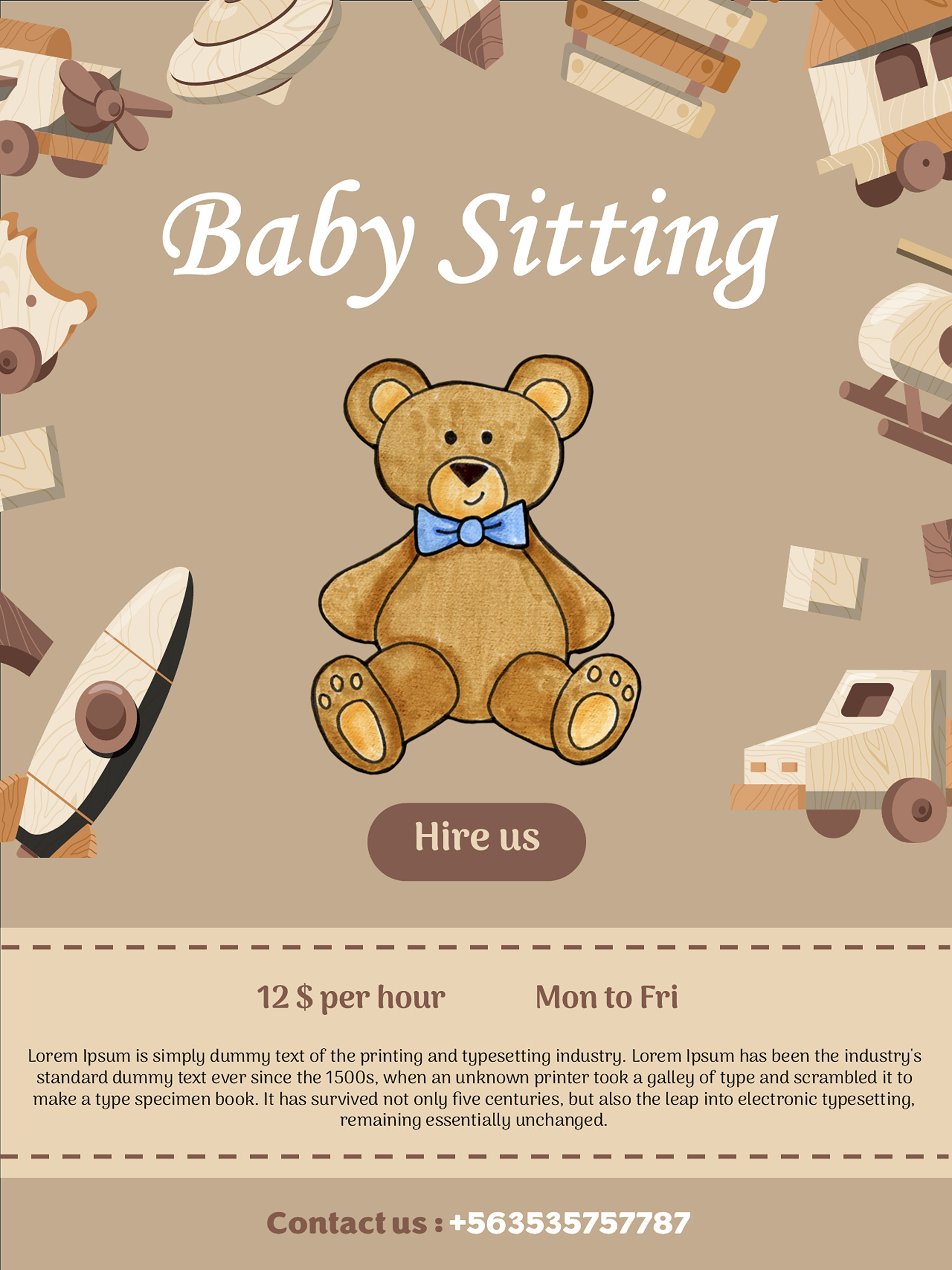
The brown teddy-and-toys flyer is another option for a short offer. Its horizontal dashed bands visually separate parts of the advert, so you can keep the introduction apart from practical details. Those bands aren’t tear-off contact tabs. If people need to take your details away, make the contact information clear in the flyer itself and use a sharing method appropriate to the place where it appears.
Several of these designs show sample rates of $10 or $12 and a Mon–Fri schedule. Replace them with your actual offer, or use appropriate wording in your personal copy if you don’t want to state a rate publicly. Leaving a sample value in place can make an otherwise finished flyer say something you never intended.
A fuller introduction when parents need more context
A longer message earns its space when it explains something a parent needs to know. That might be your actual experience with an age group, the kind of babysitting you offer or the way you want families to enquire. It doesn’t need to become a list of flattering adjectives.
Here is a second, fuller pattern to adapt:
I’m [name], offering [type of babysitting] in [area]. My experience includes [specific, accurate experience relevant to that care]. I’m available [actual days and times] and can discuss [services you genuinely offer]. I have completed [accurately named course or certification, if applicable]. Contact [enquiry route] to talk about your family’s needs and my availability.
Read the brackets before choosing a layout. If you have little relevant information for a clause, leave it out instead of replacing it with “highly experienced” or another claim you can’t explain. A clear, modest introduction gives the reader more to work with than a larger block of vague promises.
The pink-baby flyer gives a fuller introduction room alongside several contact labels. The yellow-photo design also includes phone, website and office-address spaces, but doesn’t supply a dedicated rate or schedule field. If availability is important to your offer, it needs a clear place in your edited text rather than being assumed from the layout.
The baby-icon-and-photo design has a larger body area that can carry useful service detail. The purple-curtain flyer divides its body into two text areas. You might introduce the care you offer on one side and put availability or experience on the other. That separation is helpful when a single paragraph keeps burying the detail you want parents to notice.
On the teal-stripe design, the contact panel gives the response information its own place. Keep the main copy focused on the offer, then use that panel for the route you actually want people to use. A website label is useful only if you have a relevant destination; an office-address label isn’t a reason to publish a home address.
Photo and illustration choices also affect the message. If you replace an image, check the crop with your own picture before settling the text around it. Use an image you are entitled to use, and don’t present a stock child photo as a photograph of children you care for.
The three-point flyer needs three real facts
The cream-and-teal photo design stands apart because it includes three numbered service points. That arrangement invites short, specific statements rather than another introduction paragraph. It can work when you have distinct facts to communicate; it can also expose repetition quickly.
Consider the difference between “Reliable, caring, friendly” repeated across three points and this bracketed set:
- Care for [actual age range].
- Available [actual days and hours].
- Completed [accurately named relevant training], [date or current status where useful].
The second version lets a parent assess an actual offer. It’s still only a pattern: use fewer points in your working copy if you have fewer distinct facts. Don’t invent a service or qualification to make all three spaces look equally full. You could also use a truthful experience detail in place of training when that better describes what you bring.
Be precise about course and certification names. The American Red Cross lists babysitting and child-care training options separately from additional First Aid and CPR/AED certification. Its page also explains that Advanced Child Care training doesn’t meet every requirement for state-licensed child-care providers. Describe what you actually completed; don’t turn a course name into a broader certification or licensing claim.
A short point should still make sense on its own. “Experienced” leaves the parent guessing. “[Accurate experience with a particular age group or setting]” supplies context, provided it is true and appropriate to share. Keep details about individual families or children out of the public wording.
Choose the details to make public
Give parents one clear route for enquiries, even if the design offers several contact fields. Check the phone number, email or website character by character. A call to action such as “Contact [name] to discuss availability” explains what the next conversation is for without promising you can accept every request.
Describe a service area that helps a parent understand whether you work nearby. Save private family information, individual arrangements and unnecessary personal details for an appropriate conversation. The flyer should help someone make an enquiry; it doesn’t need to settle every booking detail in public.
For placement, consider local noticeboards or relevant community groups that permit service adverts. Check each venue’s rules and obtain permission before displaying or posting the flyer. A school, shop or online group may have its own policy, so a convenient location isn’t automatically an available advertising space.
Read the finished wording from a parent’s point of view: can they find the area, relevant availability and enquiry route without decoding the artwork? If a decorative headline takes more attention than those details, shorten the surrounding copy or reconsider its placement in your working file.
Turn the wording into the finished flyer
Make a personal copy of the PowerPoint file or Google Slides presentation before editing. Work through the entire design, including small text, for Lorem ipsum, sample rates, old schedules, phone numbers and taglines that don’t describe your service. A replacement headline doesn’t make the rest of the flyer ready.
The source canvas is about 13⅓ × 17 7/9 inches. Check paper size and scaling if you intend to print on Letter or A4, then inspect the smallest text, image crop and edges on a proof. These downloads don’t include tear-off tabs or a supplied PDF. You can create a PDF from your edited file using PowerPoint’s export options; in Google Slides, inspect the print settings and preview.
Check the result at the size and in the form people will actually see. A parent should be able to understand the offer, decide whether it matches a need and use the contact details without hunting through the page.
About This Article