
Excel dashboards are one of those things that sound super technical… until you come across a very good one. Then all of a sudden, a messy spreadsheet, countless rows of numbers, and confusing reports start making sense. Well, you don’t need to invest hours looking into data because you can get everything important in one clean view: charts, KPIs, trends, and updates all in front of you.
Though making such a format is really difficult, here’s the good news. We have designed Excel dashboard templates that are go-to solutions for businesses, teams, and, honestly, anyone who is tired of staring at boring spreadsheets.
You know, what makes them more reliable? The fact that you don’t need to be an Excel expert to use them. In this guide, we will explore different dashboard templates and how they work perfectly for you. Let’s get started:
Why Everyone Looks for a Good Excel Dashboard
Honestly speaking, the concept of a spreadsheet always seems to be painful and overwhelming. Endless rows and tiny numbers of random formulas, it’s easy to get lost. That’s why people need good dashboards that literally ease their lives.
Usually, they take all the messy data and turn it into something you can actually understand by just looking. With them, you need to scroll forever and try to figure out what’s important. These dashboards keep everything in one clean view so that every number makes sense instantly.
But here’s a question: while there are fancy tools out there, why do businesses still rely heavily on Excel? Well, because they’re flexible, easy to use, and more accessible than expensive software. Additionally, what makes them great for everyone is that not every company wants to spend thousands on advanced tools, and that’s when Excel comes to save the day.
How Businesses Actually Use These Templates in Real Life
Excel dashboards templates aren’t just for a professional look; they literally speed up your business and keep everything organized. Teams can use them for weekly reporting so managers can instantly check your progress without exploring multiple files.
The sales team can use them to achieve targets and performances, whereas the operations team checks inventory, workloads, and day-to-day activities in real time.
Apart from this, they’re super useful in presenting information to clients, investors, or stakeholders because they keep things visually interactive and informative. The superb advantage, similarly, is that Excel dashboards really cut down the need for manual entry and repetitive reporting, which saves you a lot more time than you realize.
Features That Make Excel Dashboard Templates Worth Using
Here are some exciting features that add life to boring dashboards and should be included in reliable templates:
1. Interactive charts and graphs
Nobody is interested in a plain spreadsheet and wants to look at it all day. That’s why interactive charts and graphs are added in templates that make data easier to follow and way less overwhelming. They help you spot trends, compare numbers, and understand what’s happening without exploring through countless rows.
2. Automated calculations
One of the biggest hacks these templates bring is automation. Good templates manage calculation automatically, so you don’t delve into manually updating the formula every time new data comes in. They believe in “less work, fewer mistakes.”
3. Dynamic filters and dropdowns
Modern templates have these features that make them way more flexible. Now, you don’t need to create separate reports for everything; you can filter data quickly using dropdowns and filters to see exactly what you need.
4. Color-coded KPI tracking
Color coding really sets the vibe and makes templates interesting. They are also pretty helpful in reading data. You can use different colors, such as Green, Yellow, and Red, to help the team see what’s going well and what needs attention without overanalyzing every piece of information.
5. Editable sections for customer data
Not every business needs every section to track the same information, which is why editable sections are designed. You can personalize the dashboard based on your own goals rather than forcing the data into a rigid layout. Interestingly, there are also different templates for different needs, which makes the job really easy. Let’s explore in the section below.
Different Types of Excel Dashboard Templates for Different Business Requirements
In case you’re wondering why there are different types of templates? Well, every business has specific needs, so instead of using the same templates, we’ve come up with different ones that can help you figure out which to use and when:
Supply chain dashboard template
As the name clearly indicates, this template is made for businesses that need to track their supply chain performance in one clear view. They really take away the hassle of going through several reports, and keep important operational data in charts, percentages, and performance indicators that anyone can understand by just looking at them.
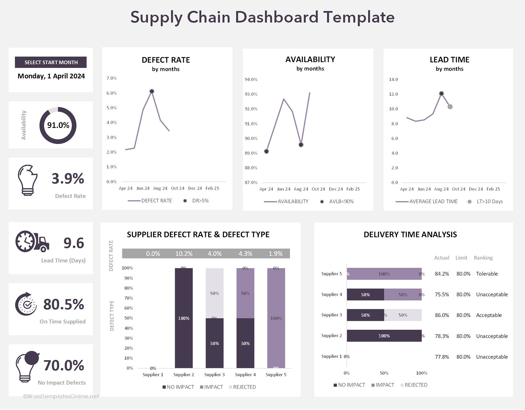
As you can see, at the top, the dashboard gives you information about key supply chain metrics like defect rate, product availability, and lead time over different months in a graphical representation. Through this, you can get an idea where your business is going and what the trends, delays, or quality issues are.
Similarly, on the left side, you can see quick KPI-style summary cards that focus on numbers like availability percentage, defect rate, lead time in days, on-time supply rate, and non-impact defects. They might seem like small details, but they are very important to check overall performance.
In the lower section, you can observe a deeper dive into supplier analysis. One chart compares different suppliers on the basis of defect type and defect impact, while the delivery analysis chart checks the supplier performance against expected delivery limits. All of these things help you find which suppliers are reliable and which ones are causing problems or delays.
Note: The “data tab” and “calculation tab” are given in the editable .xlx file or Google Sheet version, which is where you can insert or change your data and check the formulas and logic behind the scenes.
Sales dashboard template
Think of this template as your team’s ultimate scoreboard. It’s designed for anybody who wants to see where the sales are heading without getting bogged down in a million different files.
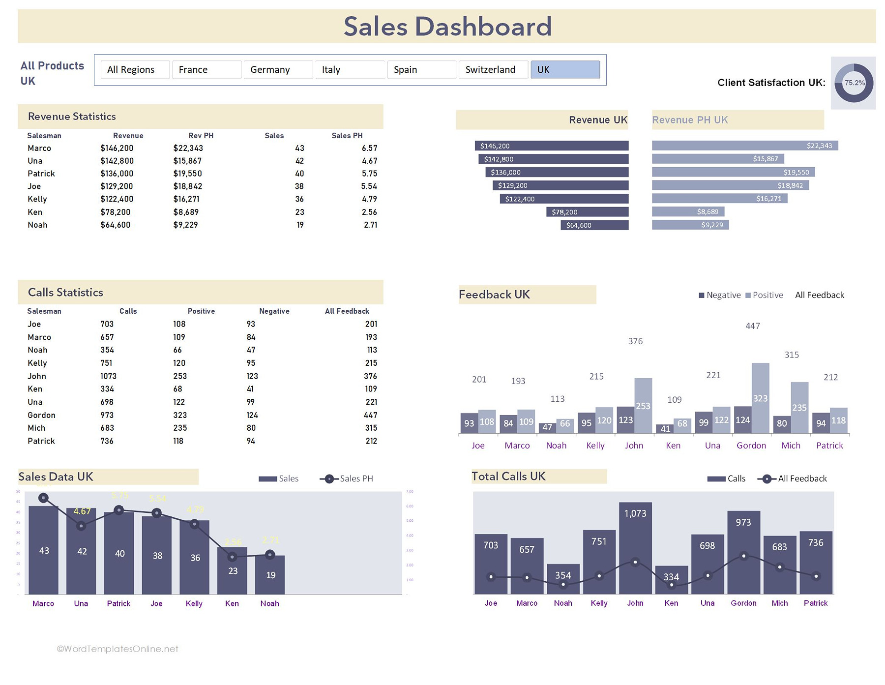
At the top, you can easily filter the data by country, so you can get an idea of which regions are doing well without any clutter. The revenue statistics of the dashboards map out the incoming and the total sales for your top performers. It’s shown in a bar chat so you can spot who’s crushing it at a glance.
The call statistics are basically the call grind that tracks the sheer volume of work, showing how many calls each person made, and most importantly, the feedback they got (positive or negative).
The best thing about this template is that it gives a handy gauge for Client Satisfaction that gives you a quick pulse on how happy your customers are. At the end, you can see the Sales Data and Total calls chart, which uses bars and lines to show you the relationship between the effort made (calls) and the results coming out (sales).
Project management dashboard
The template serves as your business game changer, giving you a 360-degree view of the ins and outs of your current project and where your team stands without breaking a sweat.
Project Management Dashboard Template
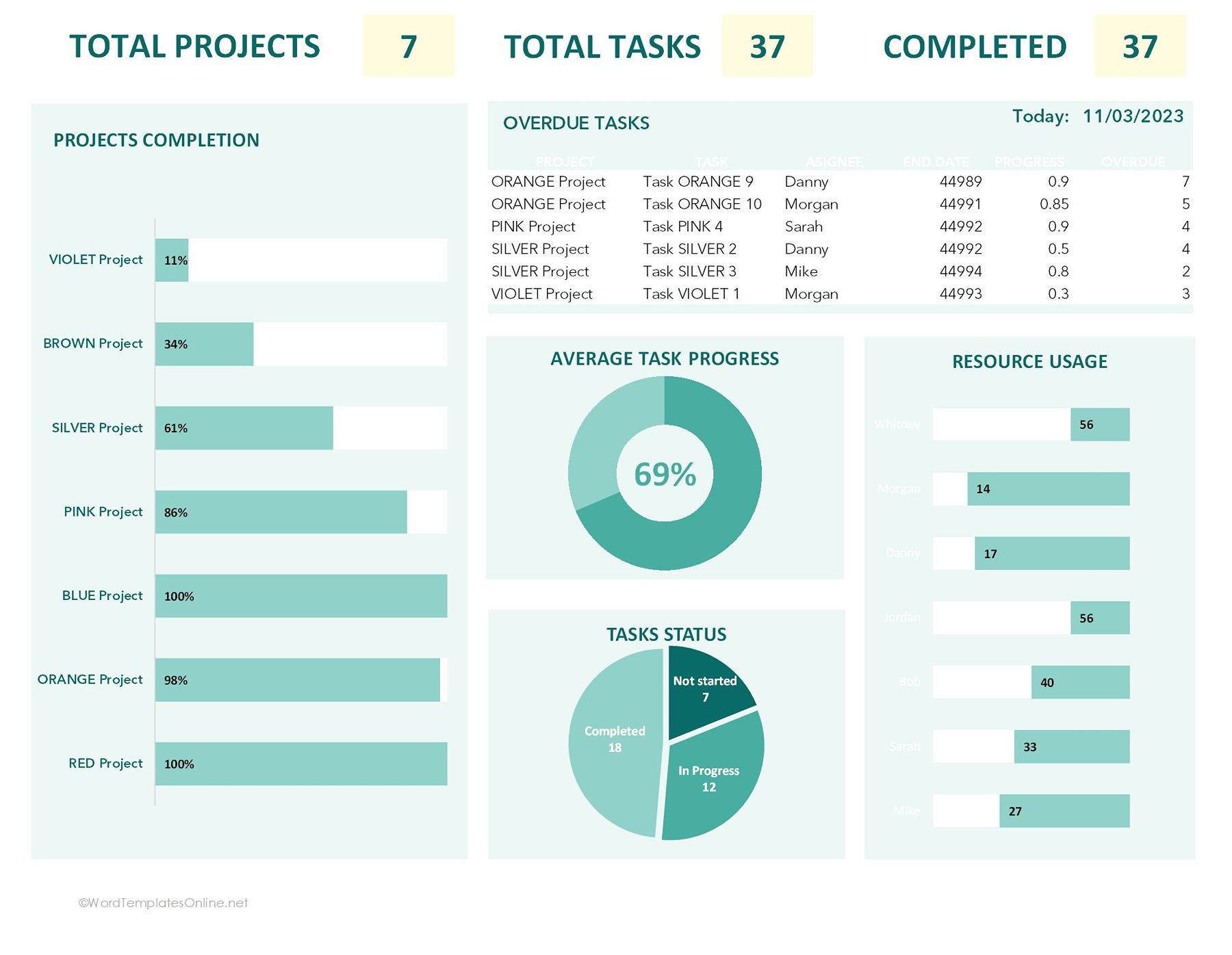
Right at the top, you get the must-have stats such as total projects, total tasks, and what’s already crossed off the list. It’s an instant reality check to see if you’re actually making a dent in your to-do list.
On the left, you can see a clean bar chart that shows the completion percentage for every project. This really makes it obvious which ones are about to finish and which ones might need an extra love.
The overdue tasks section is basically an “oh-ho list”. Well, it’s better for you to consider this an early warning system as it calls out which tasks are running behind, who’s supposed to be doing them, and how many days they’re over.
Talking about the pie charts, which are right in the middle, gives you a quick glance at your average task progress and task status. Additionally, over on the right, there’s a resource usage chart that shows how much everyone has on their plate. It’s perfect for spotting who is carrying more burden while those who have more breathing space.
Marketing dashboard template
Well, if you’re thinking this template is all about figures, you’re right. A marketing dashboard acts as your all-in-one mission control for digital growth. It is perfect for seeing how your outreach is landing without needing to get a report from the team or exploring different tabs.
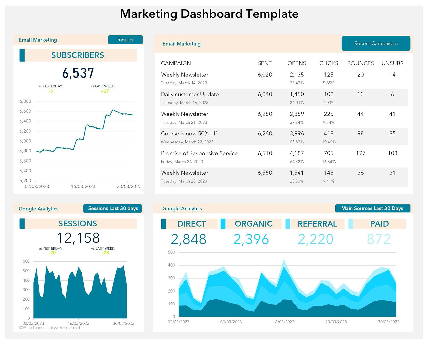
As far as the template working is concerned, the top left shows your total subscriber count and a trend line, so you can quickly see if your audience is growing or stalling. Right next to that, you’ve got a “Recent Campaigns” list that gives you a complete overview of your email marketing. It shows which emails are making a high impact and clicks, and which ones are bouncing or causing unsubscriptions.
At the bottom, you will get a traffic pulse that gives you a 30-day view of how many people are coming to your site, making it really easy to spot daily or weekly spikes. Finally, the “main sources” chart breaks down into where your traffic is actually coming from, either from paid ads, organic, or referrals, so you know where to double down or cut your budget.
In short, this template is a simple, no-fuss way to stay on top and make sure your marketing efforts are actually paying off.
KPI dashboard template
This template is basically a shortcut for making business numbers into something people can actually understand in a minute. Moreover, you can think of it as a high-level check for your business, keeping things clear so you can see how you’re going against your big goals on one screen.
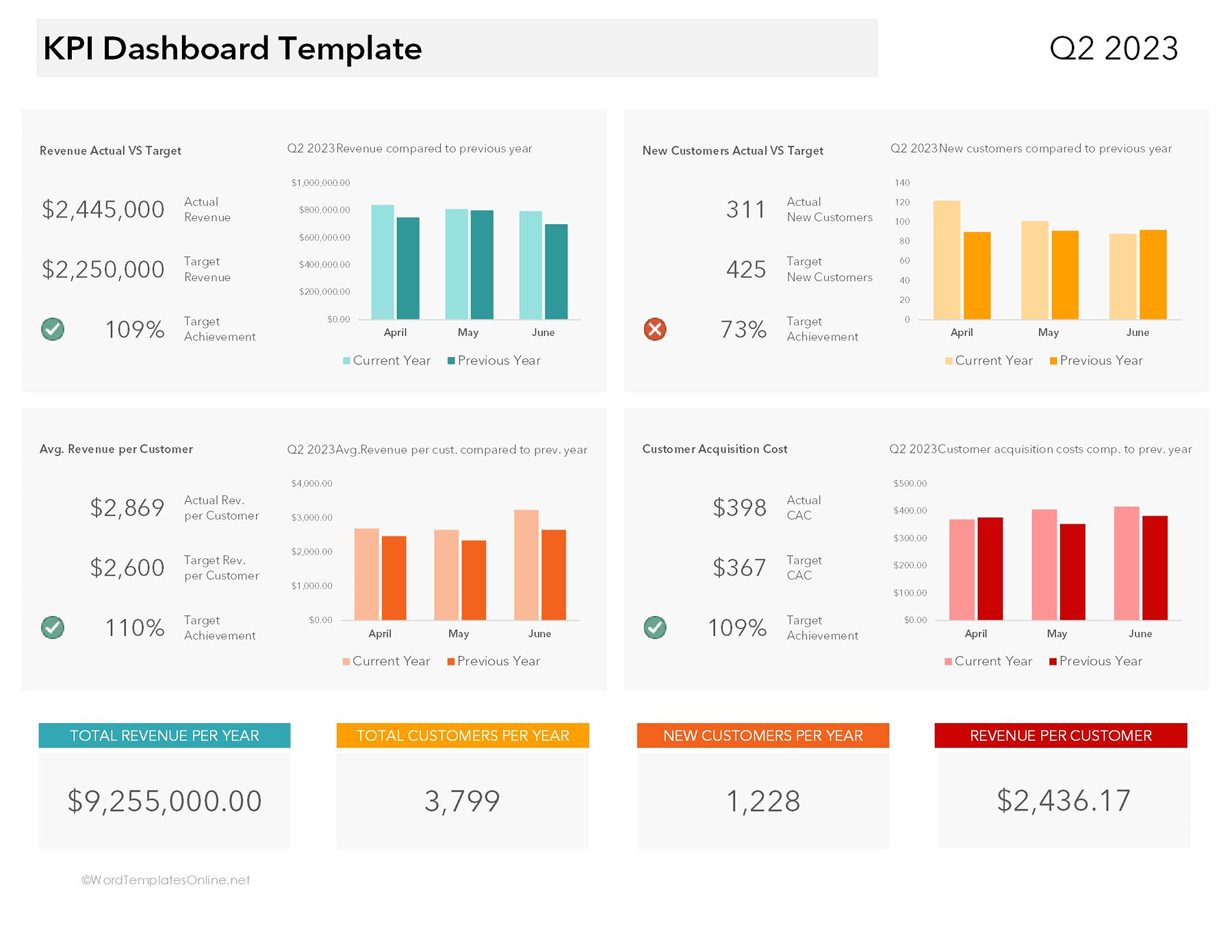
The template initially shows you the important KPIs (Key Performance Indicators), which are usually numbers that businesses track to check whether they’re going well or not. For example, you can see that the current dashboard is tracking things like revenue, new customers, customer acquisition, and revenue per customer.
Each section of the template is designed to compare actual performance against targets so that everyone can know what’s reaching the goal and what’s not.
Moreover, you’ll also observe the small charts that aren’t just for design but to show you the trends over time. These charts are super useful in meeting sessions or reporting because everyone can understand what the matter is by just looking at them.
Additionally, at the bottom, you can get summary cards that give you a quick glimpse of yearly totals for revenue, customers, and other important metrics.
Overall, this template is worth using for any business, sales teams, marketing department, or managers who need fast performance tracking without using any complicated software.
Inventory dashboard template
The inventory dashboard is something that helps you keep an eye on stock without getting buried in spreadsheets all day. Everything is pulled into one visual dashboard so you can rigorously see what’s in stock, what’s selling, and what might need a reorder.
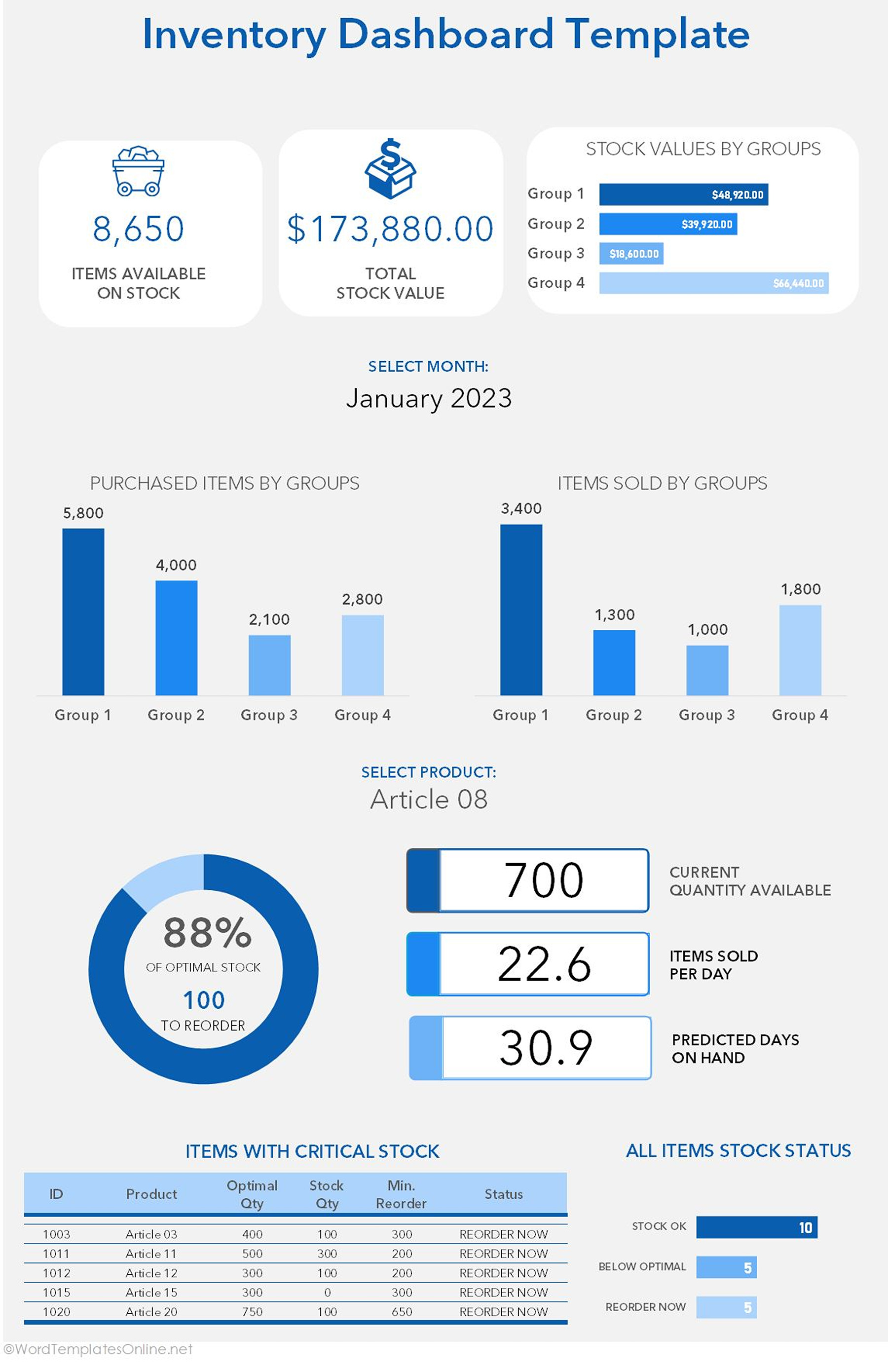
Most importantly, this template is designed in a way that gives you a quick snapshot of the big numbers, such as how many items are in stock and what the total value of the inventory is. Well, all this takes away the struggle of calculating everything manually, and you get a quick overview of the stock as soon as you open the file.
The charts in the middle give an in-depth review of inventory activities. One section shows purchased items by group, while the other tracks sold items by group. In this way, it is easier to compare which categories are moving faster and which ones are sitting in the storage longer than expected.
Additionally, the dashboard also has a product-specific section that emphasizes one product/item at a time. It shows the current quantity available, how many units are sold per day, and even predicts how many days you can run on the available stock. Well, that’s one of the most useful parts because it helps avoid last-minute storage chaos.
The bottom of the template is where you get the products with critical stock levels and shows whether the item is best, below the basic levels, or needs immediate reordering. Overall, the template is a lifesaver for stores, warehouses, and ecommerce stores that need an efficient tool to stay updated with their inventory.
Health & safety dashboard
This dashboard is what you can really say is your team’s safety compass. It’s made for anyone who wants a simple way to keep their workplace safe without the headache of exploring messy incident logs or complicated reports.
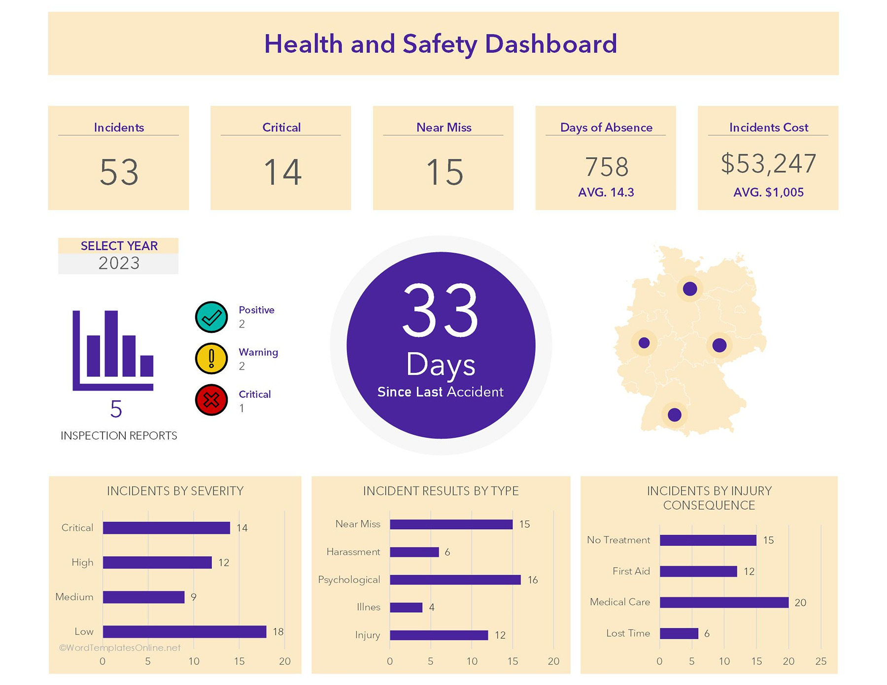
Let’s break down how this works:
The top row is what we know as heavy hitters because it gives you the important statistics right away, such as the total number of incidents to the particular count of critical cases, and near misses. It even breaks down the ripple effect on the business, meaning it shows you exactly how many days of work were missed and the total cost of these incidents.
The big purple circle literally holds the entire dashboard. It tracks how many days it’s been since the last accident, acting as a constant reminder to stay sharp and keep the streak going.
The inspection report, placed on the left, is here to give you a quick pulse on safety checks. It uses the color-coded system to show if your latest review was positive, a warning, or a red flag that needs fixing ASAP.
The map on the right is a great visual for knowing which locations fall under the safety targets and which ones might be experiencing some kind of trouble. The best part is the bottom charts that give you more explanation. You can see how many incidents were actually “critical” vs “low” severity, and what kind of medical care was required right after.
Financial dashboard template
Finance is the most important part of the business, and any missed detail can cause a lot more pain than you think. That’s why you need a financial dashboard that lets you know explicitly where your money is coming from and where it is going.
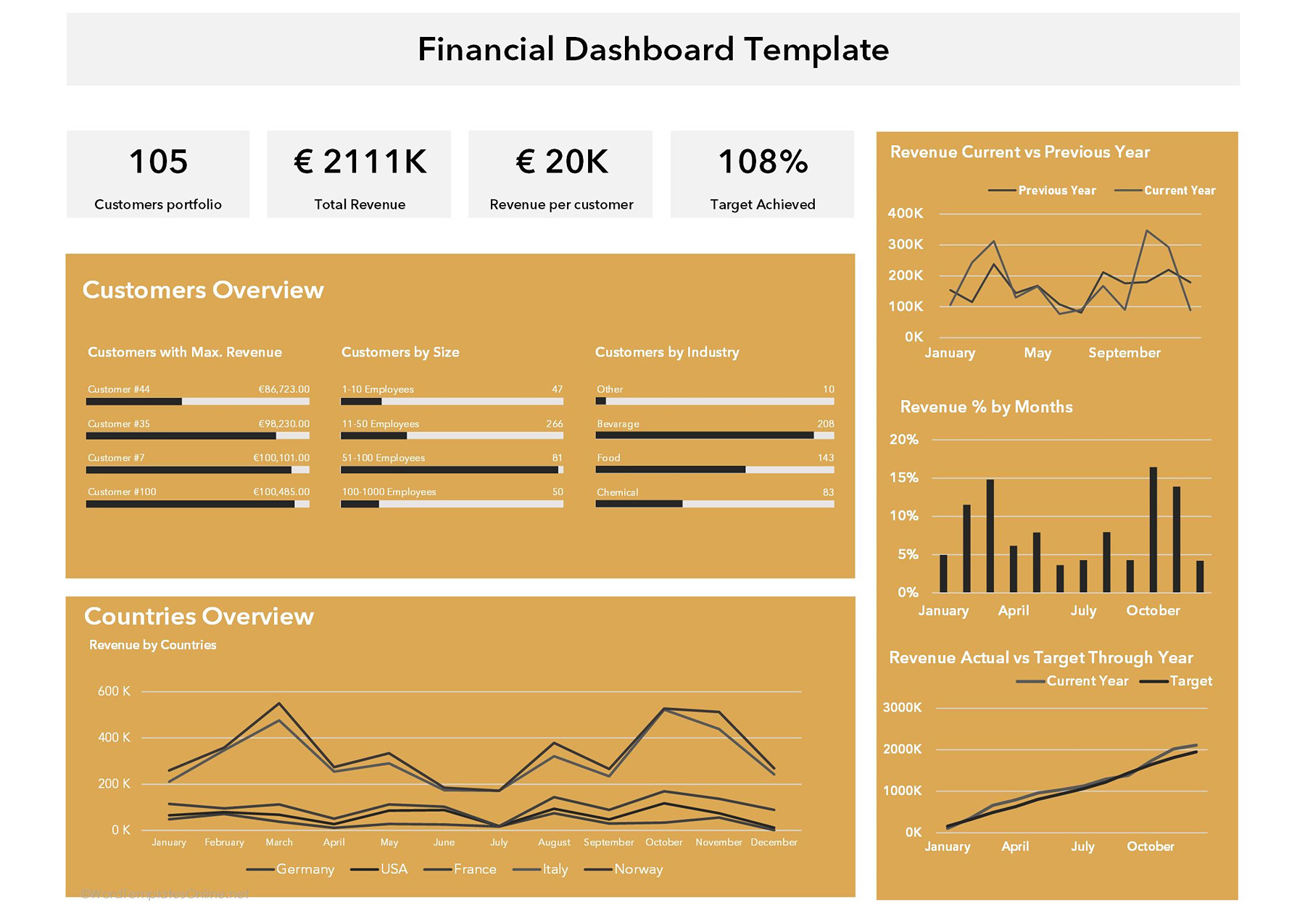
As far as it is concerned, right at the top, you get a quick overview of key statistics like total customer portfolio, the mammoth revenue, and the fact that you’ve crushed your % target achievement.
Next, it opens up into a customer overview section where you can see exactly who your VIPs are and what kind of business they give you. Let’s say it focuses on revenue by customer size and industry, so you know where your bread is buttered.
Moreover, in the countries overview, you get a clear view of how different regions are performing. It’s perfect for seeing which markets are on the boom while which ones are declining.
The right side of the dashboard gives a revenue current vs previous year line chart that helps you compare your current spending (hustle) against last year’s results. Through this, you can easily find seasonal spikes to help you plan ahead.
Similarly, the final chart placed at the bottom right keeps you honest by showing your actual revenue vs your target throughout the year. It’s the best way to make sure you’re staying on track.
The Difference Between a Perfect Dashboard and a Confusing One
Not all Excel Dashboard templates are worth using. Here’s how to find out which one can really steal the show:
- Clean Layouts Always Beat Fancy Designs: Probably because the simple ones are easy to look at and understandable. A dashboard doesn’t need to be overly flashy. Too many design elements, colors, and visuals can make it confusing rather than being effective.
- Crowding It With Too Many Charts: While it looks tempting to add charts, more visuals don’t always mean better insights. When dashboards are overloaded with graphs, people don’t have enough information. So it’s better to keep things clean and add only meaningful charts.
- Highlighting Key Metrics Matters More Than Decoration: The real purpose of a dashboard is to help people notice important numbers fast. KPIs, trends, and performance indicators need to stand out immediately. The fancy elements are fine, but they should not distract from the real data.
Small Tweaks That Make Your Dashboard Look More Professional
If you really want your dashboard to stand out, you just need to make these small changes:
- Add Company Branding Without Making It Cluttered: The best thing you can do is to add your company logo or brand colors. This makes your dashboard look professional and personalized. Just make sure you don’t go over the top.
- Use Colors to Guide Attention: Only use colors when they help people spot information. For example, green can show good performance, while red can indicate problems or low KPIs.
- Keep Fonts and Formatting Consistent: Don’t go for any random font, size, or style, as it can make your dashboard vibe messy. Try to keep the format consistent so that everything looks organized and easy to read.
- Organize Data So People Instantly Understand It: More importantly, if you claim that your dashboard is professional, then it should be more intuitive. Show important metrics first, then introduce charts in logical flow, and make sure the related info stays grouped.
Final Thoughts
Most people don’t realize how much time they waste just trying to make sense of the messy spreadsheet until they start using a proper dashboard template. The no-nonsense templates make reports easy to read, let important numbers stand out, and track performance, which doesn’t feel like a chore anymore. And honestly, that’s the real value of a good Excel dashboard template. Moreover, you don’t need the most advanced system in the world to stay organized. A clean, well-designed dashboard in Excel is more than enough to monitor progress and keep teams on the same page. Your duty is to get a reliable template that fits your workflow. That’s all.
Frequently Asked Questions
Are dashboard templates reusable for multiple projects?
Yes, perfectly. Most templates are designed so you can use them several times. You can simply remove the old data with the new one and use the same dashboard for different projects.
Do Excel dashboards update automatically?
Well, many dashboard templates do, particularly if they already include formulas, linked charts, and automated calculations. Once you update the raw data, the visuals on the dashboard refresh automatically, saving you a lot of manual work.
Can I customize the charts and KPIs?
Of course. When you download our templates, you get editable versions that let you change charts, KPIs, and metrics based on your needs. Usually, you need to update the Data tab with your information, while the Calculation tab handles the formulas and backend logic that power the charts and visuals automatically.
About This Article