A leaflet gives you a limited amount of space to explain something. You might want to advertise a lunch offer, introduce your business, or invite people to an event. The difficult part is often deciding what to include and where it should go. You don’t want someone to pick up your leaflet and still wonder what you’re offering or how to get in touch.
Start with three questions: What should the reader notice first? What do they need to know? What should they do next? Those answers will help you decide how to use the panels without filling every available space with text.
The ten leaflet templates below cover businesses, restaurants, events, products, schools, and visitor information. Each design is available as an editable Microsoft PowerPoint (PPTX) file and a linked Google Slides template. The layouts contain three panels on one designed side. The second slide holds credits, not artwork for the reverse side of a folded leaflet.
Leaflet Templates 01
Leaflet Templates 02
Leaflet Templates 03
Leaflet Templates 04
Leaflet Templates 05
Leaflet Templates 06
Leaflet Templates 07
Leaflet Templates 08
Leaflet Templates 09
Leaflet Templates 10
Read the panels as someone seeing the leaflet for the first time
Imagine someone picking up your leaflet without knowing anything about your business. They shouldn’t have to read every line to understand what you’re offering. Give the main message a noticeable place, then use the remaining space for details that help them make a decision.
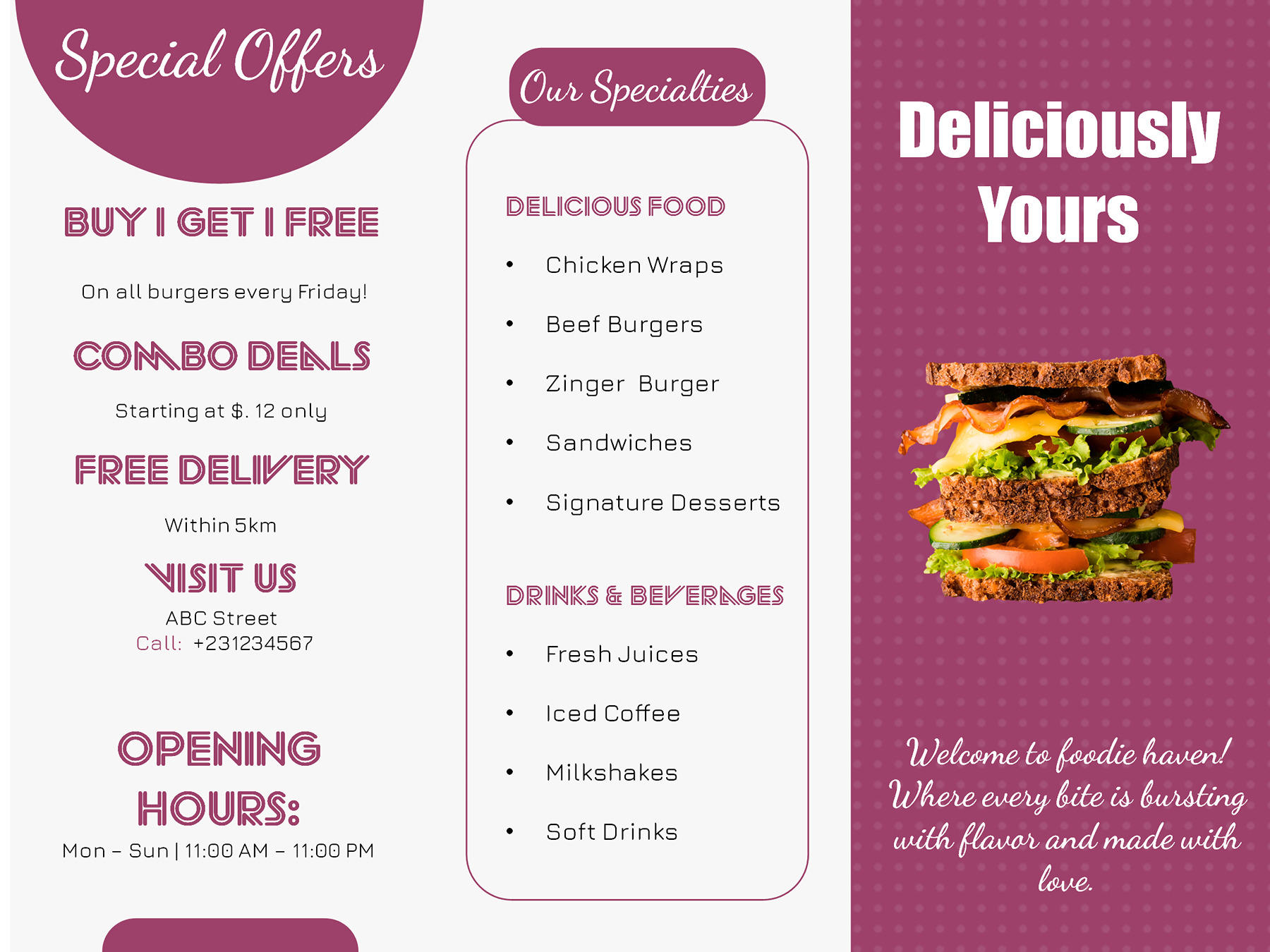
The burgundy restaurant leaflet is a useful example. It includes menu items, prices, offers, opening hours, and contact information. All of these can matter, but they don’t need equal attention.
Suppose a restaurant wants to advertise a weekday lunch special. Here’s an invented example of how the message could work across three panels:
- The offer: Weekday lunch special — [meal or combination] for [actual price].
- The details: What’s included, available choices, and any conditions customers should know.
- The next step: Order through [actual contact method] during [current opening hours].
The offer gets someone’s attention. The menu details help them decide whether they want it. The ordering information tells them what to do next.
Now imagine that same leaflet with a long menu, several competing headlines, and a phone number hidden among the descriptions. The information might all be there, but finding the lunch offer would take more effort.
You can avoid that by deciding which information deserves the most space. If the leaflet is advertising one lunch special, there’s little reason to include the restaurant’s entire menu. A few relevant choices may be enough. Keep prices and availability accurate rather than retaining whatever appears in the sample.
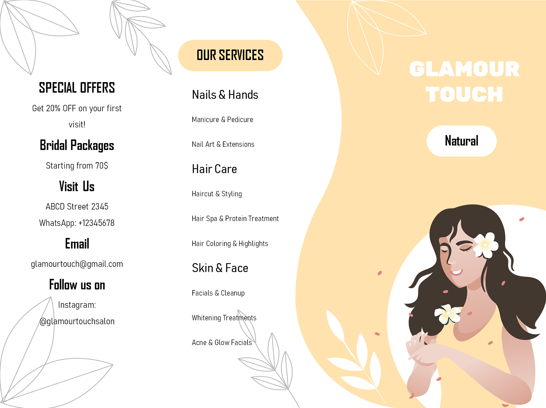
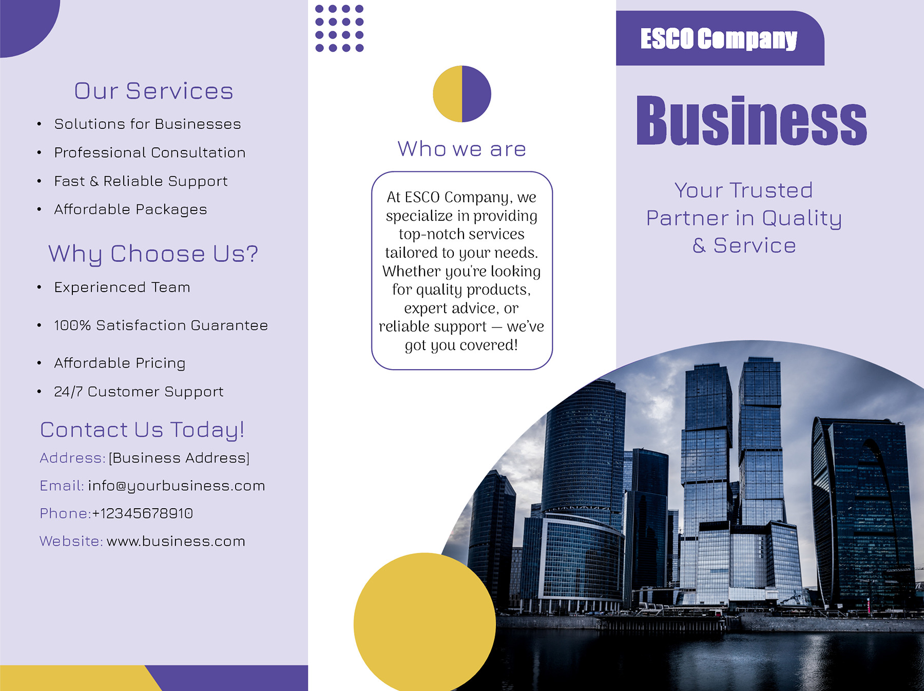
The principle also works for the beauty salon and corporate services designs, although their readers need different information.
A salon customer may already know which treatment they’re looking for. The service categories and offers can help them find it, while the contact details provide a booking route. A potential business customer may need more context before making an enquiry. The corporate layout leaves room to explain what the company does, which services it provides, and how to contact it.
Neither leaflet needs a long introduction simply because the design has space for one. Give people enough information to understand the offer, then let the practical details do their job.
These are ways to organize the message, not fixed rules about which physical panel must become the front cover. The final reading order depends on how you intend to fold the page.
A date, a visit, and a product ask different questions
The purpose of a leaflet changes what people look for. Someone considering an event wants a date and location. Someone planning a visit needs opening hours. Someone comparing a product or travel package may want to know exactly what’s included.
That’s a more useful starting point than trying to fill every panel with the same amount of writing.
Help people decide whether to attend or visit
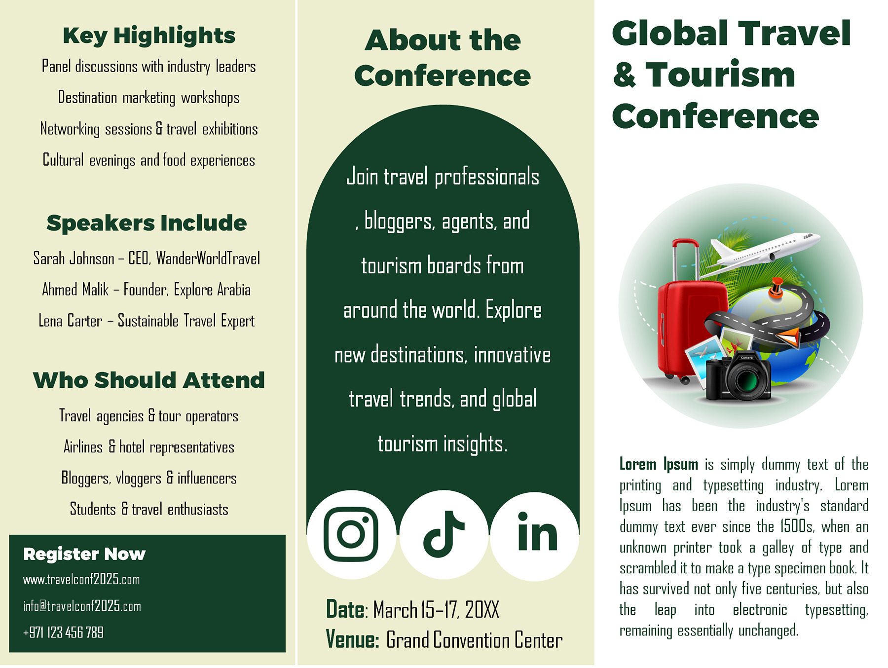
Consider the tourism conference leaflet. It provides space for the event title, speakers, date, venue, and registration information.
The title should tell people what the event is about. A short description can explain what they’ll learn or experience. Speaker details may help them decide whether the conference interests them.
But an interested reader still needs the basics. Put the actual date, time, venue, and registration route somewhere easy to find. If registration closes on a particular day, include that deadline too.
The kindergarten and museum designs also introduce places, but their readers are asking different questions.
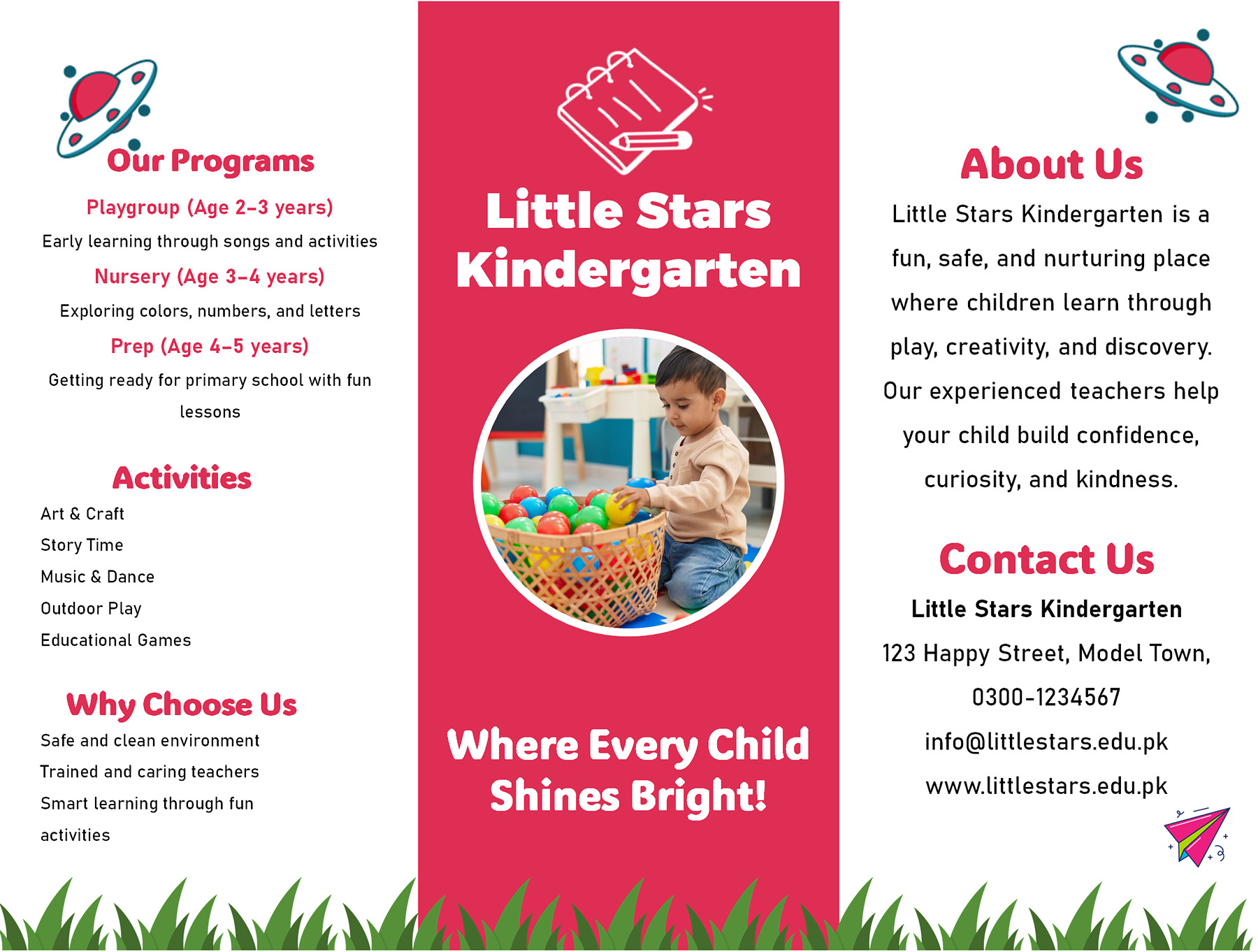
Parents looking at a kindergarten leaflet may want to know which age groups the school accepts, what programs are available, and how to arrange an enquiry. The school introduction can provide context, but it shouldn’t push those details out of sight.
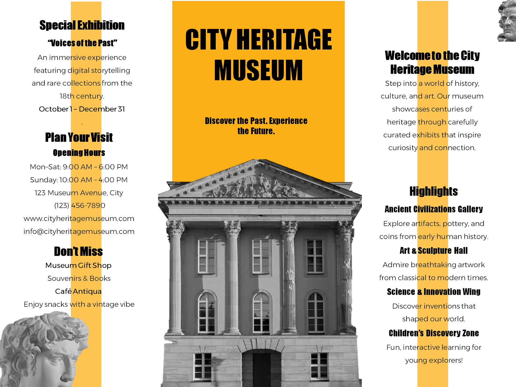
A museum visitor is more likely to ask what’s currently on display, when the museum is open, and where it’s located. The museum layout gives those details space alongside an introduction and exhibition highlights.
For example, a short museum notice might say:
Visit [Museum Name] to explore [current exhibition]. Find us at [verified address]. Opening hours are [current days and times]. For admission information, visit [official website].
This is an example, not information about a real museum. Check the hours, exhibition dates, and admission details against the venue’s current information.
There’s no need to describe every exhibition or school program on a leaflet. Select the information someone needs before deciding to visit or enquire. More detailed material can be available through the contact route or website you provide.
Give people enough information to compare an offer
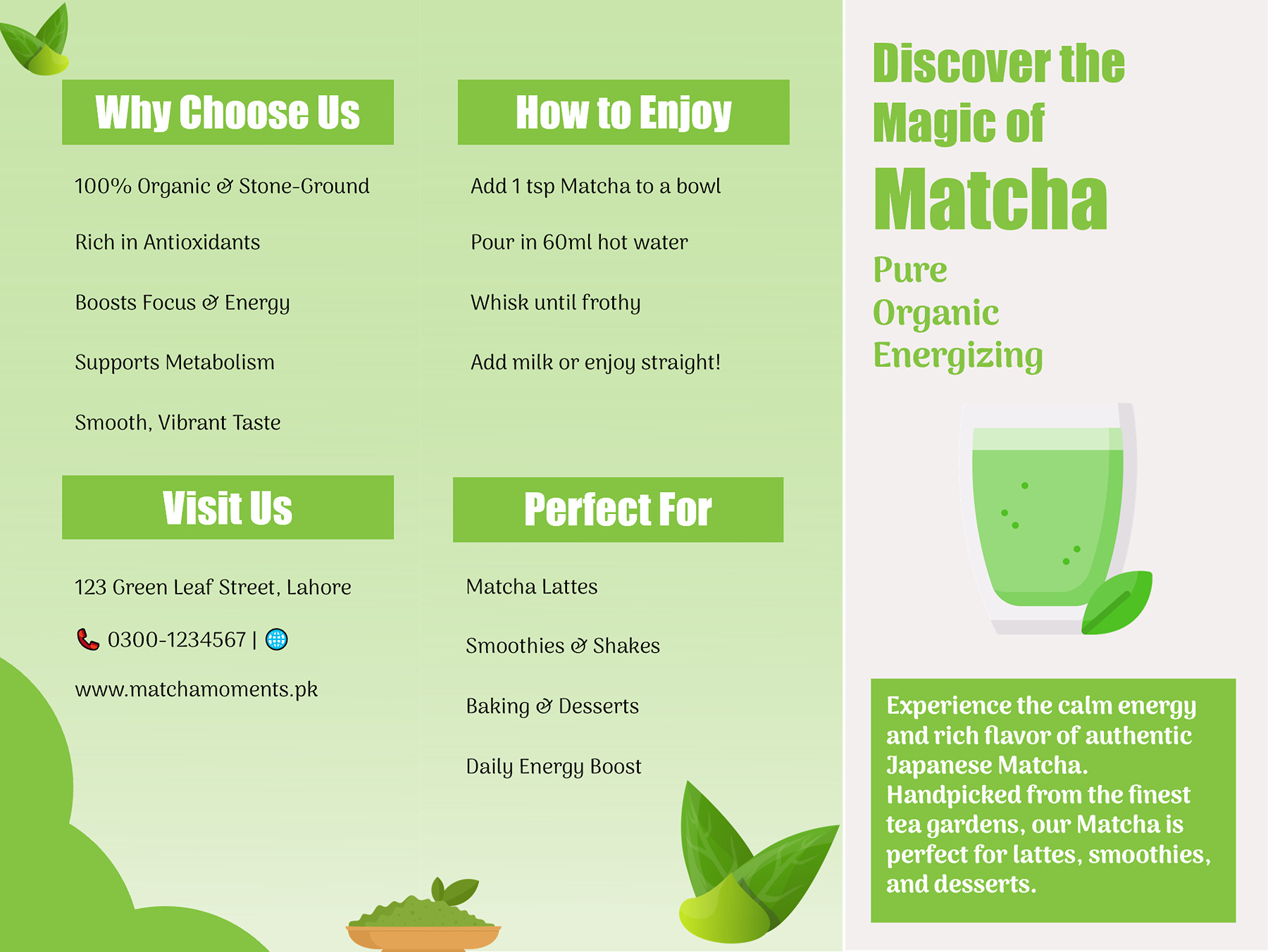
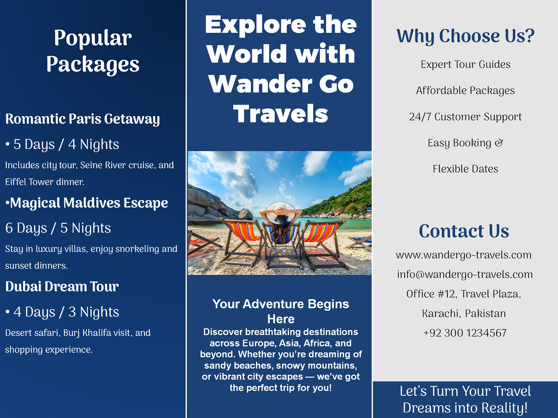
The travel package and matcha product designs show another kind of message. Both introduce something people may want to purchase, but the questions behind that decision are different.
With a travel package, a destination and an attractive photograph aren’t enough to explain the trip. Readers may want to know how long it lasts, what’s included, and what arrangements they’ll need to make separately.
Use the travel layout’s package and itinerary areas to answer those questions. State the actual inclusions rather than relying on broad descriptions such as “complete package.” If flights or meals aren’t included, don’t leave people to discover that only after they enquire. The contact information should point to a real booking or enquiry route. The leaflet itself doesn’t provide a booking system.
A product leaflet can focus more on what the item is and how people use it.
The matcha design has room for a product introduction, preparation information, features, and contact details. If customers are unfamiliar with the product, a short explanation of how to prepare it may be more useful than several promotional statements.
Only include product claims that you can support. The sample’s health or nutrition-related wording shouldn’t be treated as verified information about the product you’re selling.
When the information needs a closer check
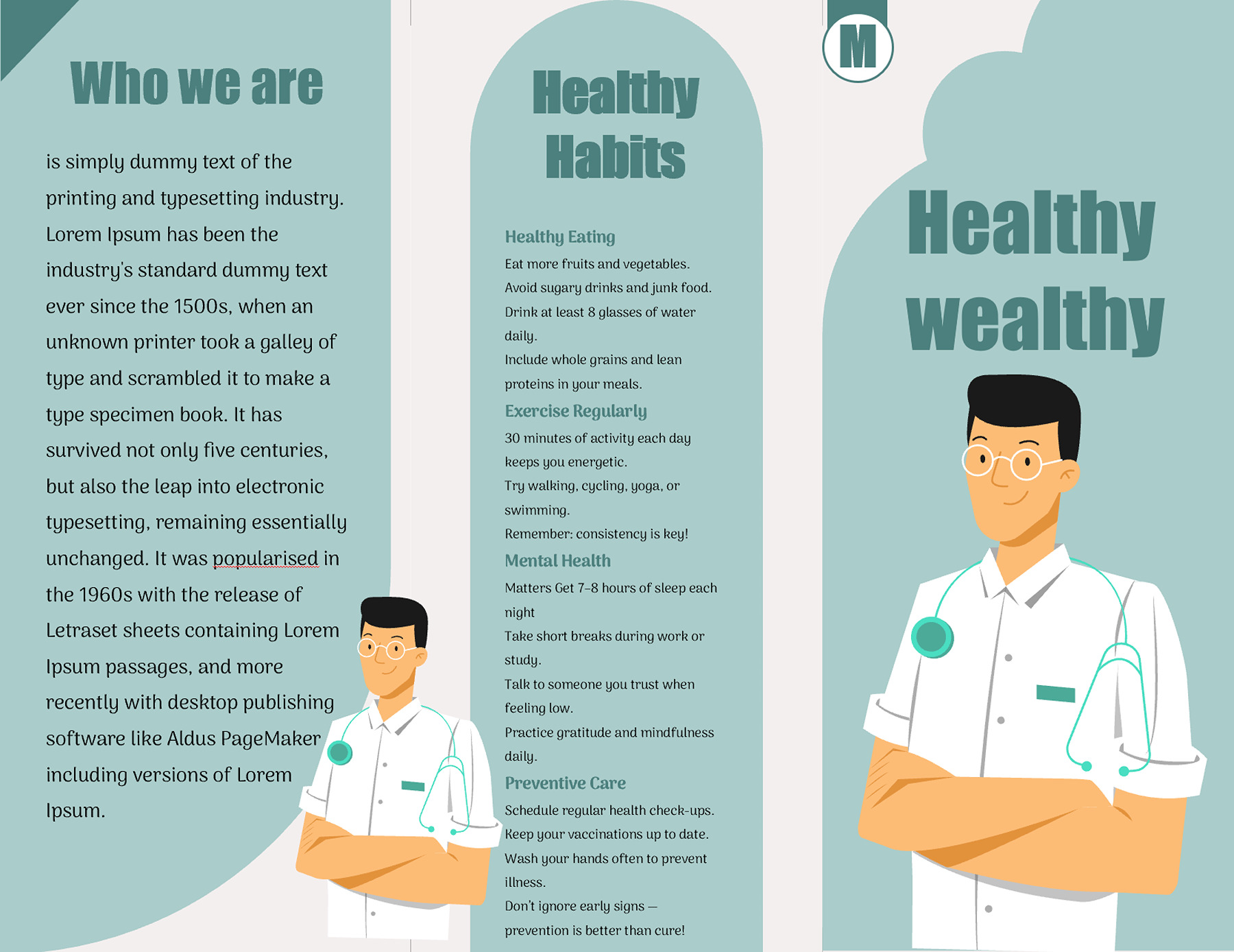
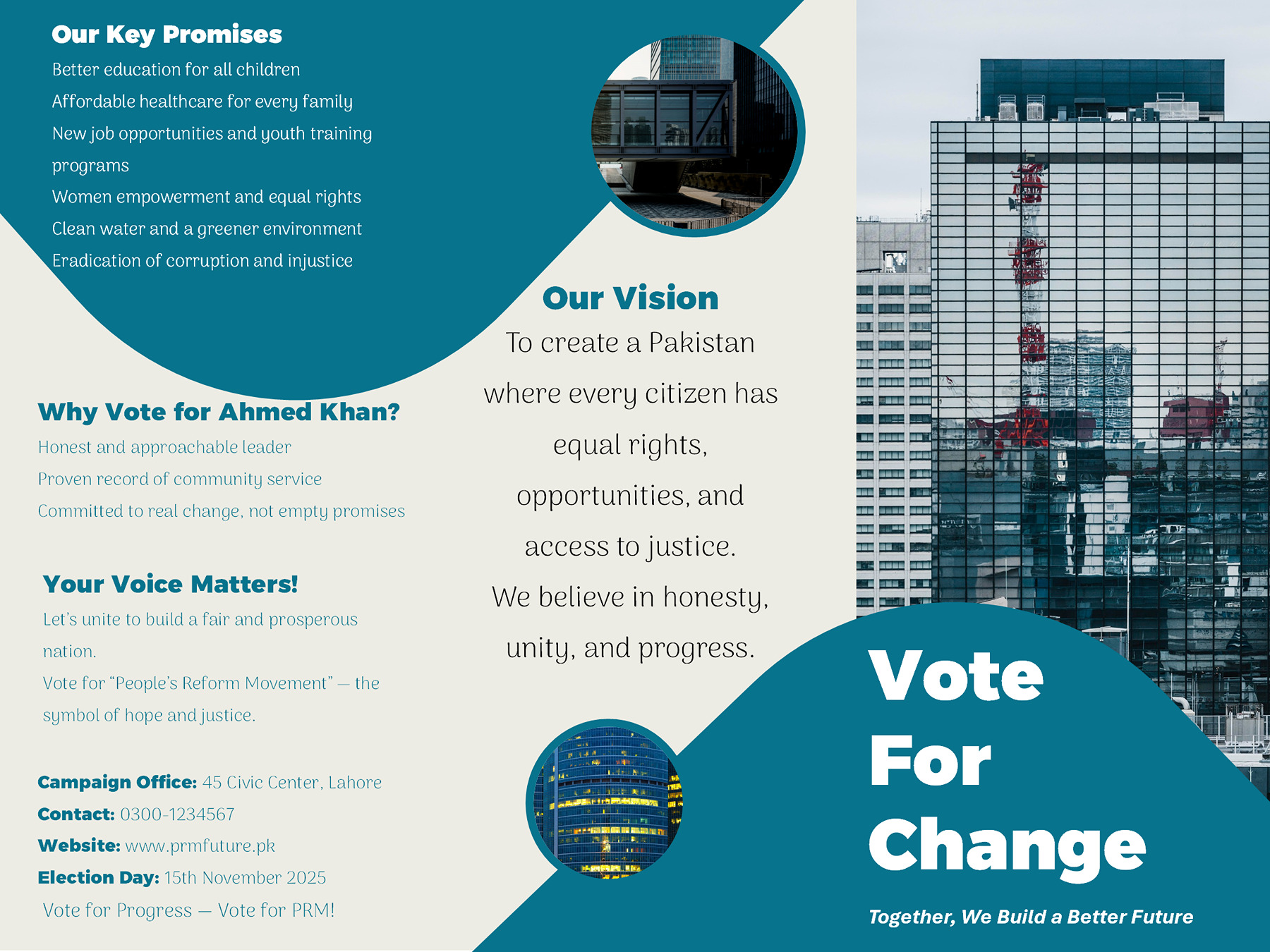
The collection also includes health and campaign information layouts. They can organize different topics into readable sections, but the designs don’t establish whether the information is correct.
The health leaflet uses an illustrated medical theme and separate areas for health-related text. Replace its sample wording with information from appropriate sources. Any medical recommendations or treatment claims should be reviewed by someone qualified in the subject before distribution.
The campaign leaflet contains sample candidate information, commitments, contact details, and an old election date. Those are examples within the design, not current election information. Anyone using the layout for permitted informational material needs to replace the sample details and verify the statements they publish.
For both subjects, keep the wording understandable and make the source of important information clear. A well-designed page cannot make an unsupported claim accurate.
Make a folded proof before deciding which panel faces out
A three-panel design looks different when you’re viewing the whole slide on a screen and when you’re holding a folded sheet of paper. A message that seems to flow naturally from left to right may appear in another order after folding.
That’s why it’s worth testing the physical arrangement before printing a full batch.
These templates have one designed three-panel side, not a complete double-sided leaflet. The source slide measures 10 × 7.5 inches in landscape orientation, and slide 2 contains credits. It isn’t artwork for the back of the leaflet.
The files are not verified as ready-made US Letter, A4, or professional press-ready designs. If you want information printed on both sides, you’ll need to plan and check the additional side separately.
Make a working copy of your chosen PowerPoint or Google Slides template and add your own information. Replace the sample names, dates, prices, photographs, and contact details. Look for leftover filler text in smaller areas too.
Before printing, check the actual slide size against the paper you intend to use. Microsoft’s PowerPoint slide-size guide explains the available settings and how changing dimensions can affect existing content. Google’s printing guidance for Google Slides covers its print and preview options.
Don’t assume that changing the paper size will automatically reposition the panels or keep every line readable. Check the layout after any size or scaling adjustment.
Print one copy on ordinary paper, then fold it the way you intend to use it. Select the designed leaflet slide for this proof. Keep the credits slide in your source presentation rather than treating it as the reverse side.
Read the folded copy as someone seeing it for the first time. Does the opening panel introduce the message? Can you find the important details as you unfold it? Is the contact or booking information easy to locate?
Look closely at the smallest text, image edges, and anything near a fold. If you need to shrink the text considerably to make everything fit, reconsider whether all that information belongs on the leaflet.
If you’re using a professional printing service, ask for its required paper dimensions, fold arrangement, and trimming instructions. The printer may also ask for bleed, which means extending background colors or images slightly beyond the final cutting edge so that small cutting differences don’t leave unwanted white borders. The amount and setup depend on the printer’s requirements. These templates don’t come with verified bleed specifications.
Your folded proof should answer the same three questions you started with: What will someone notice first? Do they have the information they need? Do they know what to do next?
If those answers aren’t obvious, adjust your working copy before printing the rest.
About This Article