These ten membership card designs give a club or small organization a printable place for member names and IDs. Each PowerPoint or Google Slides layout has eight cards arranged on its first slide, with a design-credit slide following it.
Start with a member whose details are already confirmed in your records. Choose a design, enter the group and member information, then check each of the eight cards. The text boxes are separate: changing the first card won’t fill in the other seven.
Choose a design that suits the group
Look at the space for your group’s name and message as well as the colors. A design can look right in the preview but become crowded once a longer club name or member name is entered.
| Design direction | Layouts | Text to check closely |
|---|---|---|
| Geometric or gold details | 01, 06 and 10 | Name, ID and any smaller group or message text. |
| A stronger brand or message area | 03, 04 and 05 | Sample branding and paragraph text as well as the member fields. |
| Alternative colors and field treatments | 02, 07, 08 and 09 | Name/ID boxes, footer text and the contrast of your entries. |
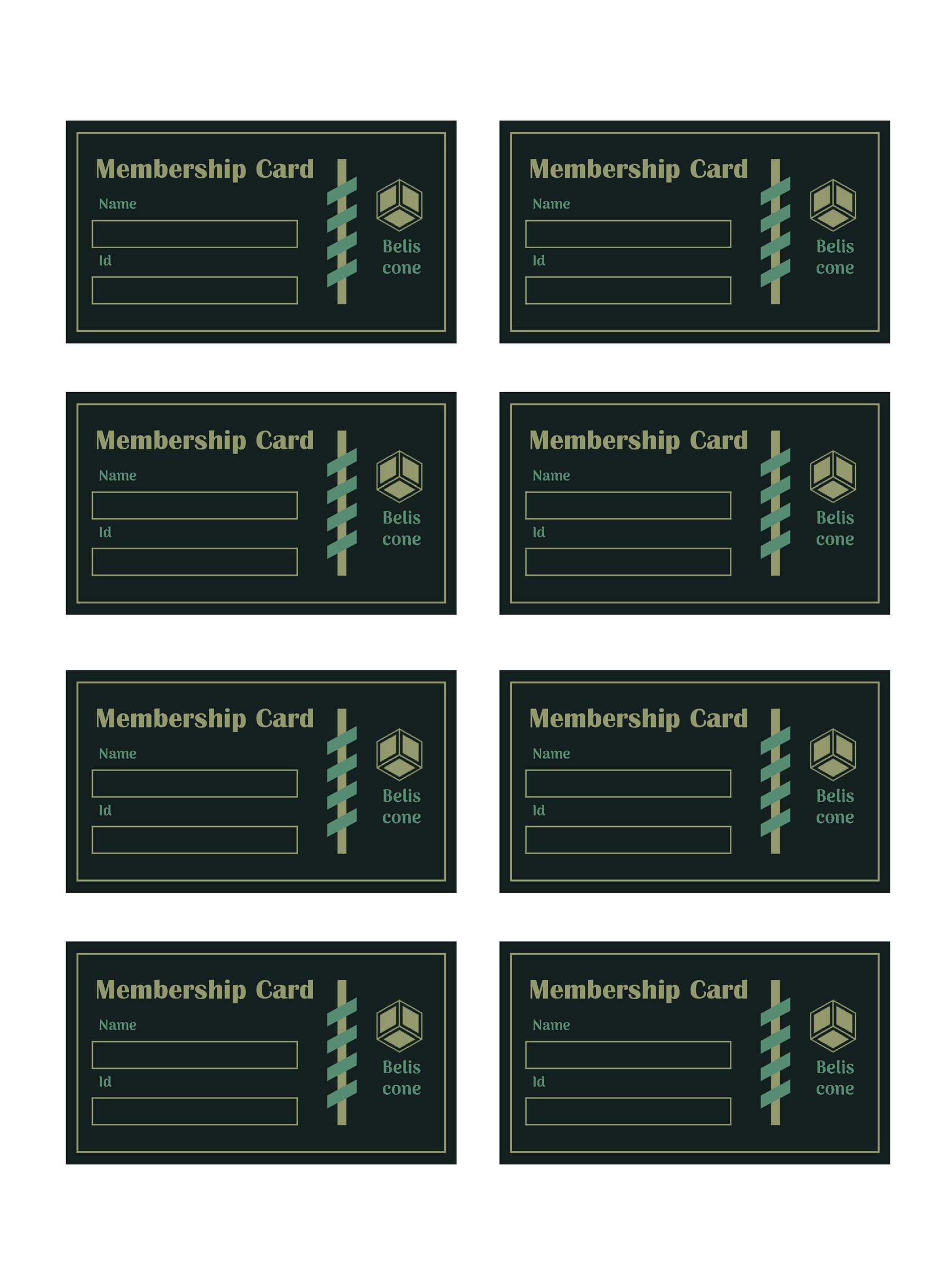
Try your longest likely name on one card before committing to a design. It is easier to make that decision with one entry than after filling the whole sheet.
Compare the ten layouts
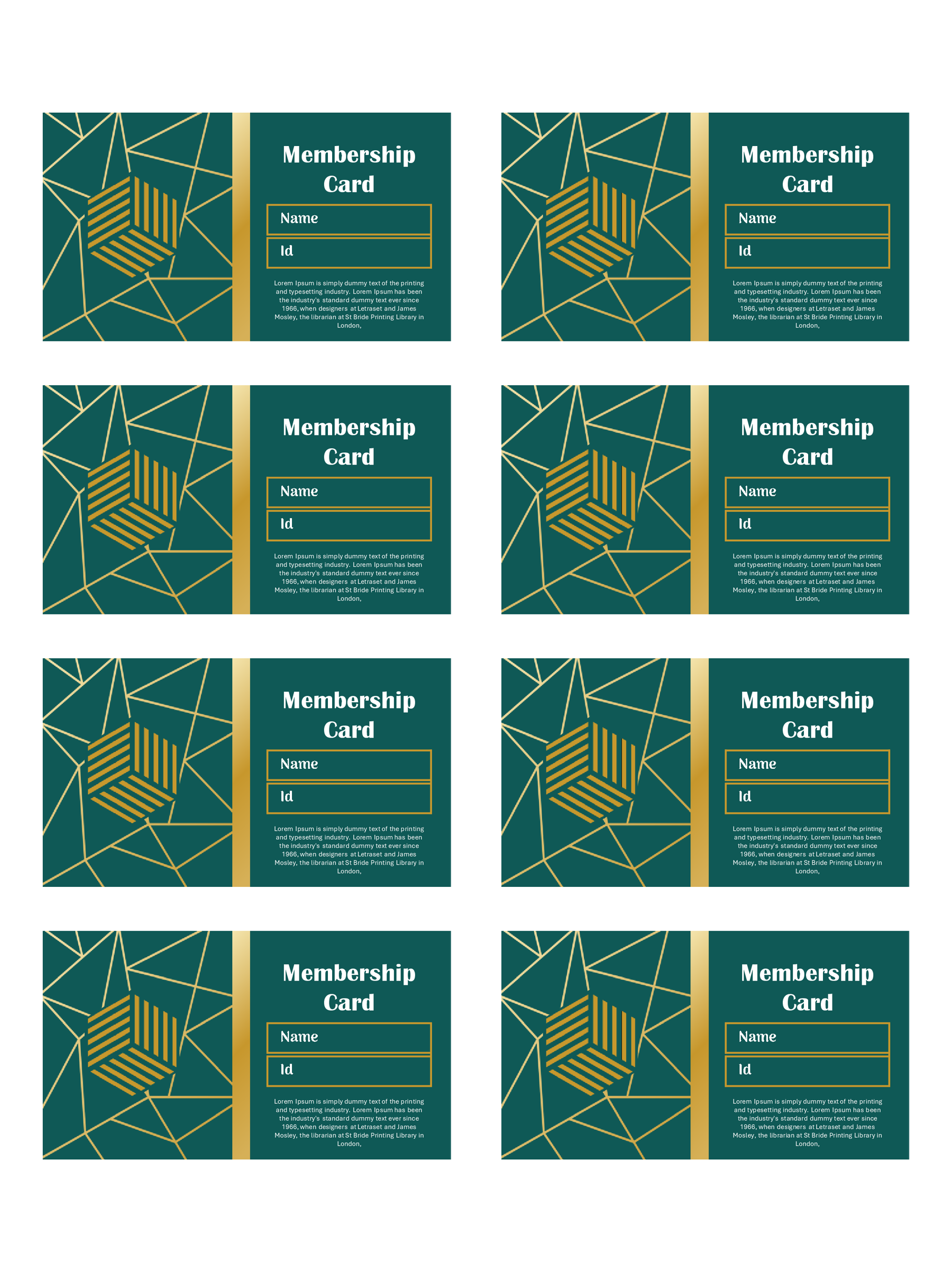
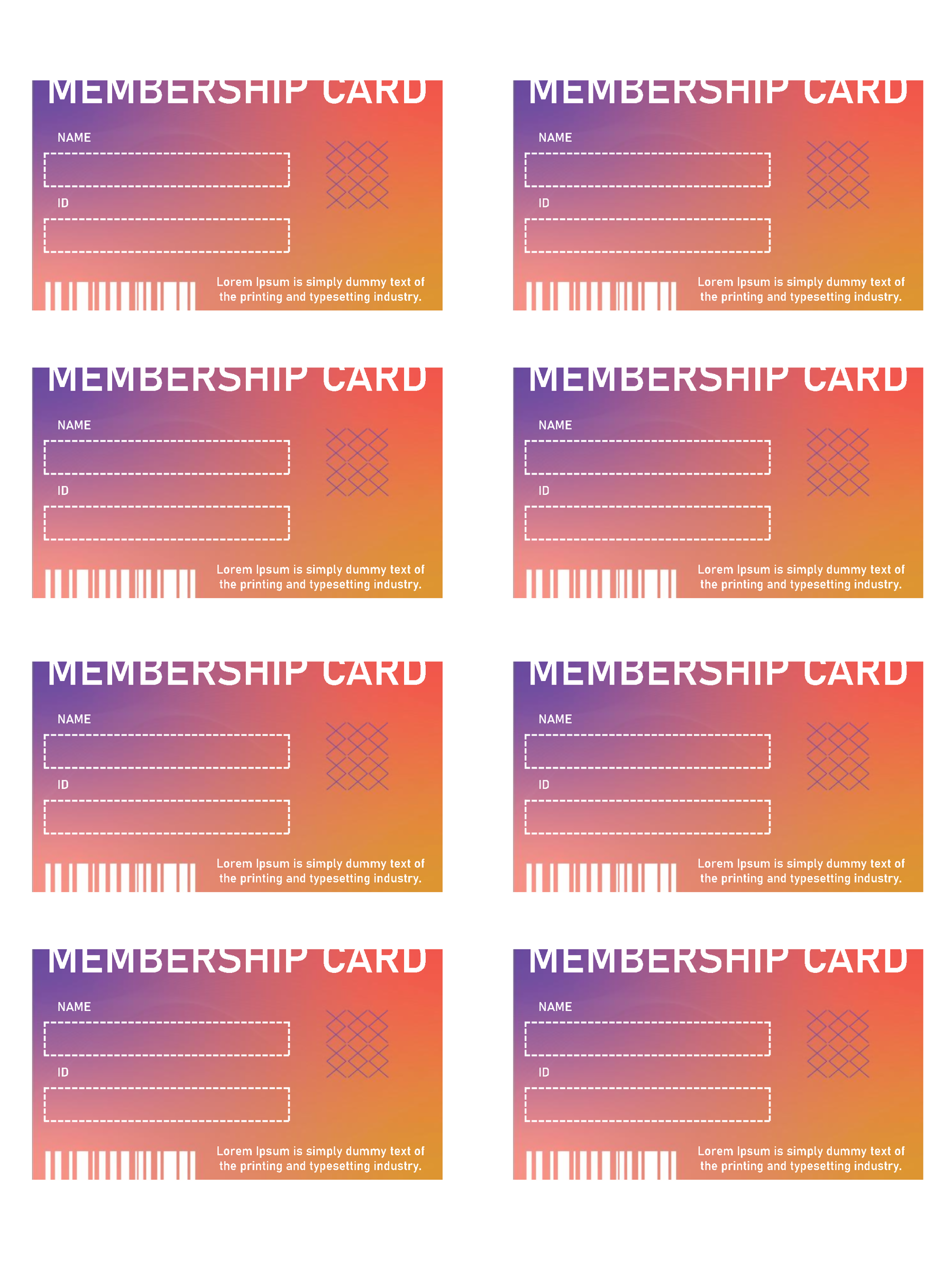
Layout 01 uses green and gold geometry around Name and ID areas, with smaller text to review after personalizing it. The purple-and-orange design in 02 places the fields in white boxes and includes printed barcode artwork. Treat that artwork as part of the design; the supplied file doesn’t establish a working barcode linked to your member records.
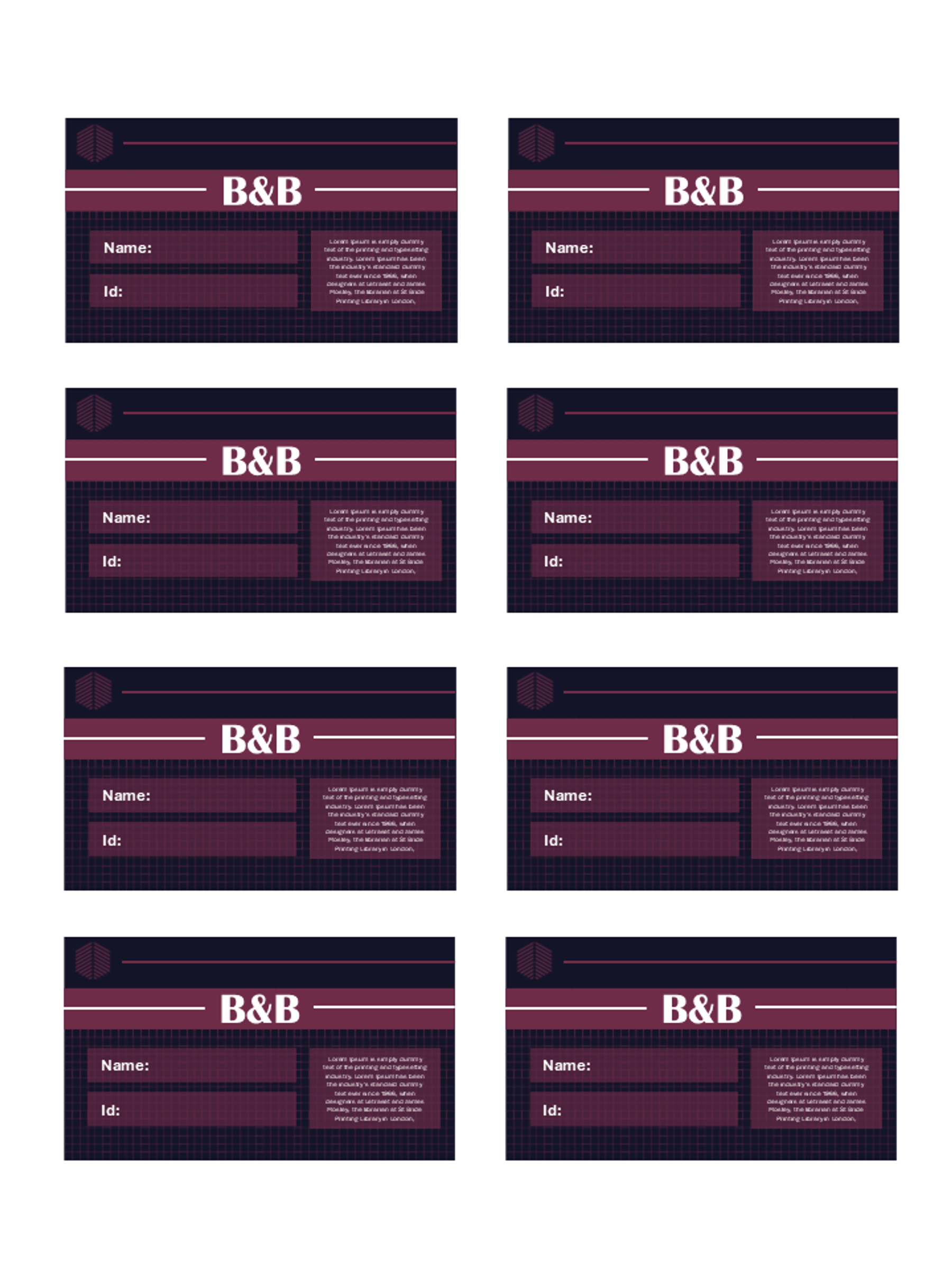
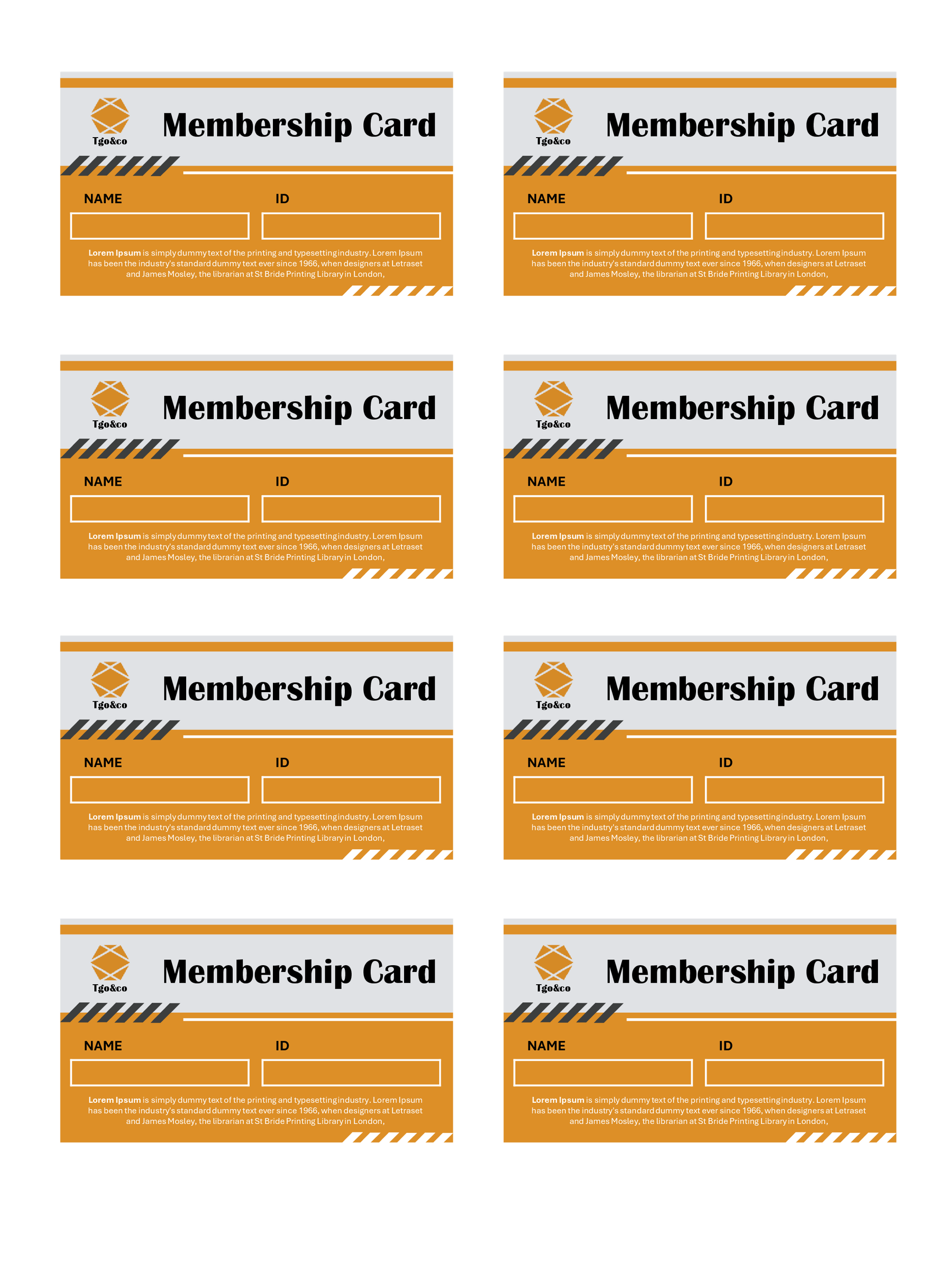
Layouts 03, 04 and 05 give more attention to the group’s identity or a short message. The maroon-and-navy layout 03 has fields on the left and message space on the right. Layout 04 uses orange and white, side-by-side Name/ID fields and a paragraph below. In 05, a black-and-cyan header, logo area and paragraph need checking along with the member details.
The navy-and-gold layout 06 displays a sample name and long ID. Use your own member ID in that position; the styling doesn’t add payment functions. Layout 07 combines navy and coral with lighter fields and footer text, while 08 has a lighter textured background and multicolored dotted border.
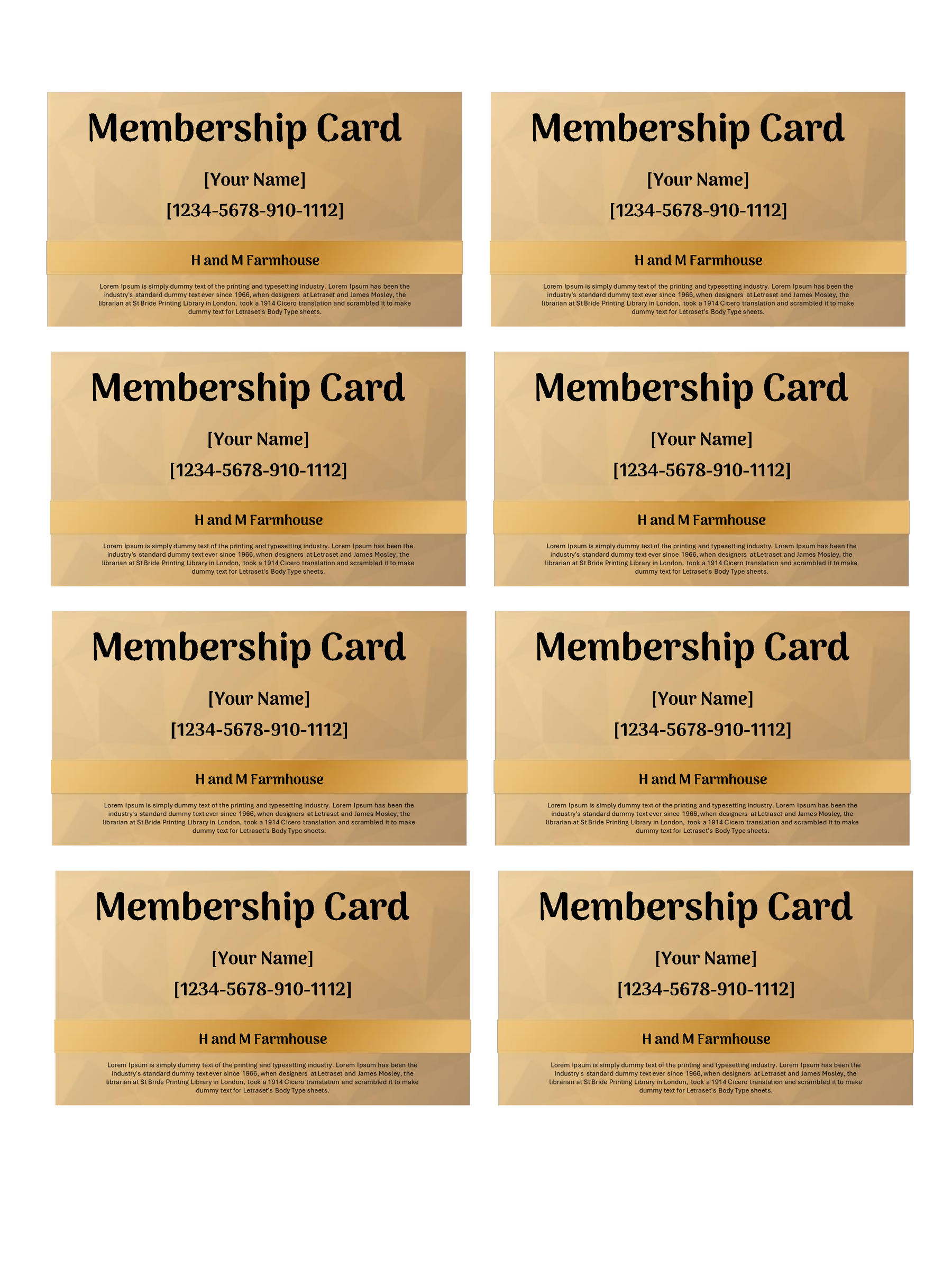
For another dark option, 09 uses green with outlined fields. Layout 10 returns to gold, with faceted shapes, a name, sample ID and short paragraph. Replace the sample organization names, logos and wording in whichever design you choose; they aren’t affiliations of your group.
Membership Card 01
Membership Card 02
Membership Card 03
Membership Card 04
Membership Card 05
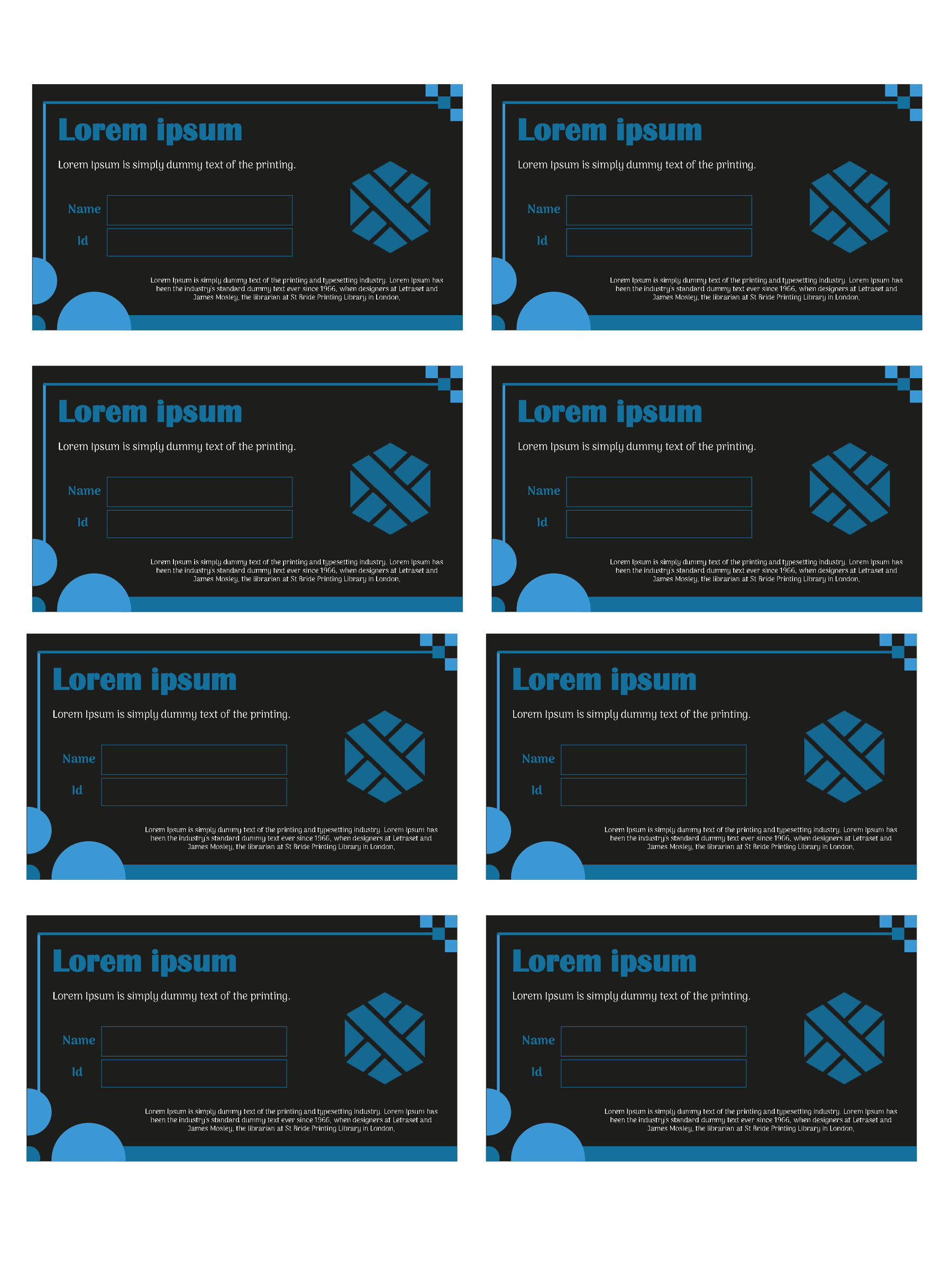
Membership Card 06
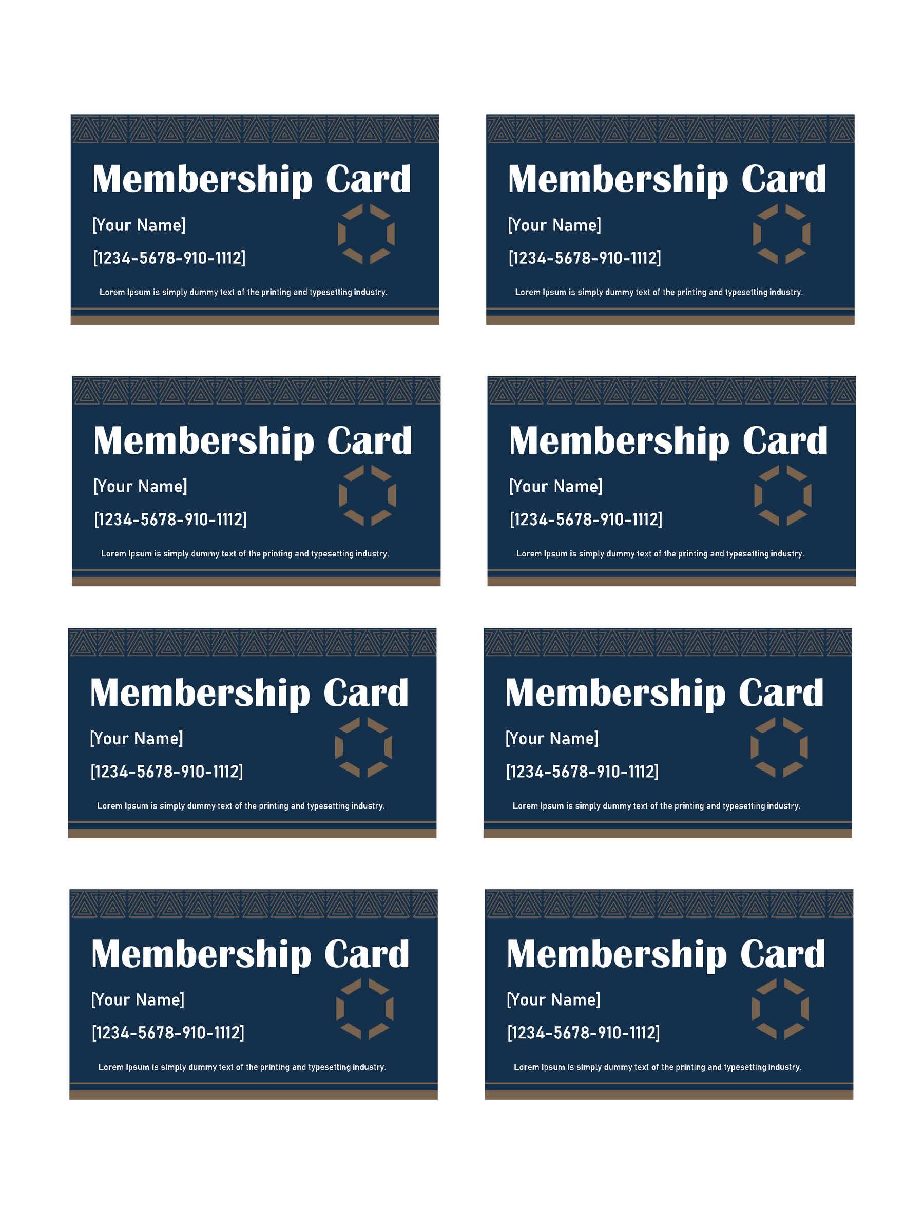
Membership Card 07
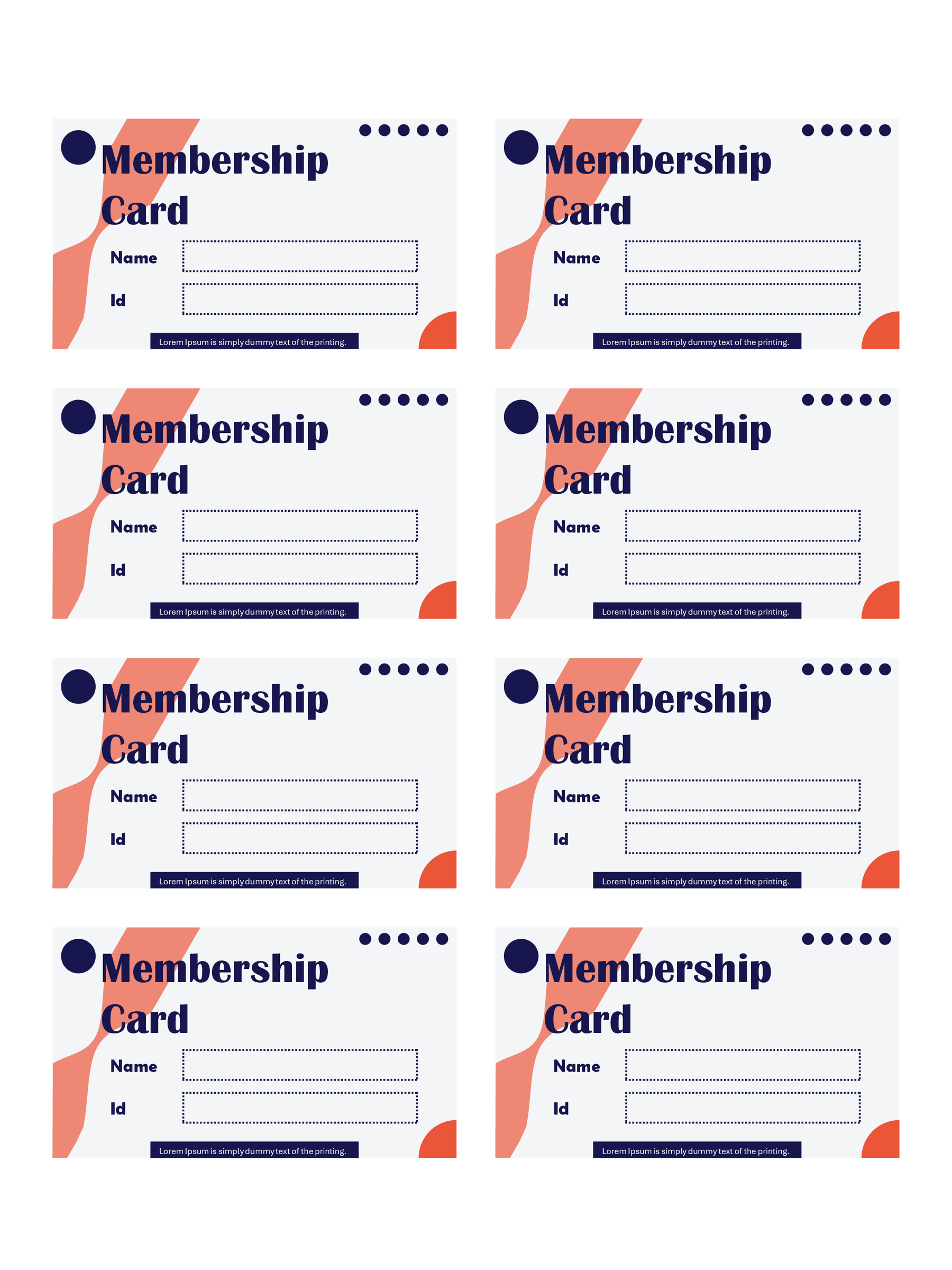
Membership Card 08
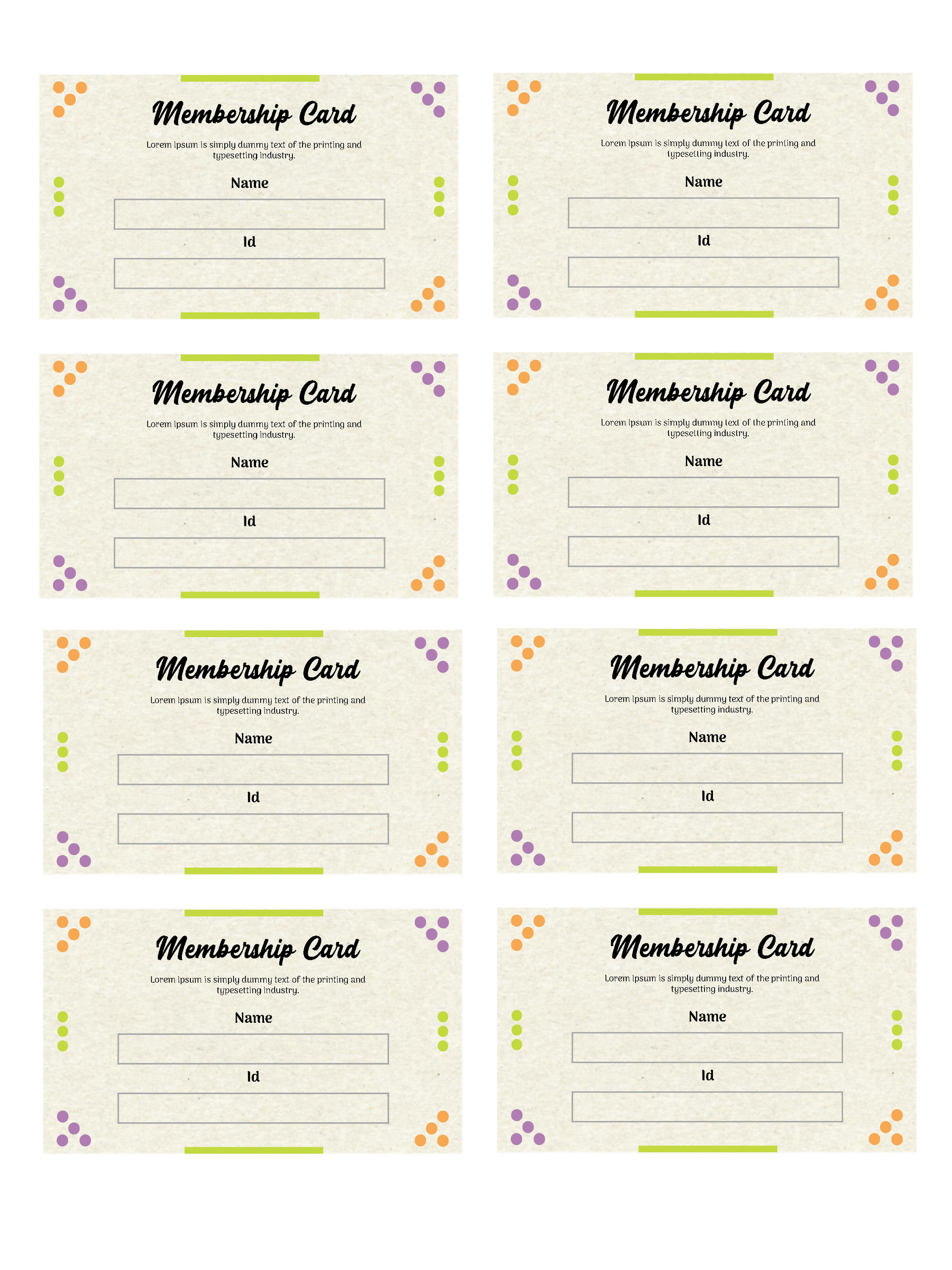
Membership Card 09
Membership Card 10
Add one member, then check every card
Suppose Riverside Reading Club has already admitted Alex Morgan and assigned the member ID RRC-024. This is an invented example. Enter Alex Morgan in the name area, RRC-024 in the ID area, and Riverside Reading Club in the available group-name text.
Read the card at its intended size. If the club name crowds another element, adjust the text in your working copy or choose a design with more suitable space. Keep the ID exactly as it appears in the club’s record, including any prefix or leading zeros.
Move through the remaining seven cards one by one. Use the next member’s confirmed details for a batch, or repeat the same details only when you intend to print duplicates. Check small paragraphs, footer lines and sample IDs as carefully as the largest text.
Keep the member list separately. These presentation files don’t assign IDs, approve applications or maintain a membership database. If you’re still collecting applications, use a membership application form before preparing the cards.
Print the card sheet at a useful size
Print slide 1 as a full slide on the page: it already contains eight cards in a two-column, four-row arrangement. Selecting an eight-slide handout would arrange presentation slides on a page, rather than preserve this ready-made card sheet. The second slide contains design credits; it isn’t a reverse side for the cards.
The inspected slide canvas is 7.5 × 10 inches. That measurement describes the whole sheet, not a guaranteed standard size for each cut card. Check the paper size, scaling and margins in your print setup, then make one paper proof before printing the batch.
In PowerPoint for the web, printed margins depend in part on the printer and paper setup; Microsoft’s printing guidance explains the limits of edge-to-edge output. For Google Slides, use its print settings and preview guidance to inspect the slide range and output before printing.
On the proof, check that names and IDs are readable, no text is clipped and you can cut between cards cleanly. If the size isn’t suitable, adjust the print setup and proof it again before using the final paper.
Keep the member record and card consistent
Before the batch is finished, compare every card with the member list: name, ID and group details should agree. Remove any sample text left on the sheet and confirm that you’re printing the intended slide.
If your group uses barcode scanning or another access system, arrange and test that separately. Decorative barcode artwork doesn’t confirm membership, and these files don’t supply NFC or digital-wallet functions.
Complete one card and check a paper proof first. Once the size and text work for your group, verify the remaining entries and print the batch.
About This Article