The photo and the amount you want to say about a player are useful starting points for choosing a trading card design. Some of these ten layouts keep the identity brief; three leave room for a short description, and one adds small numbered entries that need a little more thought.
Each download is a PowerPoint PPTX file with nine cards on its first slide and a separate credits slide. Linked Google Slides versions are also available. The whole card sheet measures 7.5 × 10 inches; that is the slide size, not a promise about the size of each finished card. Browse the photo frames and writing areas with your intended picture and details in mind.
Let the photo do most of the talking
The teal-and-navy card keeps the photo inside a straight square frame, with a player name, number and stars completing a brief identity. It is a straightforward option when the picture and name can carry the card without an extra paragraph. Try the name at its actual length: a short sample name doesn’t show how your longer one will sit in the same space.
The burgundy-and-gold design uses a diagonal photo treatment. That gives the picture a different shape on the card, but it also makes the crop a more important part of your choice. A frame that works with the sample may cut across a face, hand or part of a uniform in your image. Place the intended photo before spending time polishing the remaining text.
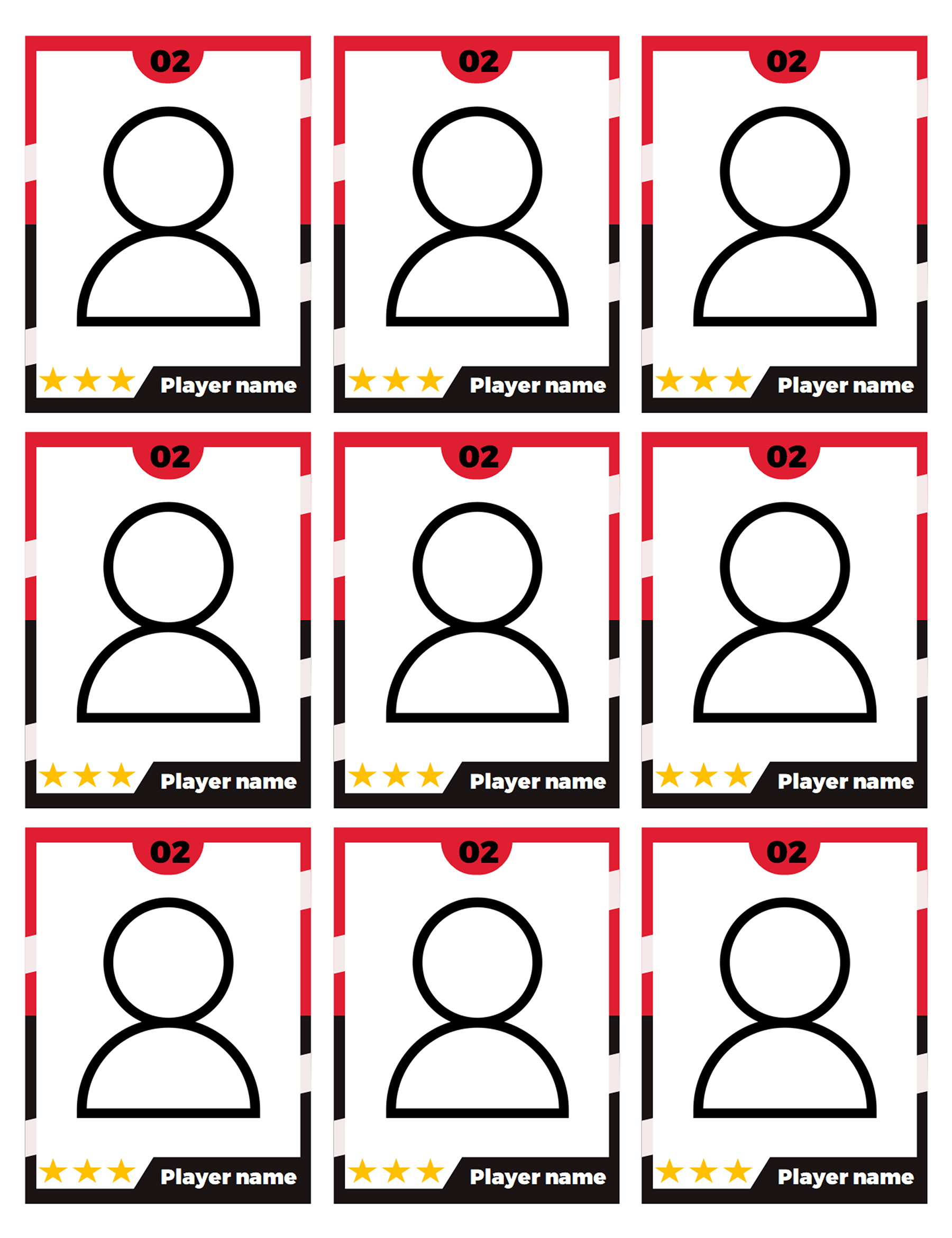
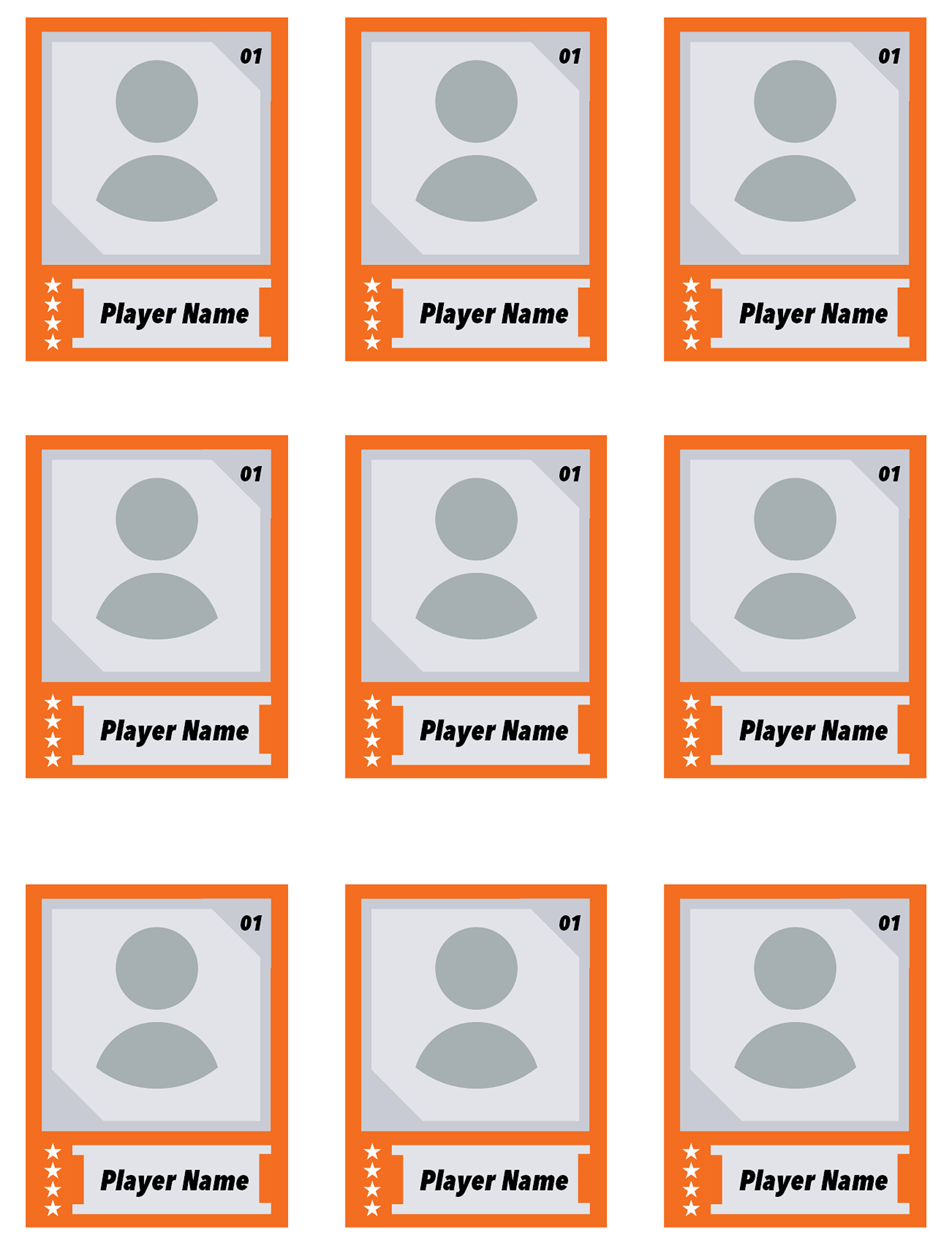
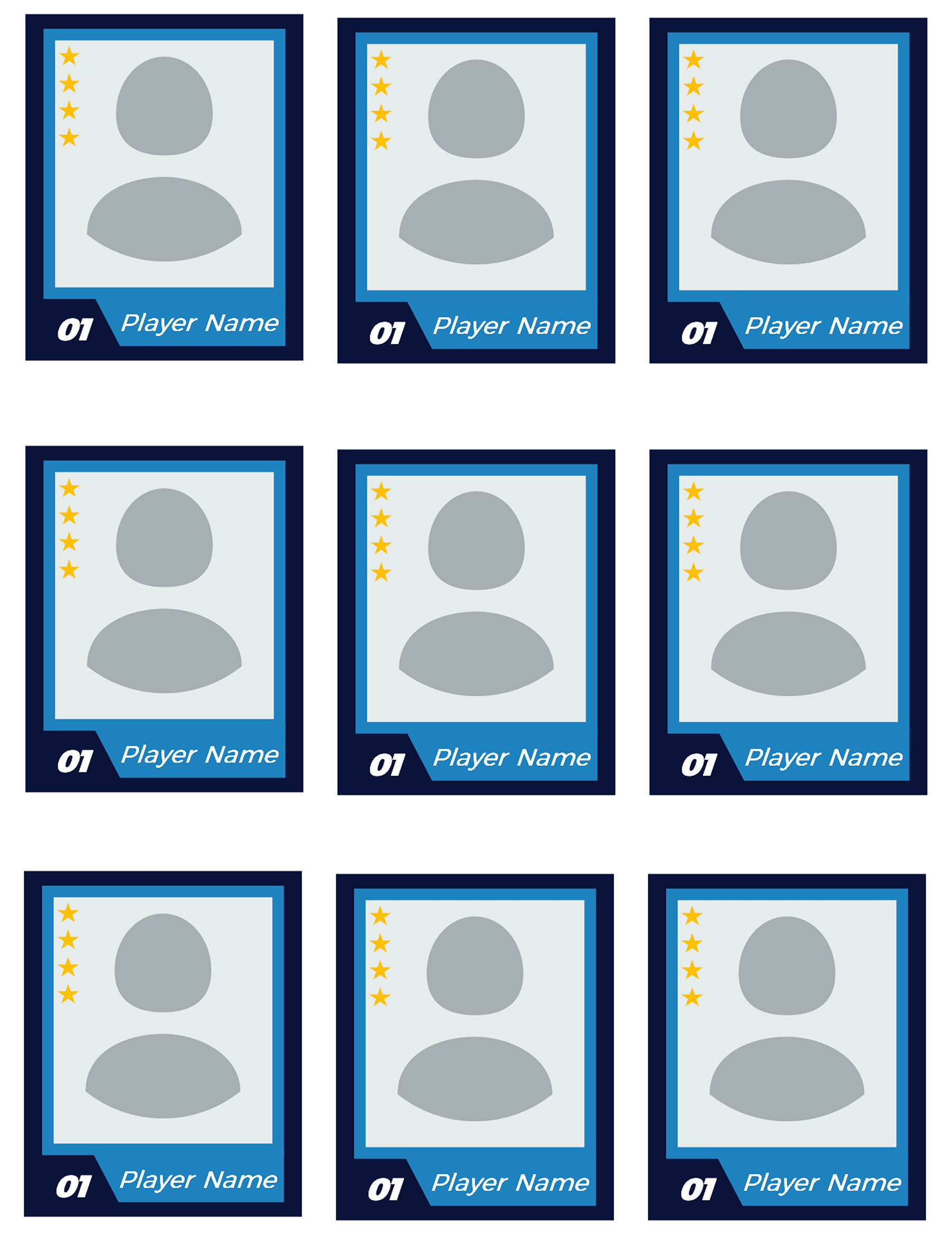
Four other compact options vary the surrounding frame and the position of the smaller details. Dark green and white puts stars vertically beside its short identity treatment. Red and black places stars below the framed image, while orange and gray and navy and teal use them at the side. Compare where your eye goes after the photo: can you find the name and number comfortably, or does one detail compete with the picture you chose?
The orange-and-gray design’s angular framing deserves the same crop check as the diagonal option. With any of these layouts, zooming in to replace a photo isn’t enough. Look at the whole card again, at a realistic reading size, to judge the balance between the image and the identity.
The stars don’t come with a supplied rating system. If they are simply decorative in your card, don’t describe them as a score. If you want to use symbols to communicate something, give them a clear meaning in your own project and check that the information is appropriate and accurate. You don’t have to turn every piece of decoration into player data.
Trading Card Template 02
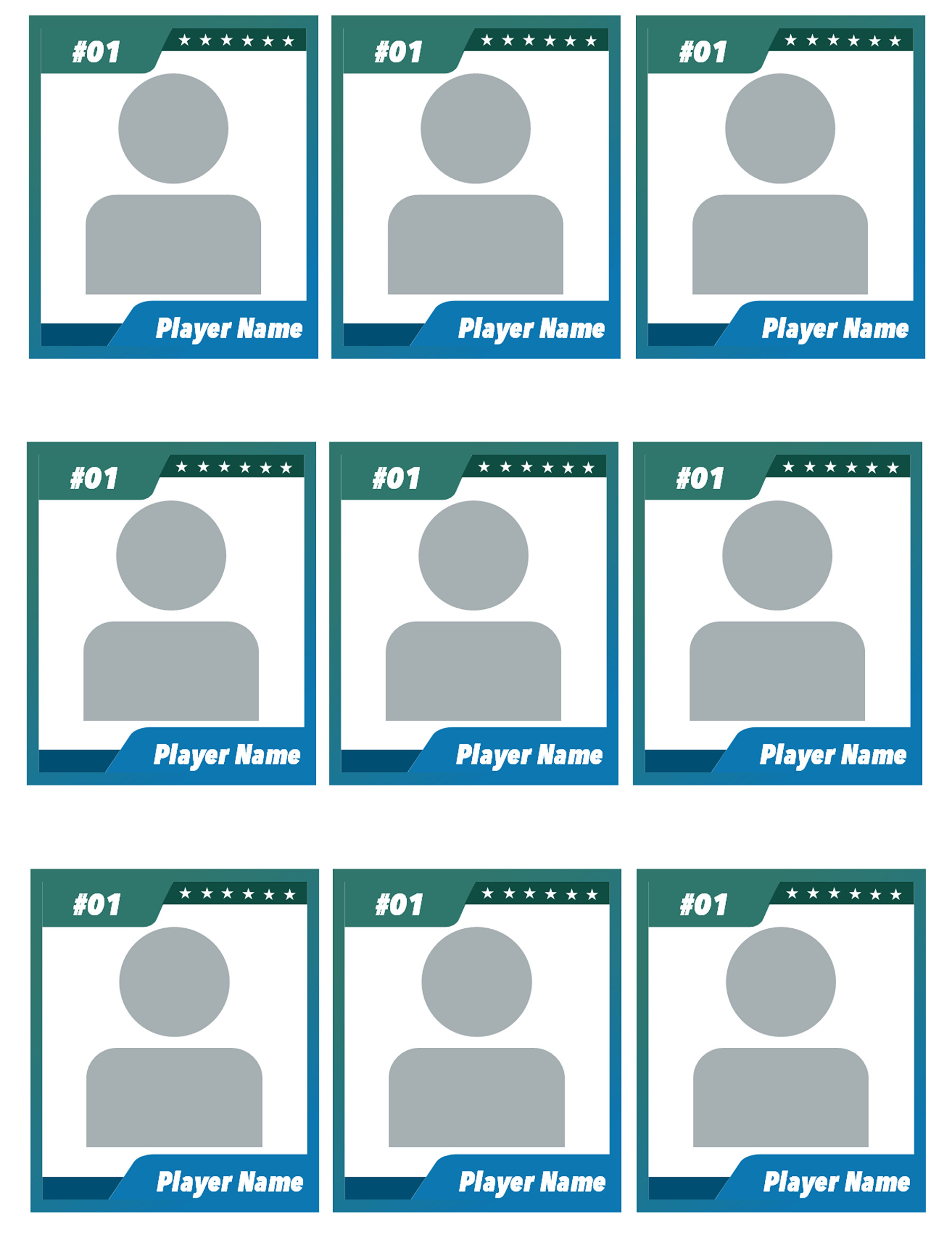
Trading Card Template 01
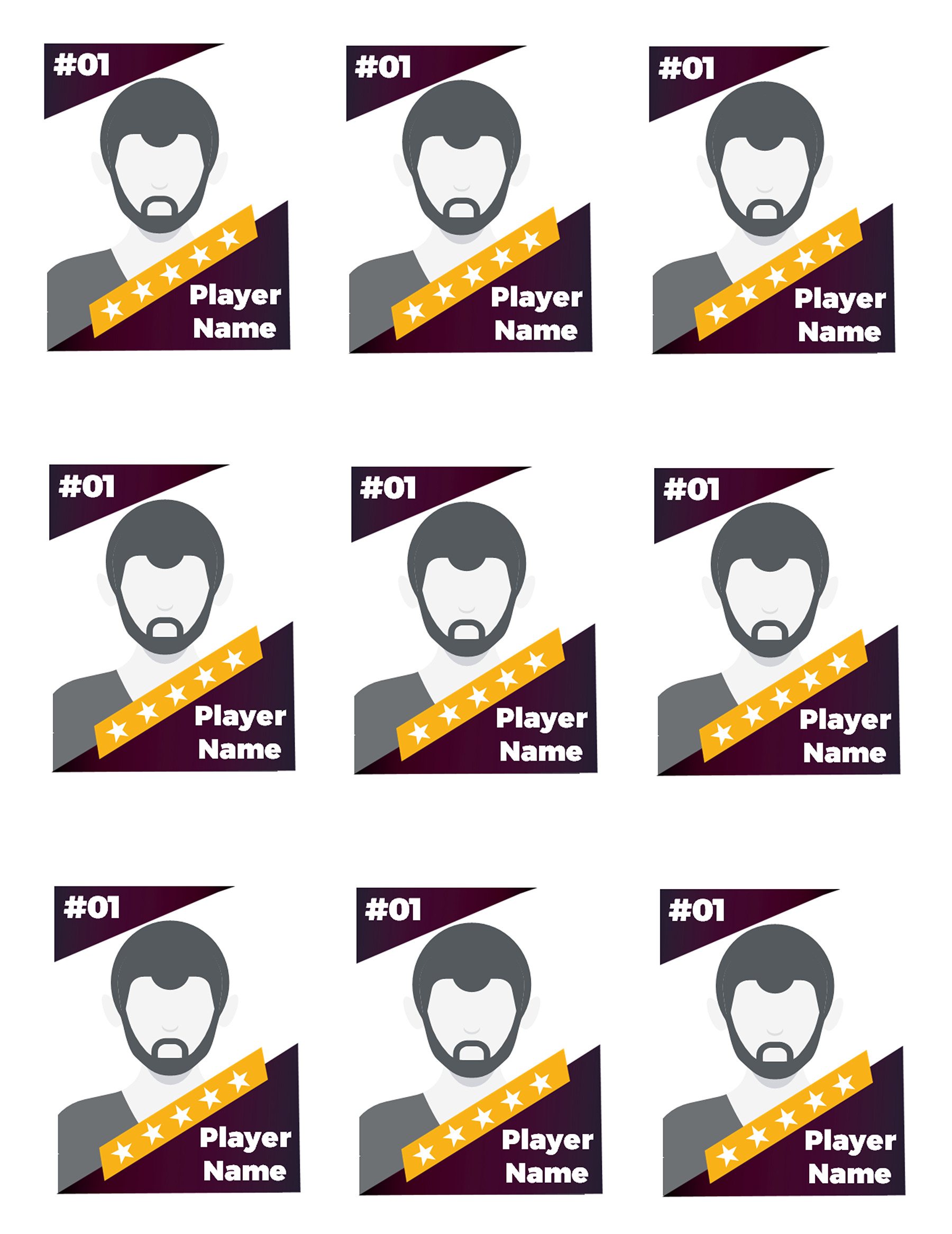
Trading Card Template 06
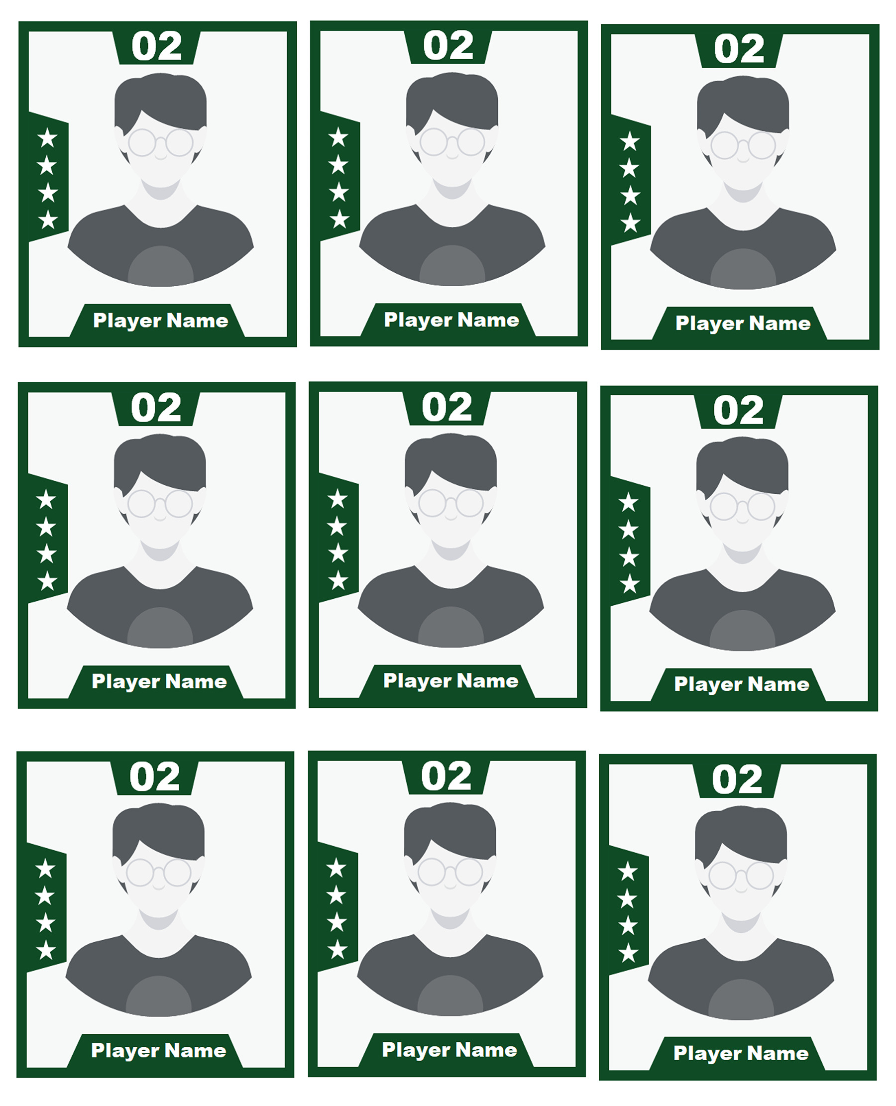
Trading Card Template 08
Trading Card Template 09
Trading Card Template 10
Three designs with room for a short player story
Sometimes a name and number leave out the detail that makes a card personal. A team, position or brief description can help, as long as it remains readable. The cyan, navy-and-violet and yellow-and-black designs all contain sample paragraph text, so they offer a different starting point from the compact cards.
Cyan rounded frame
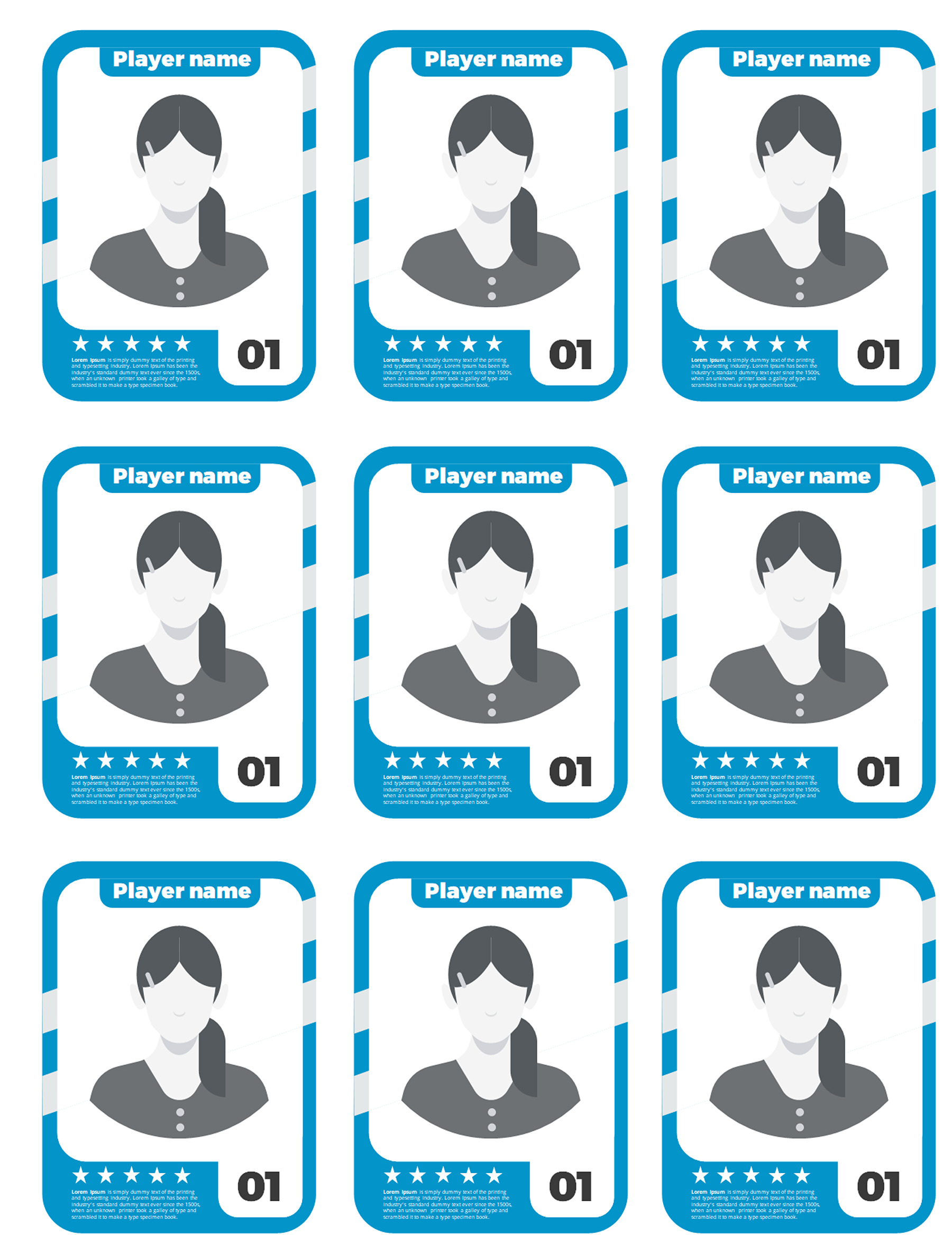
The cyan design combines a rounded photo treatment with a brief description area. Use that space for one useful detail about the player rather than trying to fit a whole biography. An invented wording pattern is “[Name] plays [role] for [team or season].” Replace the brackets with accurate details, and use only the parts that suit your project.
Read that line beside the name and number. If it repeats information already prominent elsewhere, it isn’t earning the small amount of space it occupies. A different relevant detail, or less text, may work better than shrinking the type.
Trading Card Template 04
Trading Card Template 04
Navy and violet
The navy-and-violet layout pairs a slanted photo with a sample “CF” position label and a paragraph area. Those two text elements need separate attention. Replacing the player’s name doesn’t make the position correct, and the paragraph remains unfinished while it contains filler.
This design gives you a place to introduce the player’s role without forcing the whole explanation into the name line. Check the role against the person represented, then use the paragraph for something that adds context. The slanted frame should be tested with the chosen photo before you decide how much surrounding text the card can comfortably carry.
Trading Card Template 05
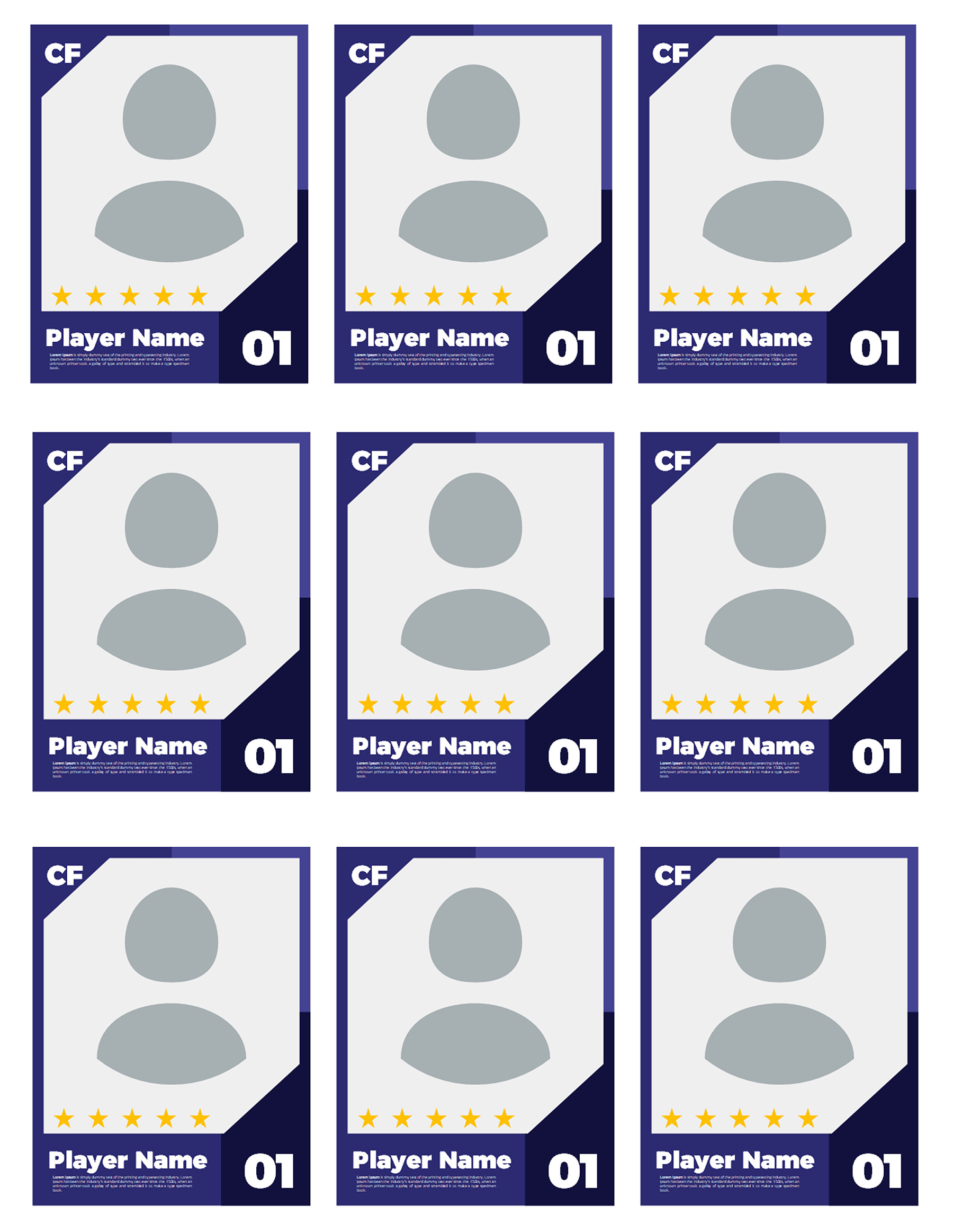
Trading Card Template 05
Yellow and black
The yellow-and-black card has a photo, number, player name, stars and a longer sample paragraph. The temptation is to replace that paragraph with another of the same length. You don’t need to. Keep the sentence that matters most to the card and remove information that belongs in a longer profile.
A card intended as a season keepsake may need a different detail from one introducing a player to a group. Let that purpose determine the sentence. The space is an opportunity to say something useful, not a requirement to fill every line.
Trading Card Template 07
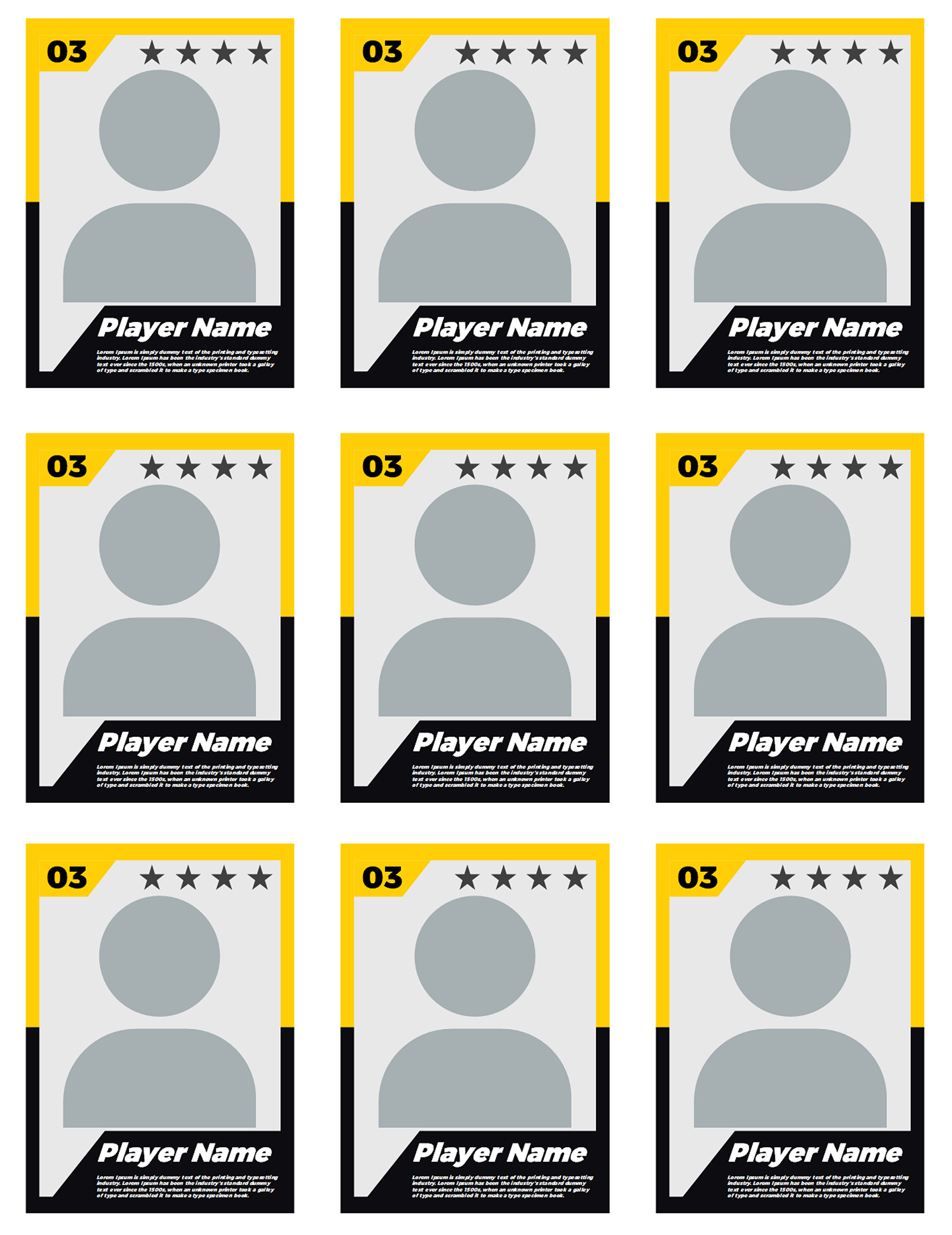
Trading Card Template 07
The lime-and-gray card: decide what the side numbers mean
The lime-and-gray design includes small side entries marked 1, 2 and 3, alongside the photo and main identity. They aren’t labeled goals, assists, speed or any other statistic. Treating them as finished data would leave the reader to invent their meaning.
There are two practical ways to handle them in your own copy. If the project needs short facts, add meaningful labels with values you can support. If those entries don’t serve a purpose, simplify the unused information rather than keeping unexplained numbers just because they were in the sample.
For an invented record pattern, “Appearances: [verified total], [season]” identifies both a measure and a period. Whether that is appropriate for your card depends on the project and the records available. A bare “12” could mean a shirt number, a total or something else entirely. Naming the detail removes that guesswork; it doesn’t create a scoring system or establish how players should be assessed.
Trading Card Template 03
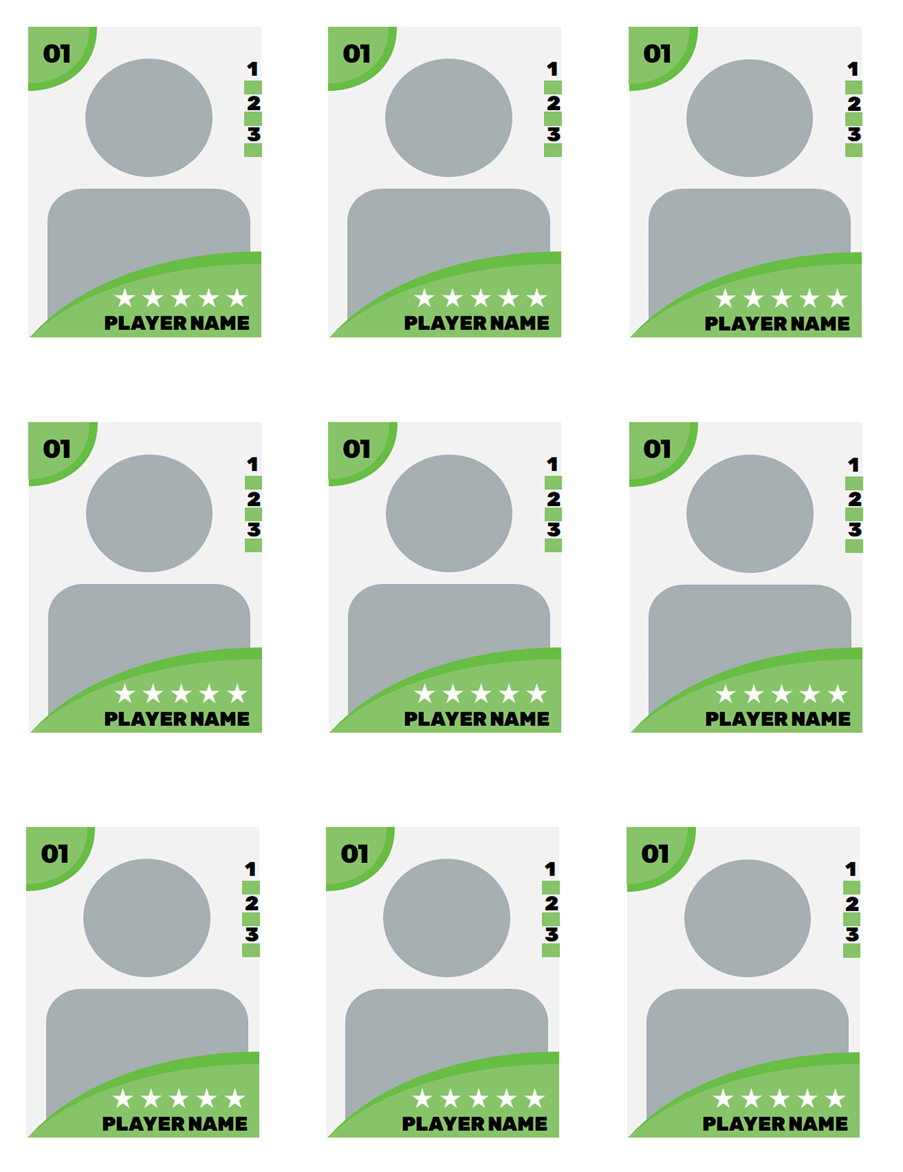
Trading Card Template 03
One person repeated, or a small team?
Finish one card before working through the other eight. Replace its photo, name, number and any sample text, then read it at the size you intend to use. This gives you a useful reference, especially if you discover that a longer name or description needs more space.
For nine copies of the same player, each remaining position should match that completed reference. Compare the photo as well as the large name. A small position label, old number or line of filler can remain even when the sheet looks consistent from a distance.
For nine different players, use your own list of intended names and details. Work across the top row, then the middle and bottom rows, checking the complete pairing in each position. A new name with the previous person’s photo is still an unfinished card. So is a correct photo and name with another player’s description underneath.
Don’t assume that editing one card automatically updates the other eight, or that a blanket replacement is appropriate for a mixed-player sheet. The repeated arrangement makes a consistent check worthwhile, but the content still needs to be right at every position. Use photos you are entitled to use and appropriate details for the people represented; a stock sample doesn’t establish anyone’s identity.
What the first printed sheet tells you
The nine cards are already arranged on one slide. Select that card slide for output and inspect a one-slide-per-page layout. A nine-slides-per-page handout would place several slide thumbnails on the paper; it doesn’t mean “print the nine cards.” Microsoft’s PowerPoint printing guide explains slide selection and the separate slide-versus-handout layout choices. Google Slides also provides print settings and preview.
Keep the credits slide in the file while selecting the intended card slide to print. It isn’t a supplied card back. Make one plain-paper proof before committing to a batch, and use it to answer the questions the screen can’t settle: is the smallest text readable, are the photo crops right, and does a measured card fit your project?
The sheet dimensions alone can’t establish each finished card’s size. Dividing the width by three ignores spacing, and fit-to-page settings can change the printed result. These files therefore don’t promise a 2.5 × 3.5-inch card, sleeve fit, duplex alignment or a professional printer’s bleed requirements.
If the proof doesn’t work, adjust your personal copy or output settings and check another sheet. Once the size and wording work together, retain those settings and make the final pass across all nine cards before printing the rest.
About This Article