The Waterfall Chart is an amazing visualization tool that can show changes in value over a specific period. It was initially used in the financial space, but it has expanded to other industries to track and present performance.
Waterfall Charts Templates are fillable that can help to ease the stress of creating your charts from scratch. They also save you time and effort in creating charts from scratch.
Are you having trouble with creating the waterfall chart? Are you overwhelmed with the intricacies? Then, this article is all you need!
If you would love to create professional charts, this article will help you through the process. You will learn about uses, when to use these charts, its advantages, and ways to create these both on Excel and PowerPoint.
But that’s not all,
You will also have your questions and concerns about the waterfall chart answered.
So, let’s dig in.
Free Charts
What is a Waterfall Chart
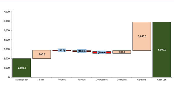
This chart refers to a particular type of bar chart that displays the story behind the net change in the value of something between two points.
Rather than display a beginning value in a bar and the end value in a second bar, this chart separates every unique component added to the net changes and visualizes them separately.
Some waterfall charts link the lines between the columns, making the chart resemble a bridge with other columns floating. These charts are particularly effective in revealing gradual changes in the quantitative value of something with time.
Some of the industries that use waterfall charts include:
- Building Companies.
- Lawyers and legal departments.
- E-commerce companies.
- Retailers.
- Sales companies.
- IT Professionals.
- Exam scoring companies.
The origin
Waterfall charts came into the limelight towards the end of the 20th century, when McKinsey & Company, a strategic consulting firm, made presentations to clients. Later, Ethan M. Rasiel, a McKinsey associate, popularized them in the corporate space in his book The McKinsey Way. Over time, these charts have become more popular and have become an efficient presentation tool.
When are Waterfall Charts Used
Waterfall charts are a great data visualization tool that can be used for different purposes.
Here are some practical scenarios where waterfall charts are used:
- Recording contracts
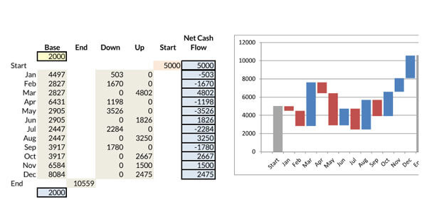
- Displaying changes in a project budget.
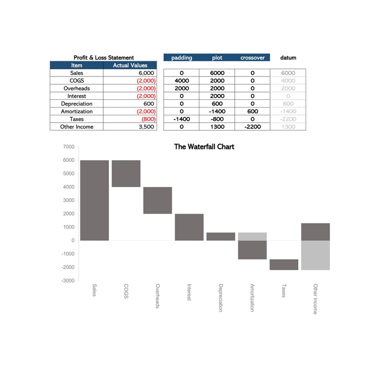
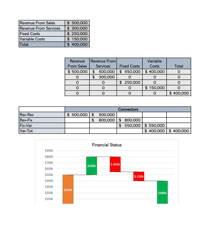
- Calculating company profit.
- Displaying profit or loss statements.
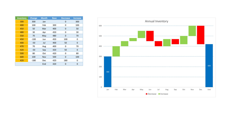
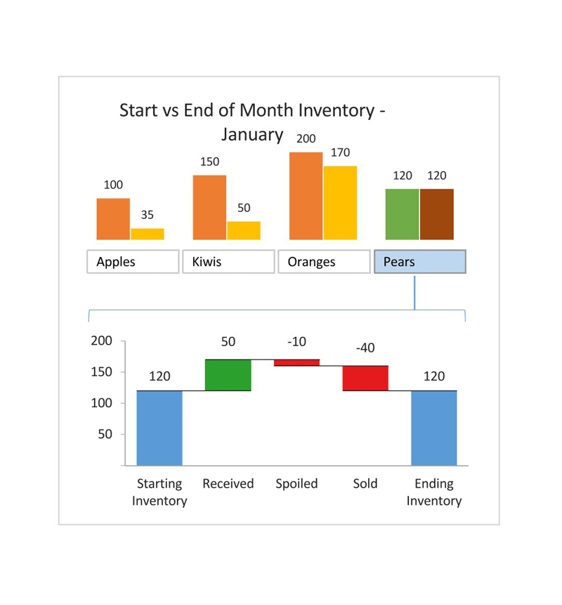
- Tracking retail inventory.
- Making executive dashboards.
- Showing changes in operating costs from one period to another.
- Comparing competitors.
- Displaying product value over some time.
- Analyzing sales or inventory over time.
- Monitor consulting jobs.
Benefits of Waterfall Charts
As a data visualization tool, these charts are increasingly important and can be used for different purposes.
Here are some of the benefits of waterfall charts:
- They are used for studying different data like project analysis, inventory analysis, KPI analysis.
- They are easily customizable and can be either simple or complex based on your desire.
- They are useful analytical tools that can describe changes in the value of an item.
- They are used to show progressive changes of a value, by displaying the collective effects of positive and negative contributions.
- These charts are primarily used in the business space. However, they can illustrate any process with additions and subtractions to a starting value.
Features of a Waterfall Chart
There are a few specific characteristicsnthat make them proper and complete.
There may be some slight difference in appearance, but these features are as follows:
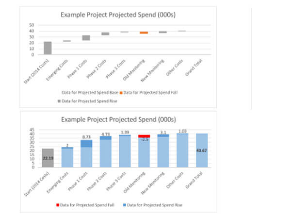
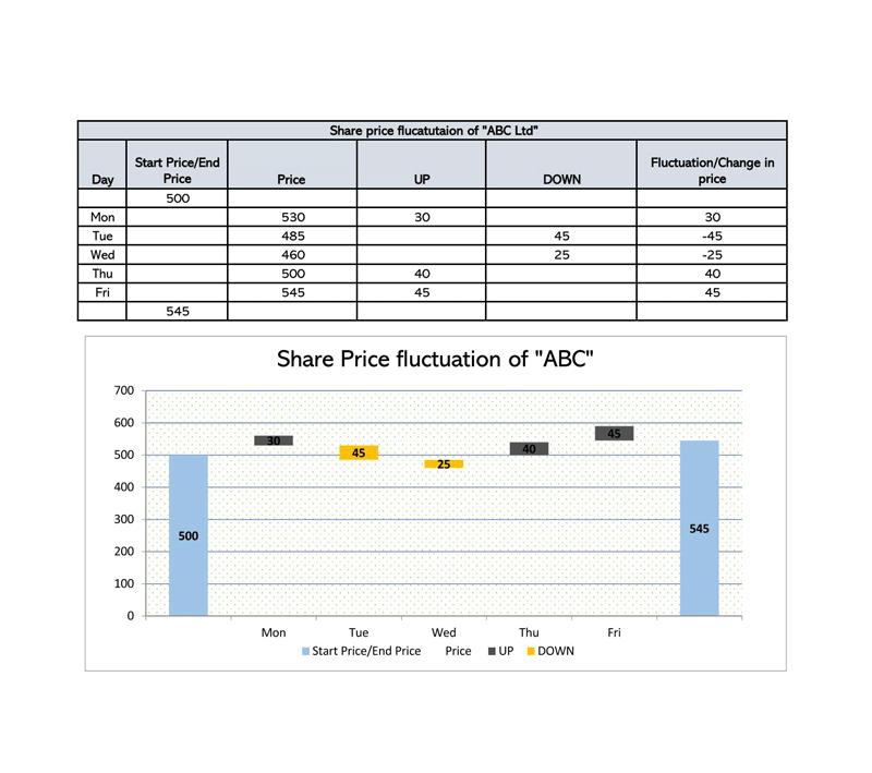
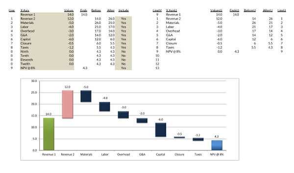
- Floating columns: The floating column shows the status of data with time. They also display the positive and negative changes that occurred to the initial value.
- Spacers: Spacers are margins or padding between the floating columns.
- Color coding: Color coding refers to assigning various colors to the different types of columns. It helps to differentiate the positive and the negative values. It also helps for easy identification of the trend of movement over time.
- Connector lines: Connector lines display the connection between the floating columns. They are not necessarily a part of every waterfall chart, but they make your chart look more professional.
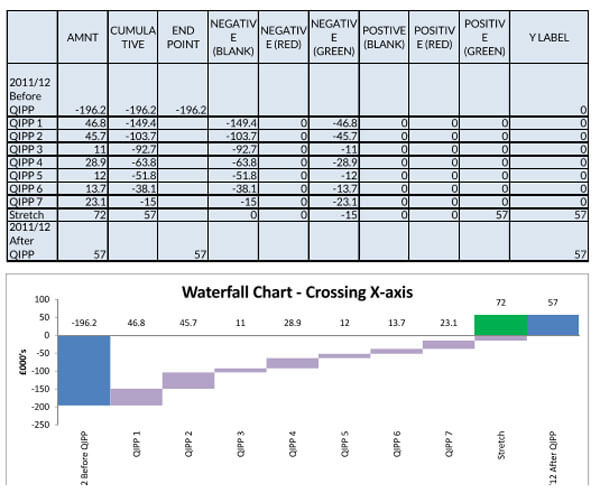
- Crossover: Crossover refers to some scenarios when the values move across the x-axis.
EXAMPLE
If you move from a positive number like 500 to a negative value like -1500, the first number will be above the x-axis while the second one will be below the x-axis.
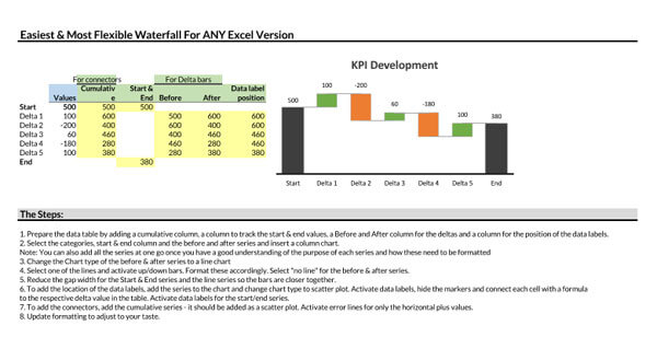
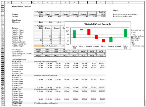
Creating a Waterfall Chart on Excel
You can create this chart on both Excel and PowerPoint. However, for Excel versions older than 2016, it’s a bit difficult to create the charts. But it’s easier for Excel 2016 version, which has a waterfall chart type in the chart options.
But if you are using an Excel version older than 2016, here are some steps for building your chart:
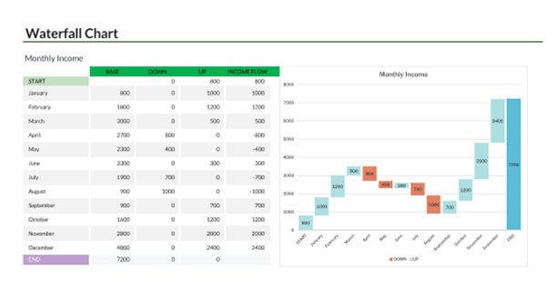
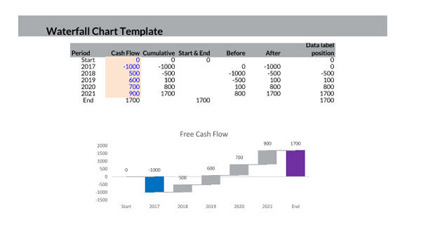
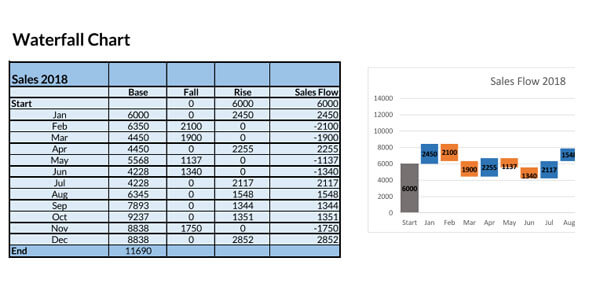
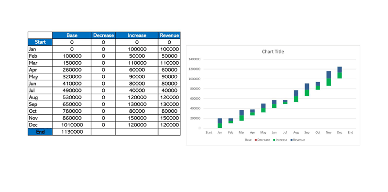
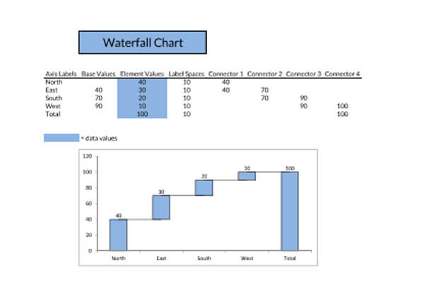
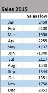
Create the data table: First, you need to create the data table.
EXAMPLE
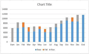
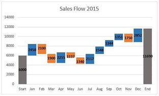
You can create a table for the profit of your company for the year.Then, input the values in the table. You’d discover that the values will be different for each month.
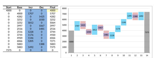
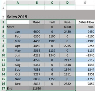
After inputting the values, add three more columns to your Excel table to show the movement of the columns on the waterfall chart. You can title them base, fall, and rise with columns B, C, and D, respectively. The base column shows the beginning point for the fall and rise of the chart. Next, input every negative number from the Fall column’s sales flow and every positive number in the Rise column.
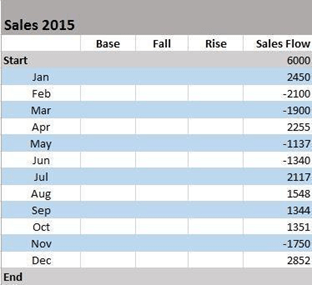
Remember to set the totals: Also, you can add a start and End row to give total values for the beginning and end of your sales year.
Add the formulas in the Table: Complete your table seamlessly by inserting formulas to the first cells of each column and drag them down the column afterward.
For instance:
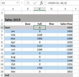
On the first cell in the Fall column, input the following formula =IF (E4<=0, -E4, 0).
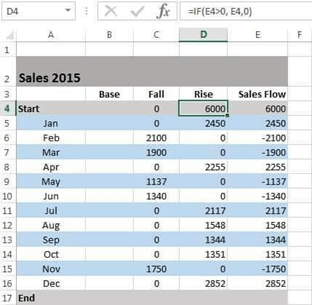
Select the first cell in the Rise column and input the following formula =IF(E4>0, E4,0)
Select the second column in the base column and enter the following formula: =B4+D4-C5 where B4 is the first base value, D4 is the first rise value, and C5 is the second fall value. Then drag it down to get the value of the other base values.

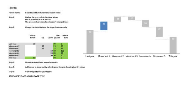
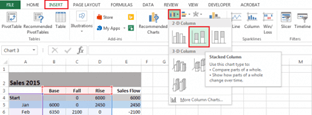
Build a stacked column chart: After getting your data ready, the next option is to build a stacked column chart. To do that, you must: Highlight the areas you want to use for the graph. From the diagram, you can see the months, base, fall, and rise columns.
Click on the insert column, go to the column’s icon, and select the stacked column. Voila! The stacked chart appears on the worksheet having the data you inputted, but we need to convert it to a waterfall chart.
Convert your stacked chart to a waterfall chart: To convert this, you must remove the Base series on the chart.
To do that, you must:
- Select the Base Series by clicking on them. After, right-click and select Format Data Series from the list.
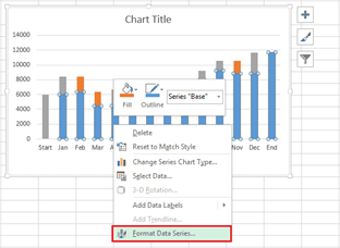
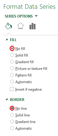
- The Format Data Series pane will pop up on the right side of your worksheet. Select the Fill & Line icon.
- Click No fill in the Fill section and No line in the Border section.
- After removing the base series, the next step is to remove the Base label listed in the legend. You can do this by double-clicking on Base in the legend, and right-clicking on the selected label, and then click Delete from the drop down list.
Format the chart: You can make your waterfall chart more appealing with some formatting.
These include:
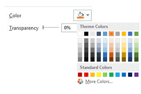
- Color-coding the columns help you identify positive and negative values. To do that, you must:
- Click on the Fall series in the chart, right-click and choose Format Data Series from the list.
- As soon as the Format Data Series pane pops up at the right side of your worksheet, chose the Fill & Line icon.
- Choose a color by clicking on the color dropdown.
- After picking the color for the Fall series, carry out the same steps for the Rise series.
- Note Color-code the start and end columns so they will stand out and do them separately.
Add a more professional look to the waterfall chart by removing most of the white space between columns.
You can do that by:
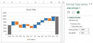
- Double-clicking on a column in your chart
- As soon as the Format Data Series appears, convert the Series Overlap to 100% and the Gap Width to 15%.
- To change the title, click on the title while highlighting and input the title of your choice.
- For the labels, click on one of the columns, right-click, and choose Add Data Labels from the list. Then, replicate the method for other series.
- For formatting the labels, choose one of the labels, right-click, and choose Format Data Labels from the list.
- As soon as the Format Data Labels pop up, you can modify the text color, label position, and font to improve the readability of the numbers.
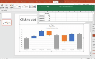
Creating a Waterfall Chart on PowerPoint
Creating a waterfall chart on PowerPoint was formerly an arduous task, but it has become easier with the new editions of PowerPoint.
Here are the steps to do it:
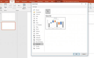
- Open a new PowerPoint presentation.
- Add a new blank slide after the title slide: You can work with an already opened work, but you need to insert a new slide for the waterfall chart.
- Select Waterfall in the insert bar: Click on the insert option and then click charts. From there, select Waterfall.
- Input the values: Input the values following the instructions for Excel above. For PowerPoint, it is quite simple, and the Excel sheet will adjust as you input the values.
- Adjust and add values: after adjusting and adding the values, you can close the Excel window.
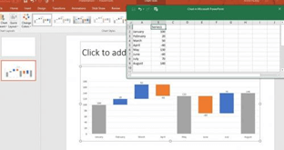
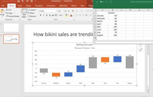
- Do customization, colors, and other stylings: After capturing what you have entered, you can add customization, colors, and other stylings based on your liking.
Tips to Consider
Creating waterfall charts can be an arduous task, but there are a few tips that will make the task easier.
Some of these are as follows:
- For maximum impact, you can customize the chart with logos and colors.
- You can change the column connections in the Waterfall by dragging the connectors’ handles.
- To begin a new summation, delete the connector to remove it. If you want to add a connector, select add Waterfall Connector in the context menu.
- Skewed connectors may result from connectors conflicting with each other. Resolve that by deleting the skewed connectors.
- In basic waterfall charts, every two columns are connected by a single horizontal connector. Click on the click, and it will display two handles.
- You can add subtotals as a visual checkpoint in the chart.
- You can input two or more values in a column. For columns with more than a segment, you can enter an e (for “equals”) for, at maximum, one of them.
- You can use the image toolbar icon to create a build-down chart.
- To connect the “equals” column with the top of the last segment, drag the right handle of the highlighted connector.
- By using labels for level difference arrows, you’ll support the display of values as percentages of the 100%= value in the datasheet.
- Remove all the distractions, unnecessary options, and formatting techniques that don’t provide meaning to the charts. This is particularly true for Excel, where there is too much chart clutter.
Frequently Asked Questions
Even though the waterfall chart is a great visualization tool, some of the challenges linked to its use include: it makes changes difficult, It is difficult to customize, It can invalidate the work you’ve previously accomplished, this method excludes end-users and clients, it typically works better for small projects only and the waterfall model can promote longer delivery times.
Some of the advantages of these charts include; they use a clear structure, the progression of the waterfall model is intuitive, the waterfall model determines the end goal early, it transfers information in superior ways when compared to other methodologies, there are fewer financial surprises with the waterfall method, the waterfall model keeps a project to a specific timescale, it reinforces good testing habits, and the phases of the waterfall model are predictable and don’t overlap.
Conclusion
The use of waterfall charts is becoming increasingly important in different industries and fields, due to its versatility. Initially, creating these charts used to be cumbersome, but with the new Excel versions of 2016 and recent ones, it has become easier. This article has provided you with all the information you need. Read, apply and start creating amazing charts.
About This Article