It is a circular graph that you can use to display information. It divides data and statistics into segments within the circle concerning the data provided.It is also known as a circle based on its shape. The divided segments, or slices, of the pie chart should add up to 100 percent, which represents the whole. A template for pie charts is a pre-made design in PowerPoint or Excel, where you can add your metrics to create accurate and presentable pie charts.
When it comes to visualising data, pie charts are the most commonly used graph type. The best way to benefit from a pie chart is by ensuring you have data that adds up to 100%. This will ensure that you prepare a proper visualisation and representation of the data. A pie chart’s segmented slices, which are sometimes coloured or shaded, make it simple to analyse information. You can draw pie charts in Excel or use its templates for different purposes such as for business, education, consumer survey, expenses, population data, etc.
These data visualisation diagrams have been used for almost 200 years, based on the idea of William Playfair. He believed that if data is appealing to humans, they will interpret it efficiently. Using this chart is the best way to share your information correctly and quickly.
This article will focus on creating a pie chart, its types, and how important a pie chart is for displaying data, statistics, and other information. This article will show you how to make this chart in Excel and provide free templates that you can customise to meet your needs.
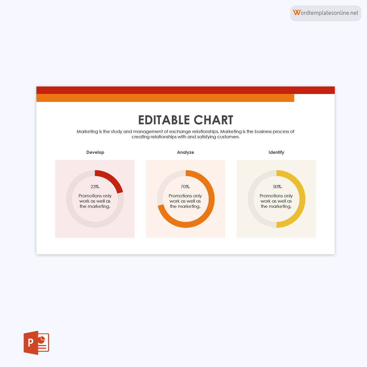
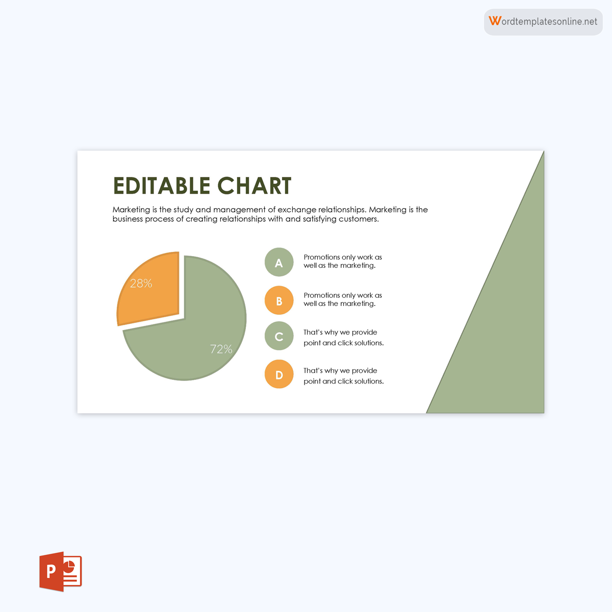
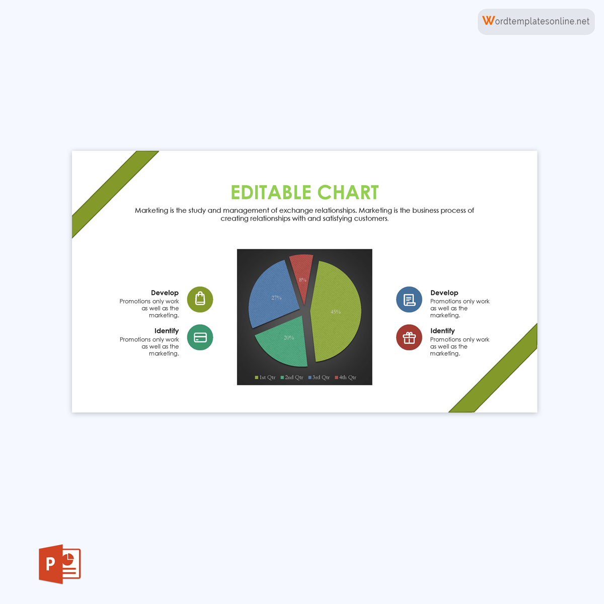
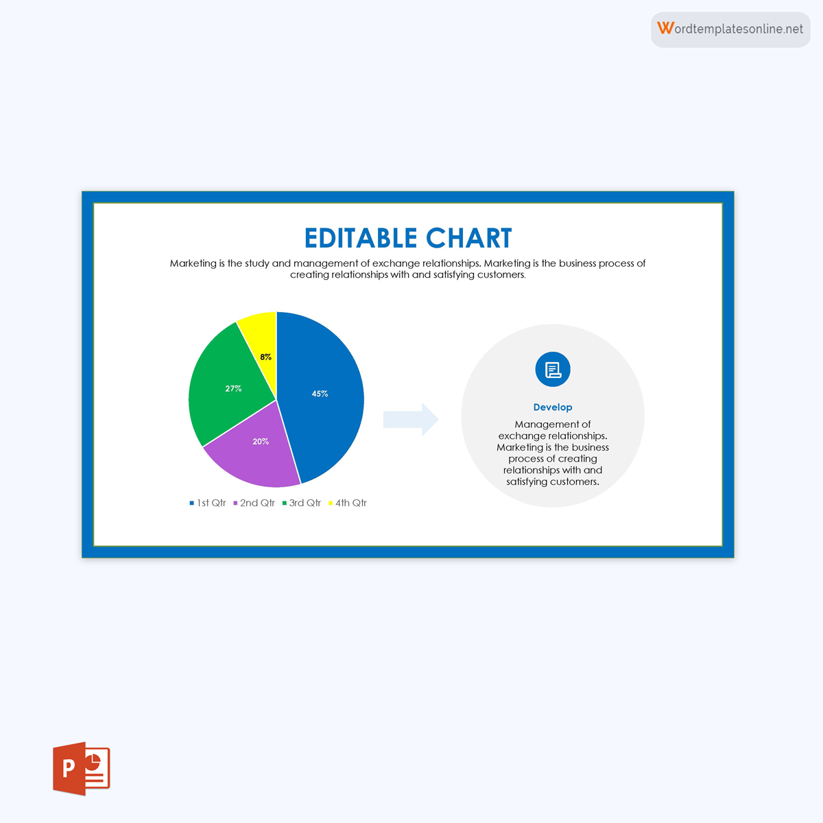
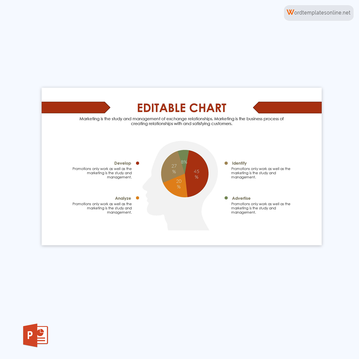
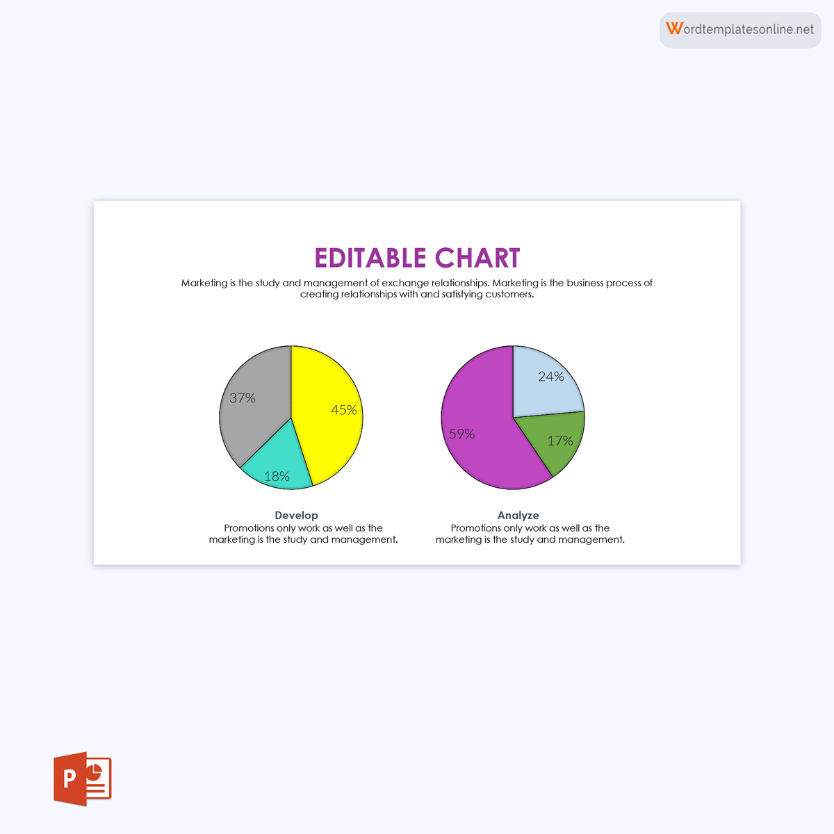
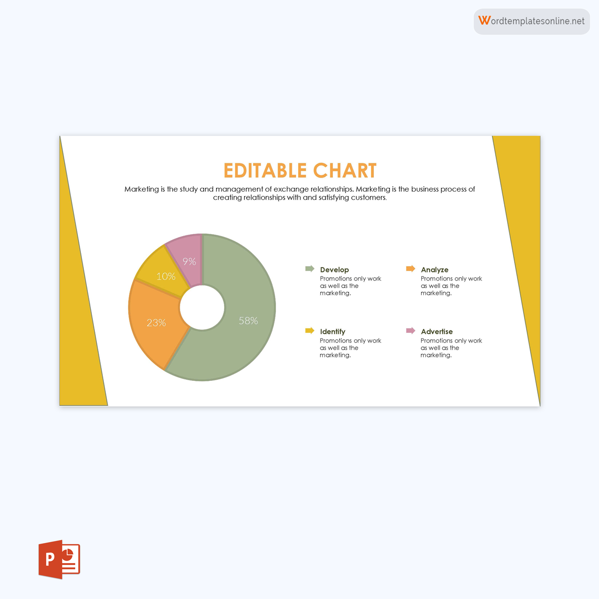
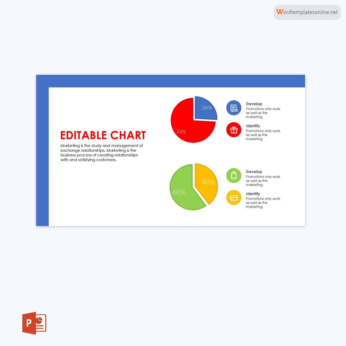
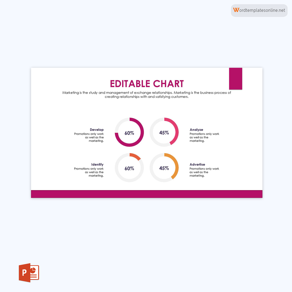
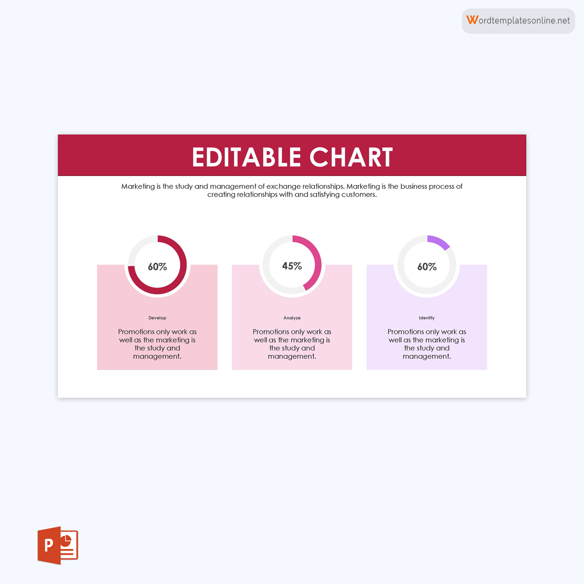
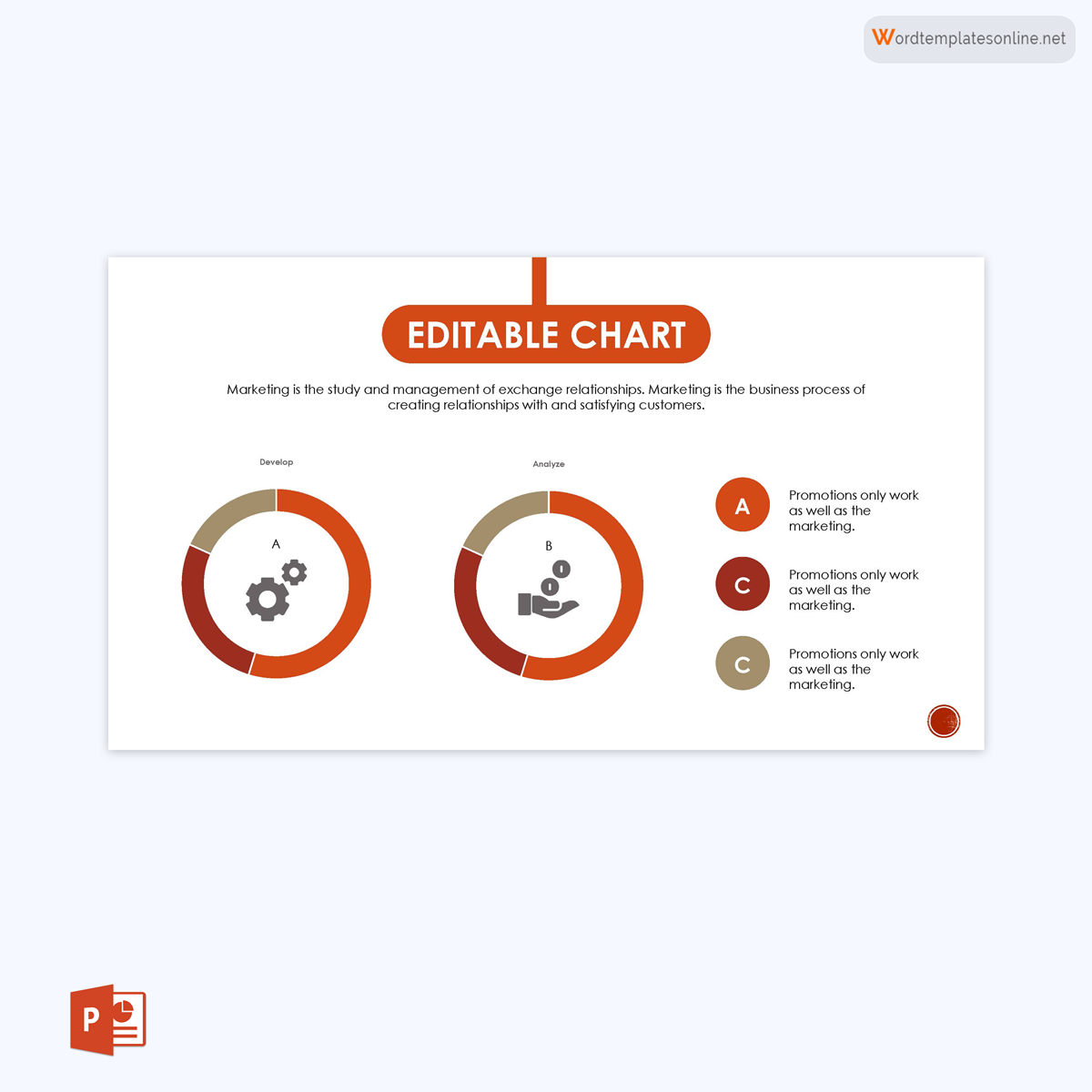
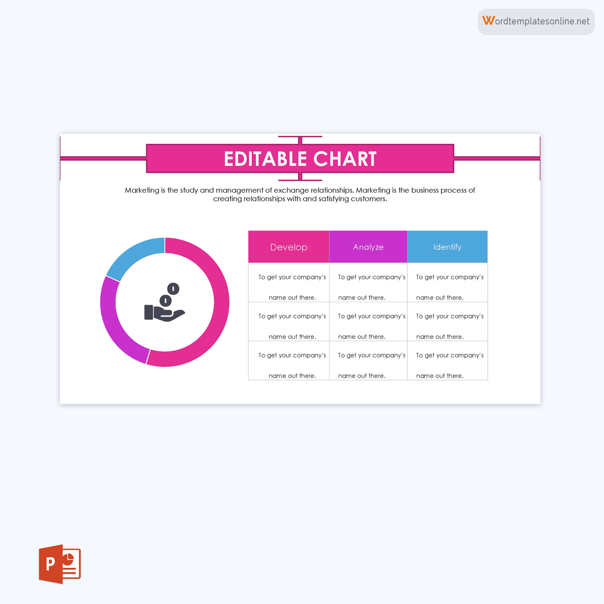
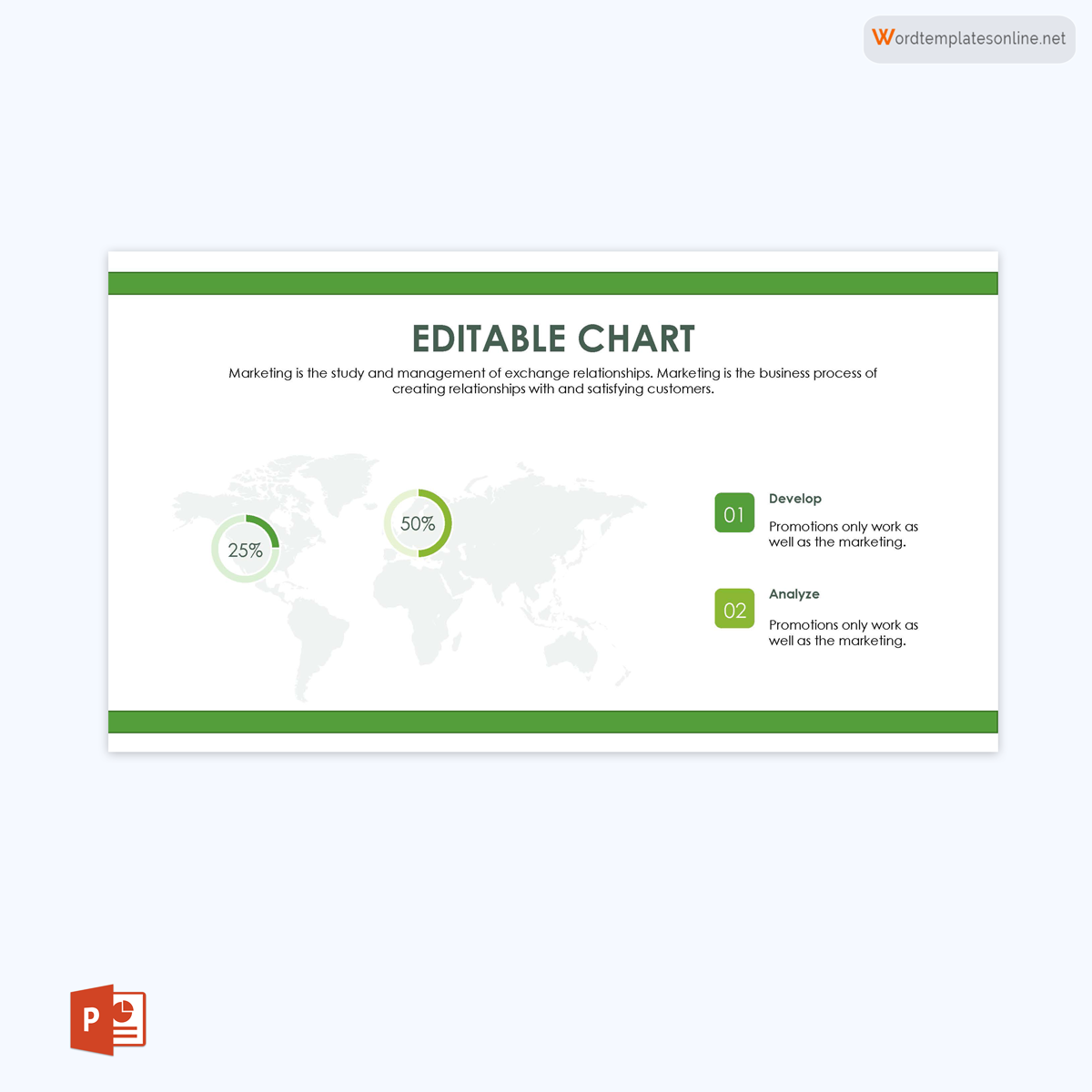
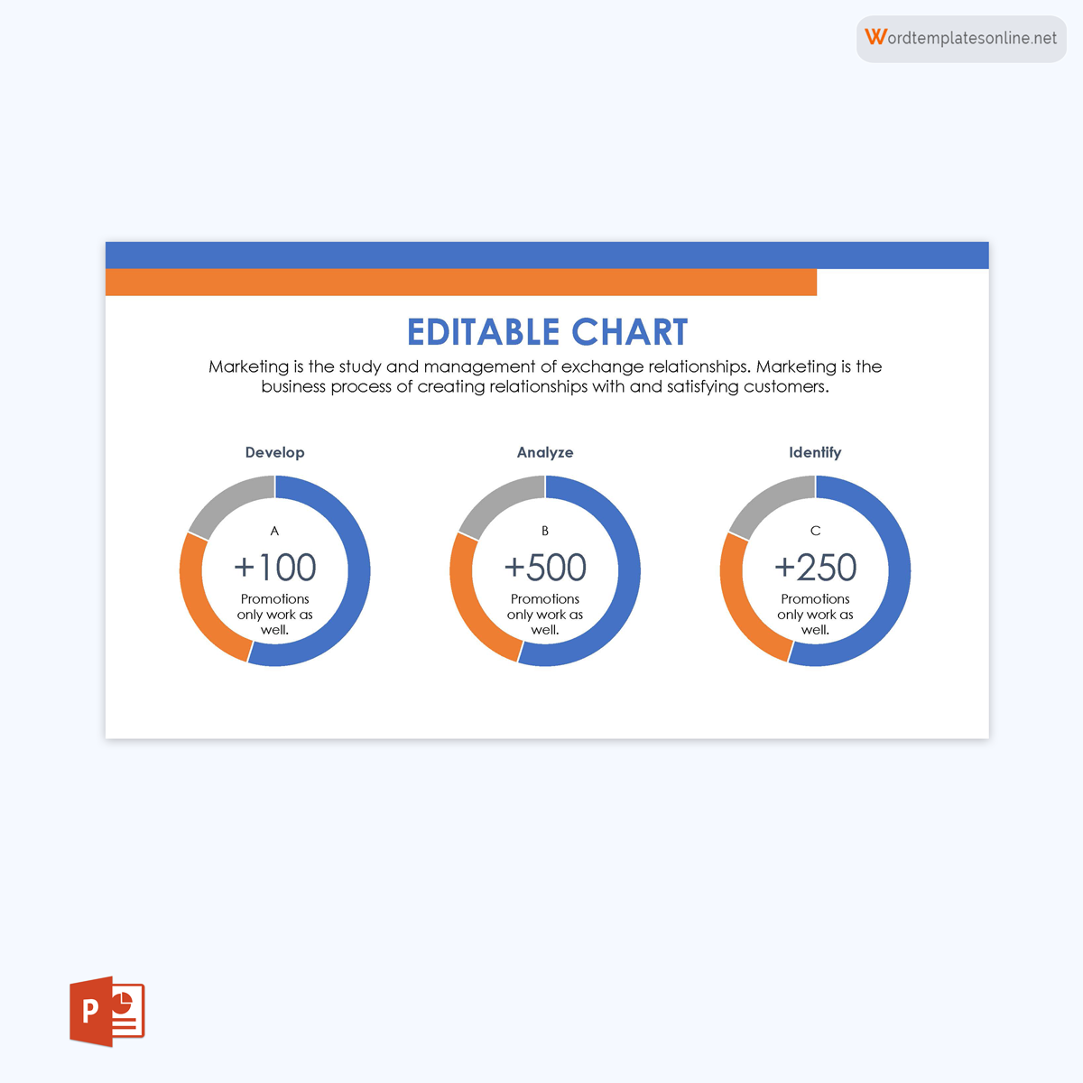
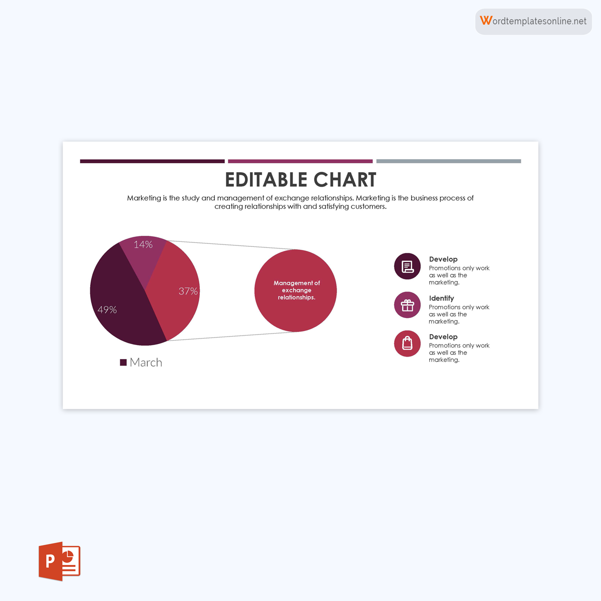
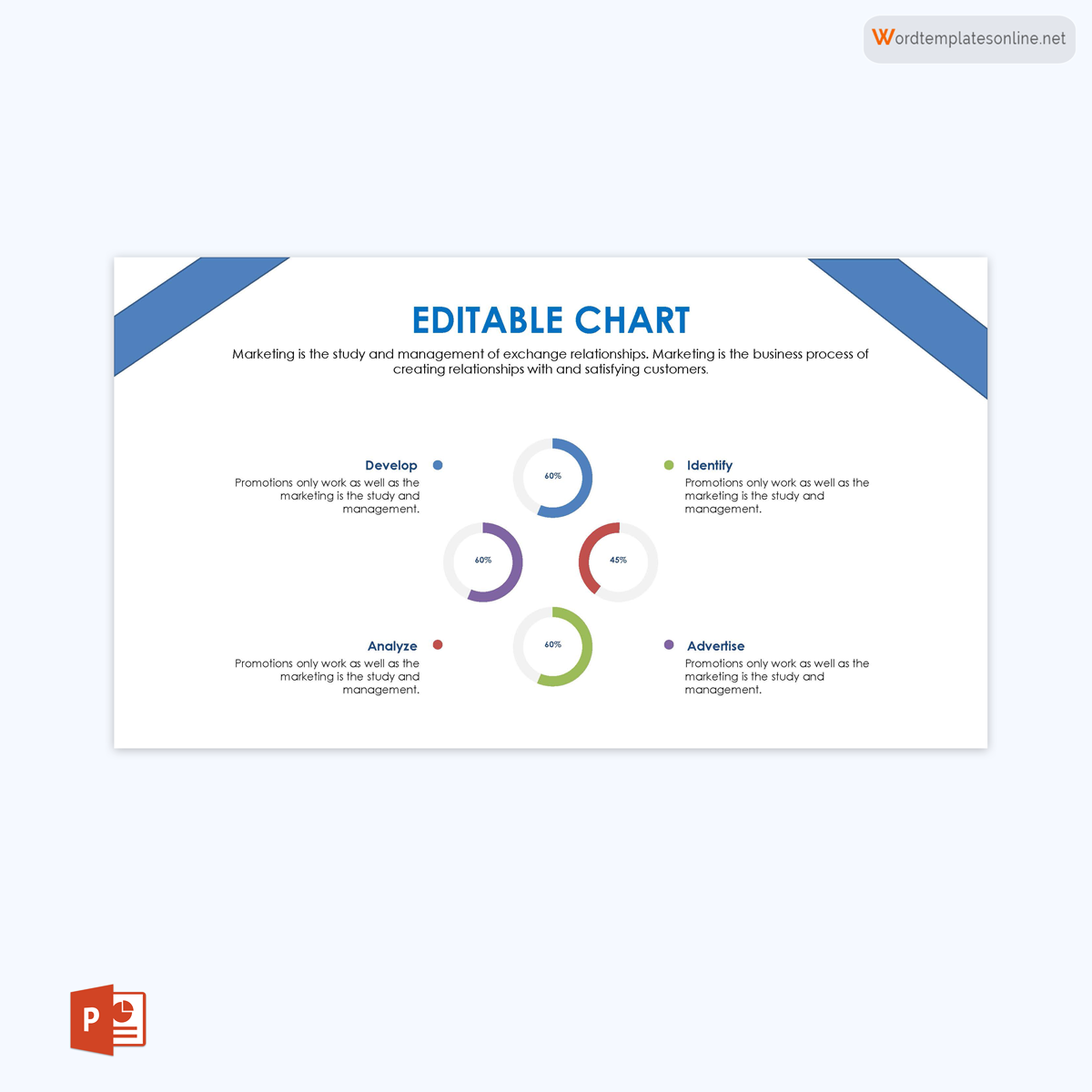
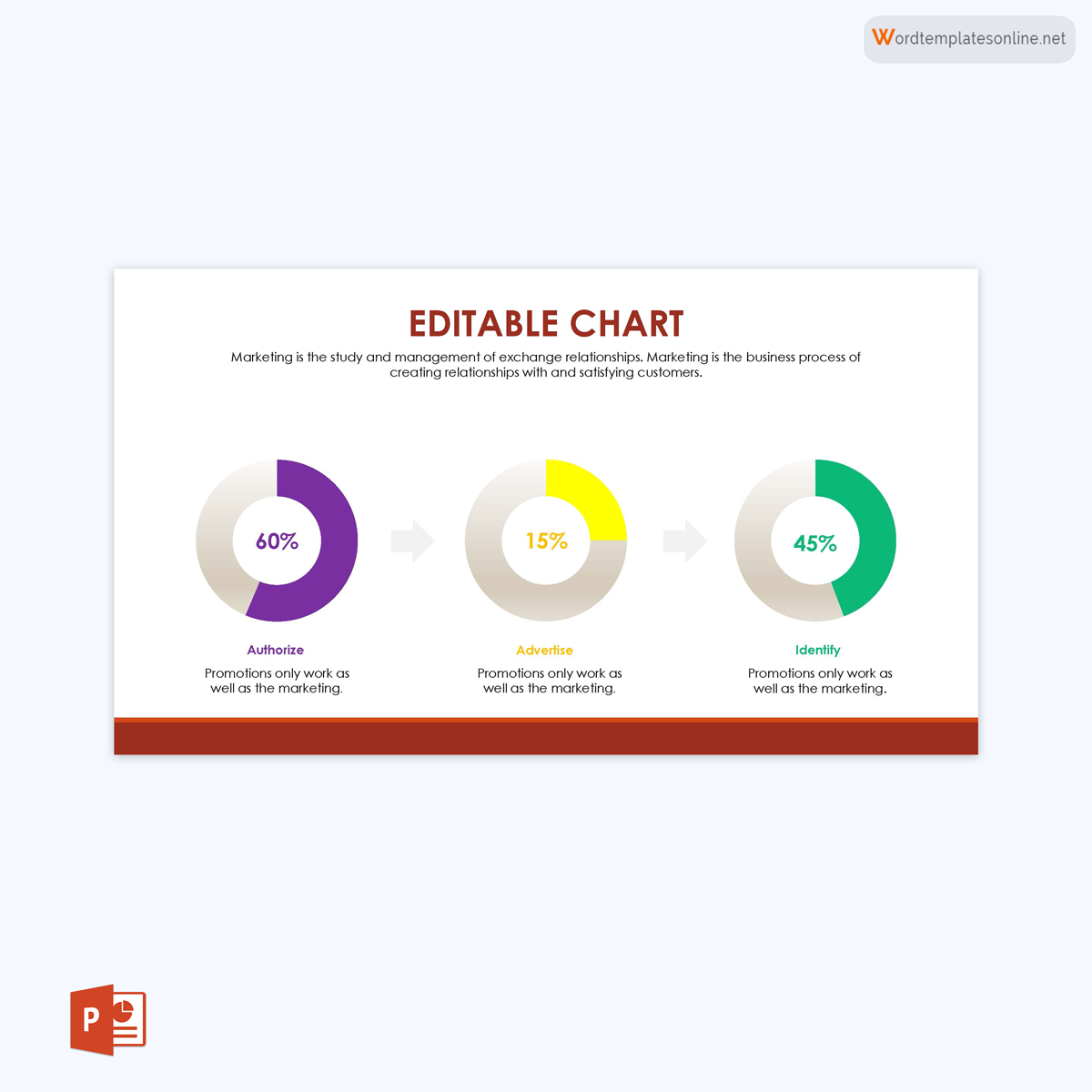
Free Pie Chart Templates (PowerPoint)
To save time and make the process easier, you should use a template to create a pie chart for data representation and comparison. With its template, you can work in a more organized manner with less stress.
Utilizing Pie Charts: When and Why
Pie charts offer a visual representation of data to show its relative sizes. That means you need this chart to represent data that has information regarding proportions. Pie charts allow you to help your audience easily compare which data is larger and which is smaller.
This chart can be used to visualise data for several different purposes. For example, you can use a pie chart to display the different types of clients of the business, to display how students from different classes performed at school, to plan a diet, to divide the household budget for various activities, etc.
Before Making a Pie Chart
To make sure you understand how a pie chart functions, its various components, and any other key ideas related to a pie chart, you should pay close attention to the information below as you create one. To ensure you use a chart properly, you need to have a total number that can be divided. The aim is to compare each slice and see how it compares to the whole group. You can also summarise the data in a table before representing it in a pie chart.
The two main sections of a pie chart are the category and the value, which is the proportion, amount, or frequency of that category. They include the central angle, surface area, and arc length. The arc length is proportional to the quantity it represents. Also, the data used in pie charts can only come from one series per pie chart, with no zeros or negatives.
Pie charts cannot be useful if they are not labelled and have no values. Also, you should not compare data across pies since the data, in this case, is separated and illustrated on different pies. It is best to focus on other types of charts if you want to make a comparison. Finally, avoid using pie charts if your data does not give a whole or sum up to 100 percent.
How to Create a Pie Chart in Excel
If you want to make pie charts for your slides or presentations, we suggest you opt for PowerPoint. PowerPoint would not help in accurate pie chart calculations or complex data analysis, but it presents the pie charts more professionally and personally. So, if you’re just looking for better visuals and presentations, you can scroll down to our free templates for PowerPoints.
Apart from using a template for PowerPoint, here is a step-by-step process for creating a pie chart using Excel. With these steps, you will be able to do more than just make a template. For example, you will be able to add labels and change the appearance of your pie chart. Additionally, using the details provided at the end of this section, you can further format your template.
Creating a pie chart
- Step 1: Open a blank worksheet in Excel and enter the intended data into the worksheet. Proceed to select or highlight this data to create a template of pie charts.
- Step 2: Based on your Excel, you should click Chart to view the different pie chart options or Insert tab and then click Chart to view the pre-designed pie charts.
- Step 3: Select the type of chart you want and click on it; the selected pie chart will appear on the worksheet.
- Step 4: Make visual changes to the chart and fonts if you’re following a theme.
- Step 5: Save this document as a template for future use.
Reading a pie chart
You will need to place your cursor on top of the pie chart to read it. Each slice has a percentage reading that adds up to 100%. In most cases, it is best to add labels to the chart for easier reading.
Adding labels to a pie chart
When you create a pie chart template, the legend will automatically appear. However, it is challenging to read the chart by checking the legend. The best thing is for you to label the pie chart.
- Step 1: For the category name to appear on the pie chart, you need to right-click while your cursor is on the chart, and a drop-down menu will appear.
- Step 2: You will click on “Add Data Labels” for the numerical values to appear on the pie chart.
- Step 3: You can also add other labels, like percentages and categorical values. To do this, you should right-click on the pie chart and click on “Format DataLabels.”.
- Step 4: Click Labels on the window that opens and make the changes or selections you need before clicking OK. Some of the selections include adding the series name, the item that separates each item, and the location where your labels will appear on the pie chart.
note
Remember, to move your data labels, you can click and drag them. Also, to change the appearance of the labels, you can use the options displayed on the open window, such as Shadow, Font, or Fill.
Changing the appearance of the pie chart
You can change the appearance of the template by following the steps given below:
Step 1: Quick layouts, styles, and themes
Place your cursor on the pie chart, and the chart tools will appear with options about the design, layout, and format of your chart template. You can place your cursor on the different options until you get what you need.
Step 2: Moving the pie chart
To move your pie chart from one side of the sheet to another, click on the chart area or its frame and drag it to where you want to place it.
To move your chart to another sheet within the same workbook, right-click on the chart and select Move Chart. You can either choose another sheet in the same workbook or create a new one. You can also click the pie chart itself and click Move Chart on the Chart Tools tab.
Step 3: Resizing the pie chart
Click on the corner of the chart area and drag it to get either a larger or smaller size. The space within the chart area is automatically resized by Excel.
Step 4: Rotating the pie chart
Change the slice that is at the top of your chart to rotate it. To do this, right-click the pie chart and select Format Data Series from the drop-down menu that appears.
Next, you should click Options and enter a value in the Angle of First Slice box. You can increase or reduce the value until you get your chart to look how you want it.
Step 5: Adding chart titles
To add a chart title to your pie chart, click Charts in the ribbon, then click on Chart Layout. Now, to include a title in your pie chart, click on the Chart Title. Make sure to choose the position where you want your title to appear as well. Depending on the version of Excel you are using, you can also click on the pie chart itself to reveal the Chart Tools on the ribbon where you will click on Layout and then click on Chart Name to select the placement of the title.
For the first method, the actual title according to the data series will appear. However, for the second method, you can click on the chart title, delete it, and then rewrite the title you want.
Since a legend appears whenever you create a pie chart, you can choose to delete it by right-clicking on the legend and clicking Delete.
To change the appearance of the legend, right-click on it and then click Format Legend to make the necessary changes.
In case you have deleted the legend but want it to appear again, click on the chart itself to reveal the Chart Tools on the ribbon, where you will click on Layout, then click on Legend, and select the position where you want the legend to appear.
Step 7: Colours, fonts, and background
To change the colour of your pie chart, you should click on the pie slice whose appearance you want to change and double-click it. It will open a Format Data Point window where you can click Fill to make the color, texture, or even picture changes.
To change the font of the data labels (plus any other changes to the data labels), you should right-click on the data label, then click on Format Text, and select the changes you want to make on the pie chart.
To change the background of the chart area of your pie chart, start by right-clicking on the space in the chart area and then clicking Format Chart Area to change the background.
Step 8: Exploding pies and exploding slices
To make the pie chart easier to read and to highlight a specific value, it is best to use this effect when your chart contains many numerical values in a single data series.
When creating your template, instead of the 2D option, select the Exploded Pie option. After creating the pie chart, you can drag any slice you want, and your pie chart will change accordingly.
You can also explode a single slice by clicking on the pie, selecting your slice of choice, and dragging it out of the pie to create the effect.
Additional Pie Chart Options
There are other ways that you can customise your pie chart. For example, you can include new categories, change the appearance of the slices, and even add WordArt. With the help of Excel’s sorting tool for new categories, the slices can be automatically sorted by size, from smallest to biggest.
For sorting out slices, you can also combine all the small slices into one category labelled “Other.” The best and easiest way to do this is by entering your numerical values into Excel, just like you would when you want to create a pie chart. However, ensure that you include all the numerical values that should fall under “Other” in one single row and name the category “Other.”
For creating WordArt, it is not possible to apply it to chart elements. That is why you should create it in Word by highlighting the text, clicking the Insert tab, and then choosing WordArt. Next, select the options you want and click on them to form WordArt. It can then be copied and pasted as data labels or titles into your pie chart.
Variations of a Pie Chart
There are different variations of pie charts that you can use when displaying data and statistics. Some of them are described below:
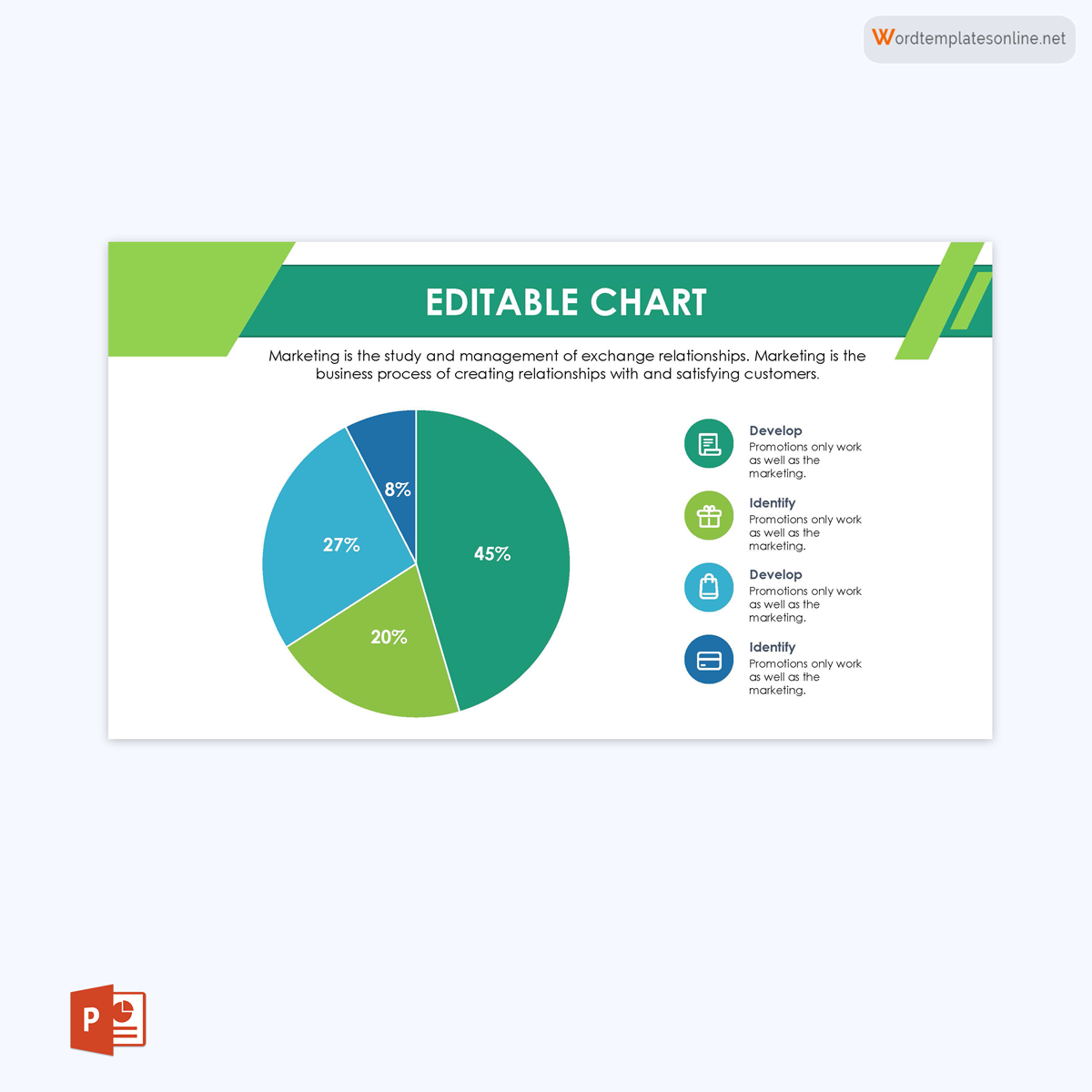
Basic pie chart
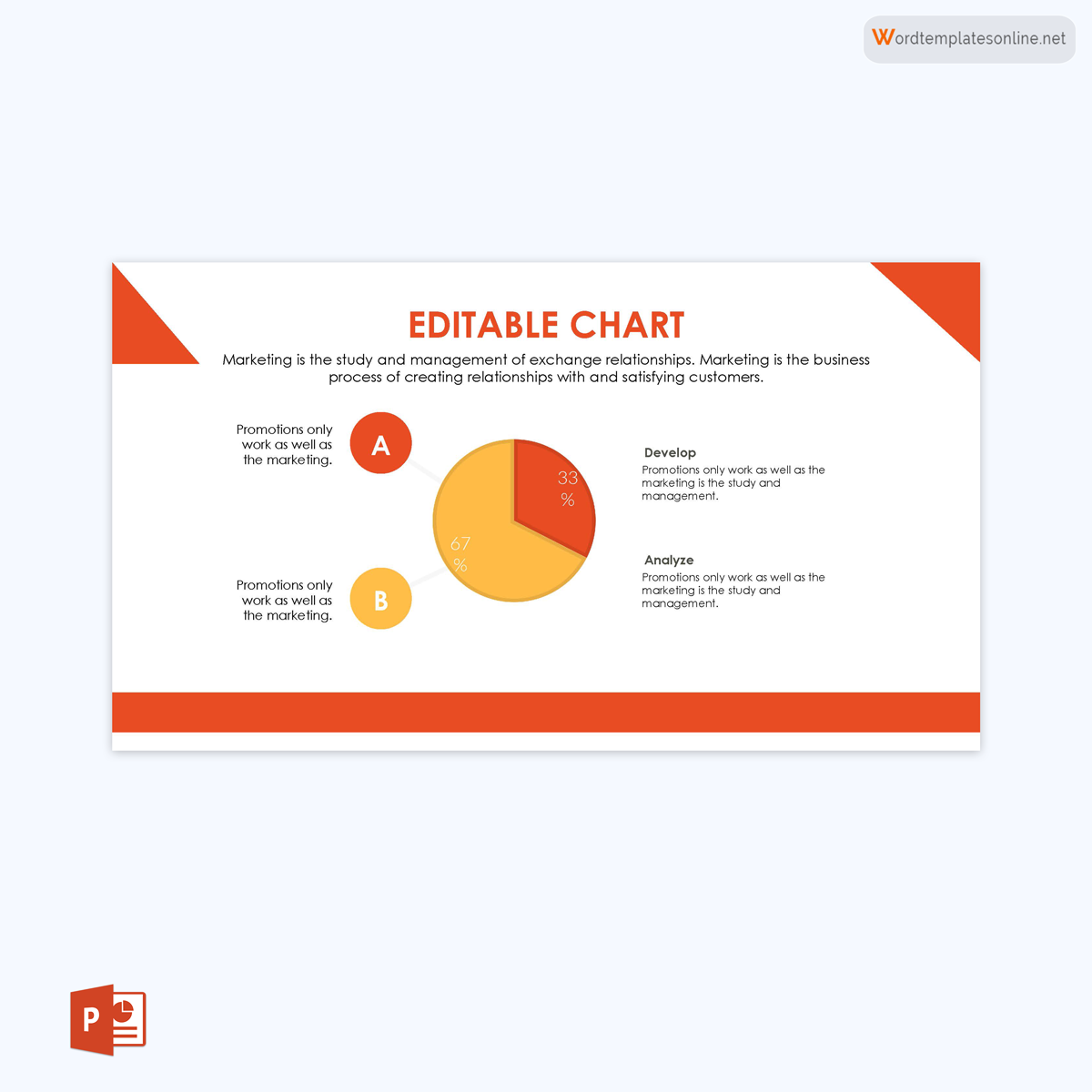
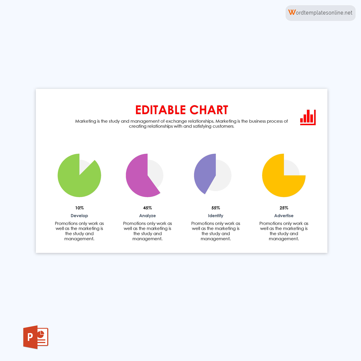
This simple circular diagram is the most common among the different types of pie charts. It is divided into slices that represent percentages or different proportions that total the whole (100%).
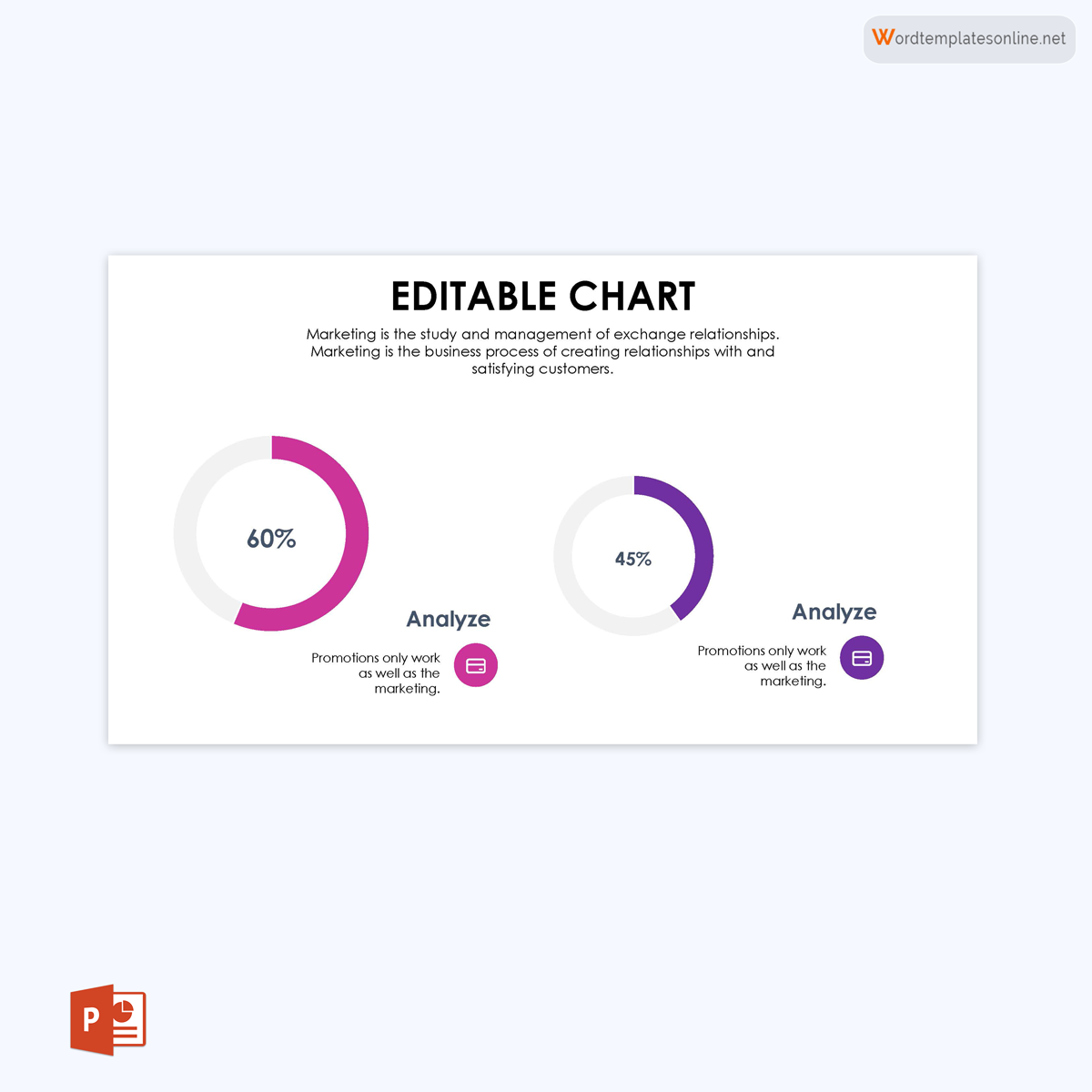
Comparative pie chart
It is used to compare the data and statistics visualised in the pie chart. There are usually two basic pie charts that are used to compare the represented information.
Bar of pie chart
A pie chart is made of slices that represent particular information. In cases where there is a subcategory of a particular slice of information, you will need to use a bar of a pie chart to represent this information. It represents a subset or subcategory of information.
3D or exploding pie chart
This is a basic pie chart with a 3D look to be more visually appealing than a regular pie chart. You can use a 3D or exploding pie chart template to either expand the information or highlight a portion that is crucial to your audience.
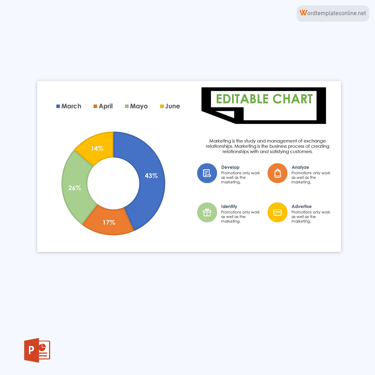
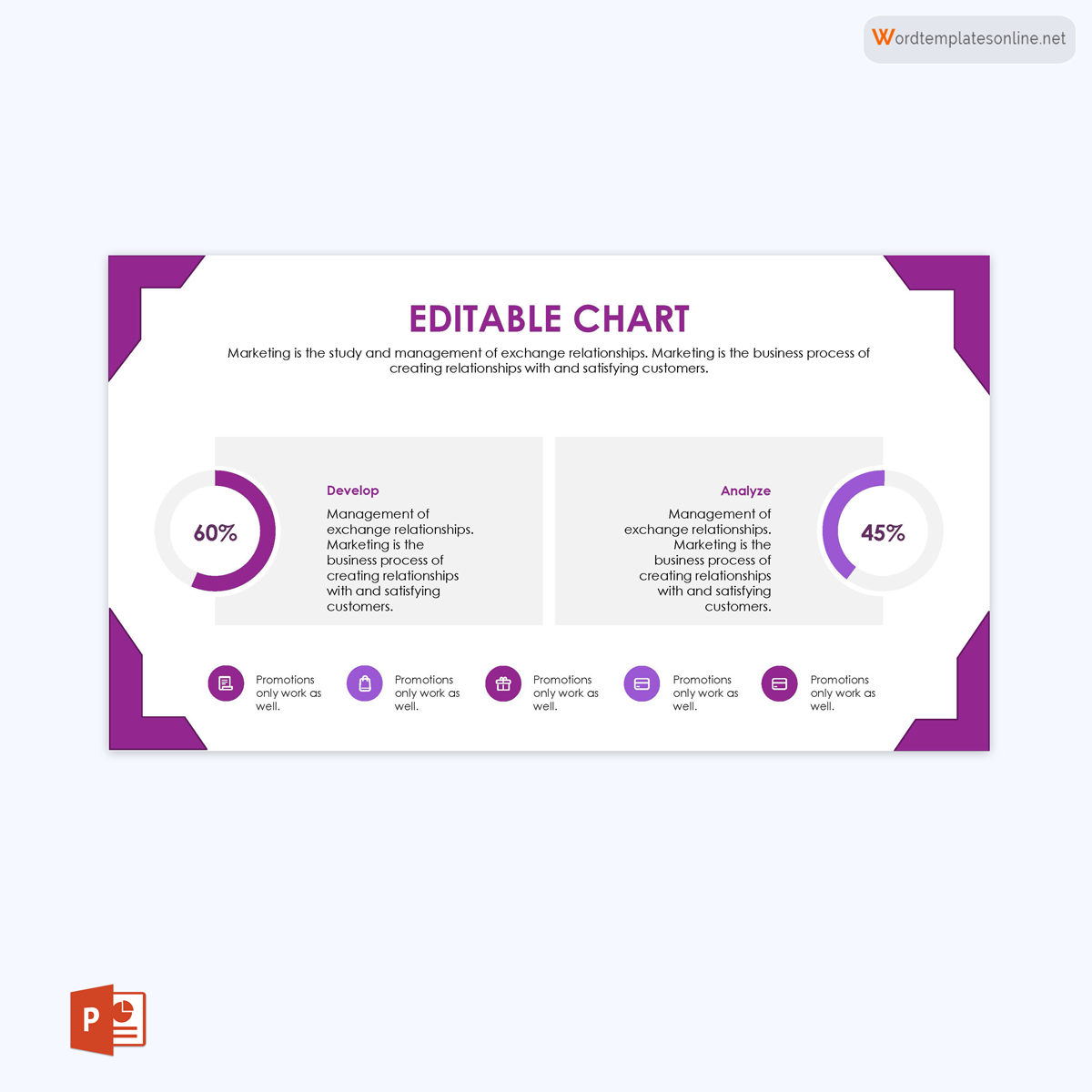
Doughnut chart
A doughnut pie chart looks like a basic one that has a hole in the middle. They are the best pie charts to use if you need to represent more than one data series.
Points to Remember
Here are some points to remember for creating, using, and formatting a pie chart for data representation:
Include annotations
Include annotations if you want your audience to be able to understand the data you are visualising. These are small comments that will help to explain what you are representing in your pie chart.
Consider the slice order
To produce a meaningful slice order in your pie chart, take into account the maximum and minimum data points when creating the pie chart. Considering the order of the slices will make the reading easier. It is best to start from the top right and move the order of slices from the maximum to the minimum data point in a clockwise direction.
Limit the number of pie slices
Always maintain a maximum of five slices per pie chart. Limiting the number of pie slices is important because it makes it easier to read and prevents you from using colors that have already been used for other pie slices. The pie chart is meant to visualize data, and that means limiting these slices makes it easier to read the data.
Avoid 3D and exploding effects
Avoid 3D and exploding effects whenever possible when creating a pie chart in Excel. These distorting effects may lead to an inaccurate representation and reading of data. You need to avoid squashing, adding depth, or even stretching and pulling out your pie charts in Excel. They tend to add unnecessary clutter to the data.
Sort your data meaningfully
Whether it is in descending or ascending order, you need to sort out your pie chart data meaningfully. While creating your chart in Excel, you can also sort your data in alphabetical order. Sorting your data meaningfully will make it easier for your audience to see and read your data.
Eliminate the legend and label the data directly
Another important thing you should do when creating your pie chart in Excel is to eliminate the legend and label the data directly. This means you should create enough space in your chart to ensure the slices have both the label and the value, thereby eliminating the legend and the time wasted reading between the legend of the data and the data represented in the pie chart.
Use colour strategically
When creating a pie chart in Excel or PowerPoint, always use colours, but strategically. Colour helps grab the attention of the audience. You need to have different colour codes to represent the data being presented in each pie slice.
Avoid trying to fit a pie to incompatible data
Ensure you use compatible data in a pie chart. You should not use a pie chart if the data to be represented does not add up to a whole or 100%. When working with data that is already expressed as a percentage but may not add up to 100%, exercise caution.
Pie charts should not be used to compare groups
Do not use pie charts if you need to compare data between one group and another. A pie chart is best used to compare data or information within the same group. You will need a different type of chart to compare groups.
Avoid comparing values from different pie charts
If you want to compare values across multiple pie charts, do not use a pie chart. You should use a stacked bar chart or a line chart for a group-to-group comparison. A pie chart is best used for comparison within a group.
Limit the number of slices
Do not have an excessive number of pie slices for the benefit of your audience and proper readability. You can avoid many smaller categories by merging them into one and labelling them “others.”
Final Thoughts
A pie chart is a circular visualisation of data and statistics meant to display a part or percentage of a whole representation. To create a proper pie chart that will make it simpler for your audience to read and understand your data, make sure you adhere to the tips given in this article. Also, ensure your chart has data that adds up to a whole that is 100%. Lastly, to create your pie chart, use one of our templates for PowerPoint or our instructions for doing so in Excel.
About This Article